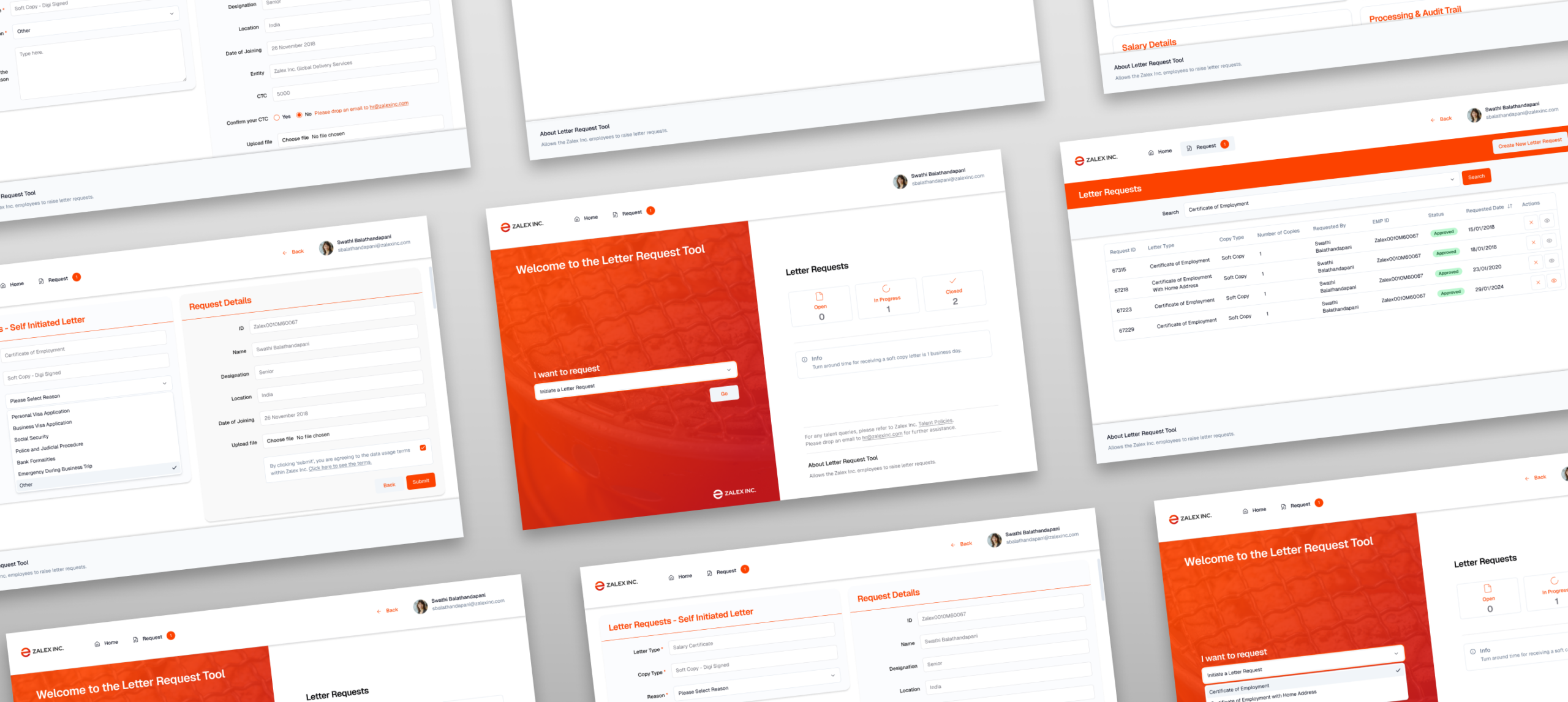
Clever Recruit —
High-Density Pipeline for 200+ Candidates
Hiring teams manage hundreds of candidates across multiple roles using spreadsheets, email threads, and disconnected tools. CleverRecruit was designed to consolidate the entire process into a single, structured workflow.
Density as a
design value
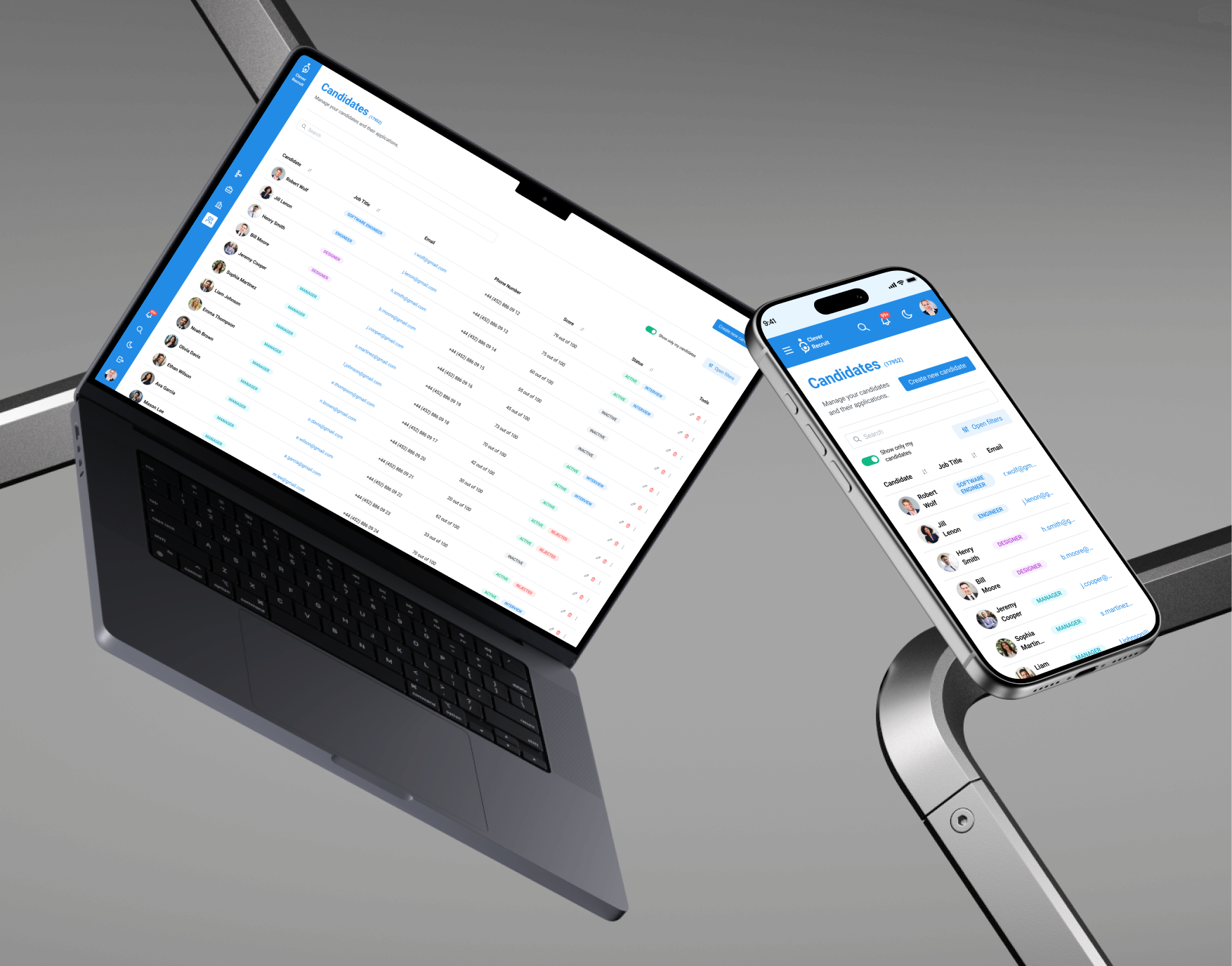
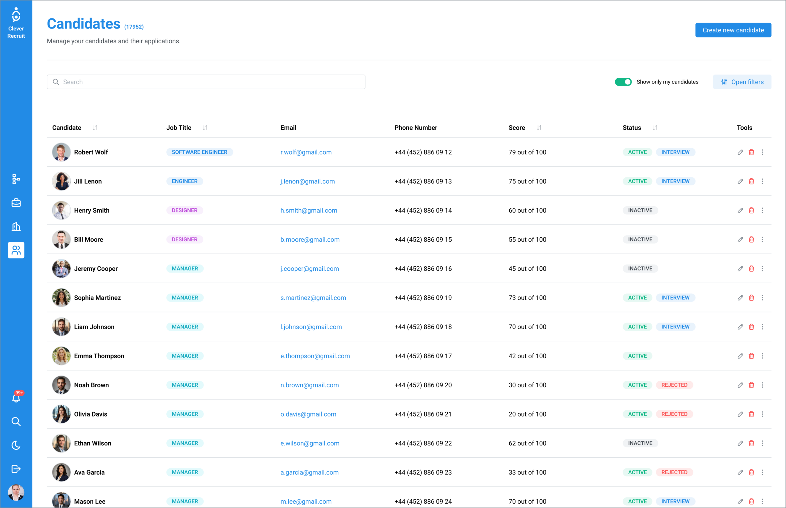
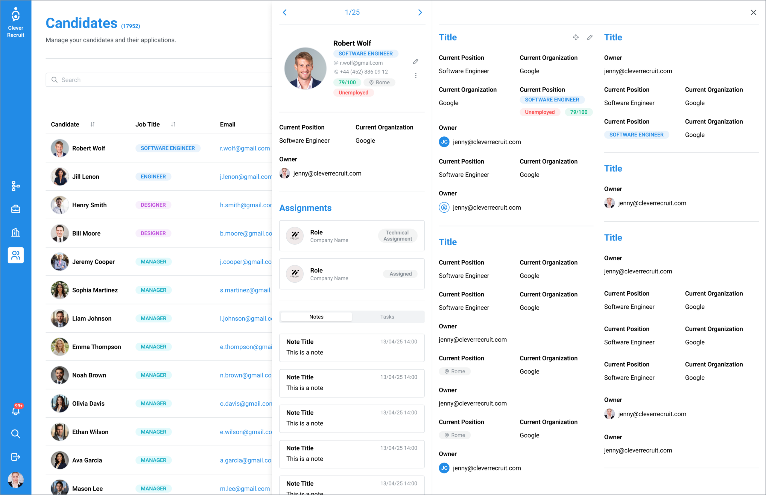
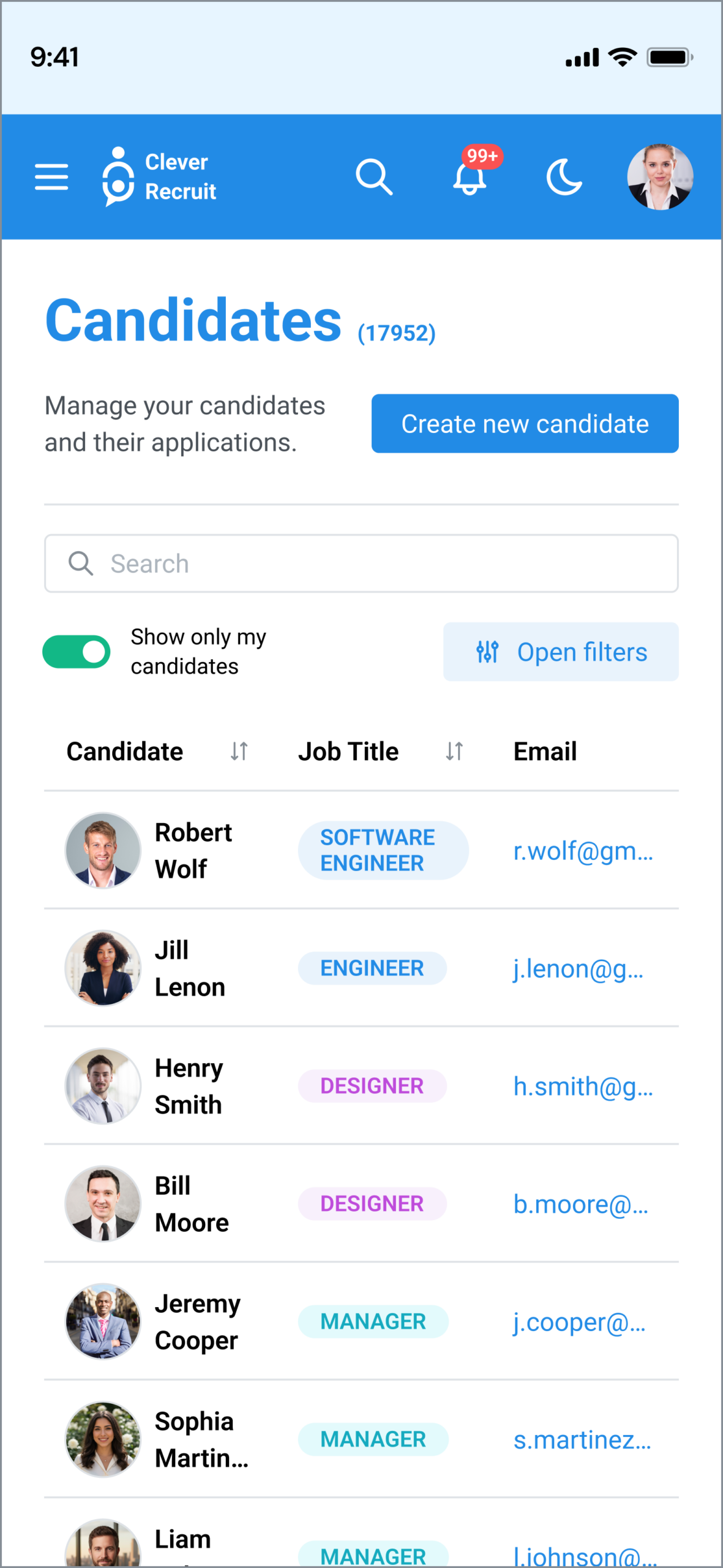
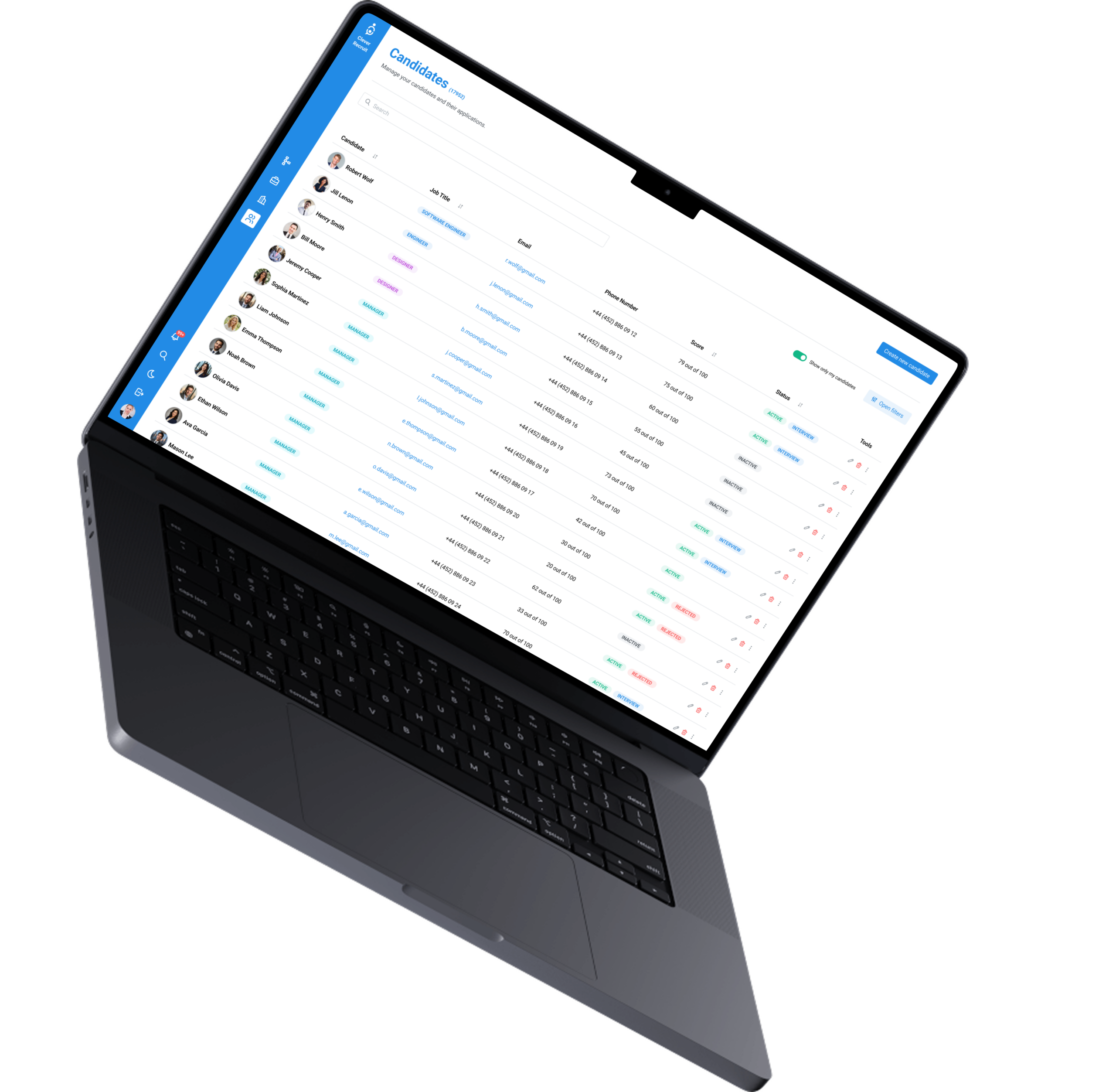
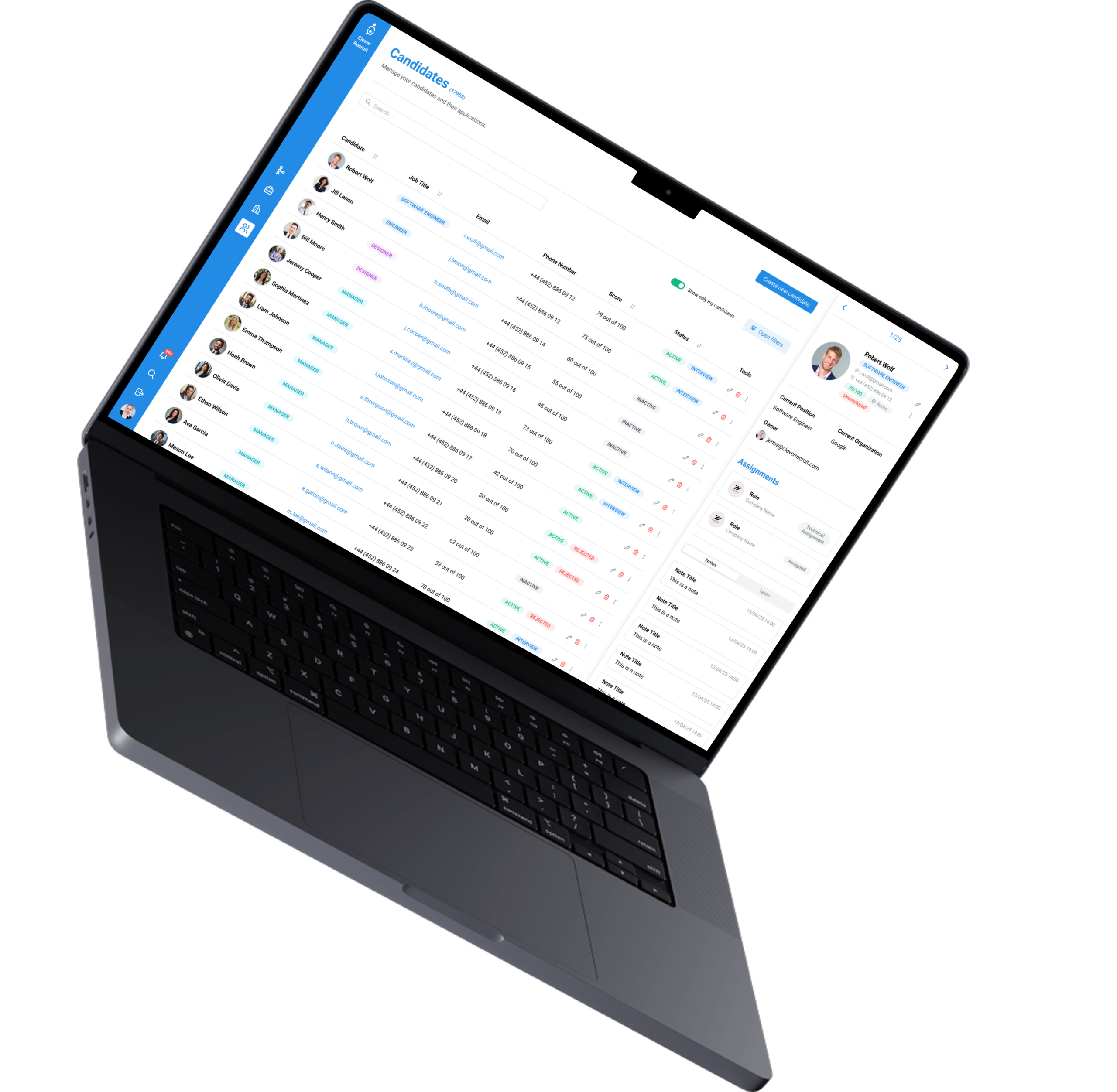
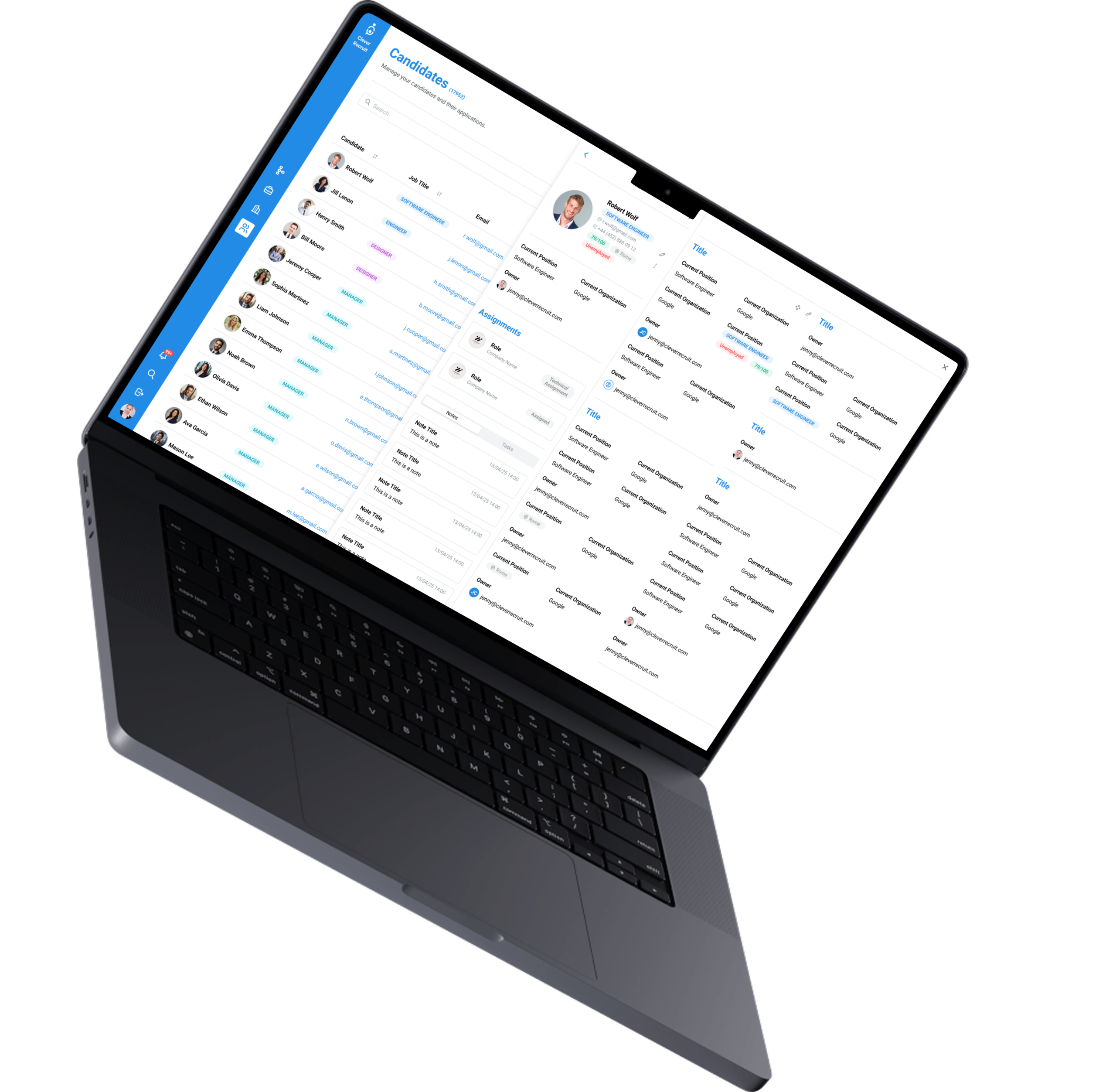
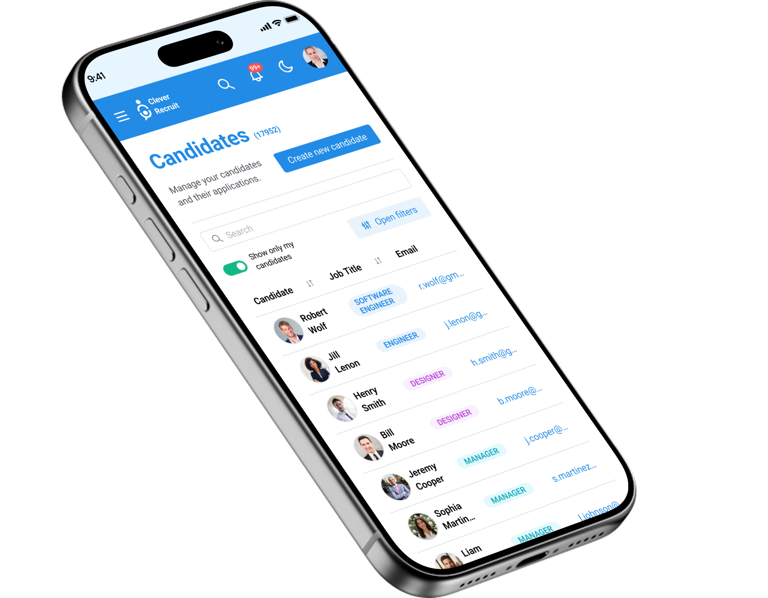
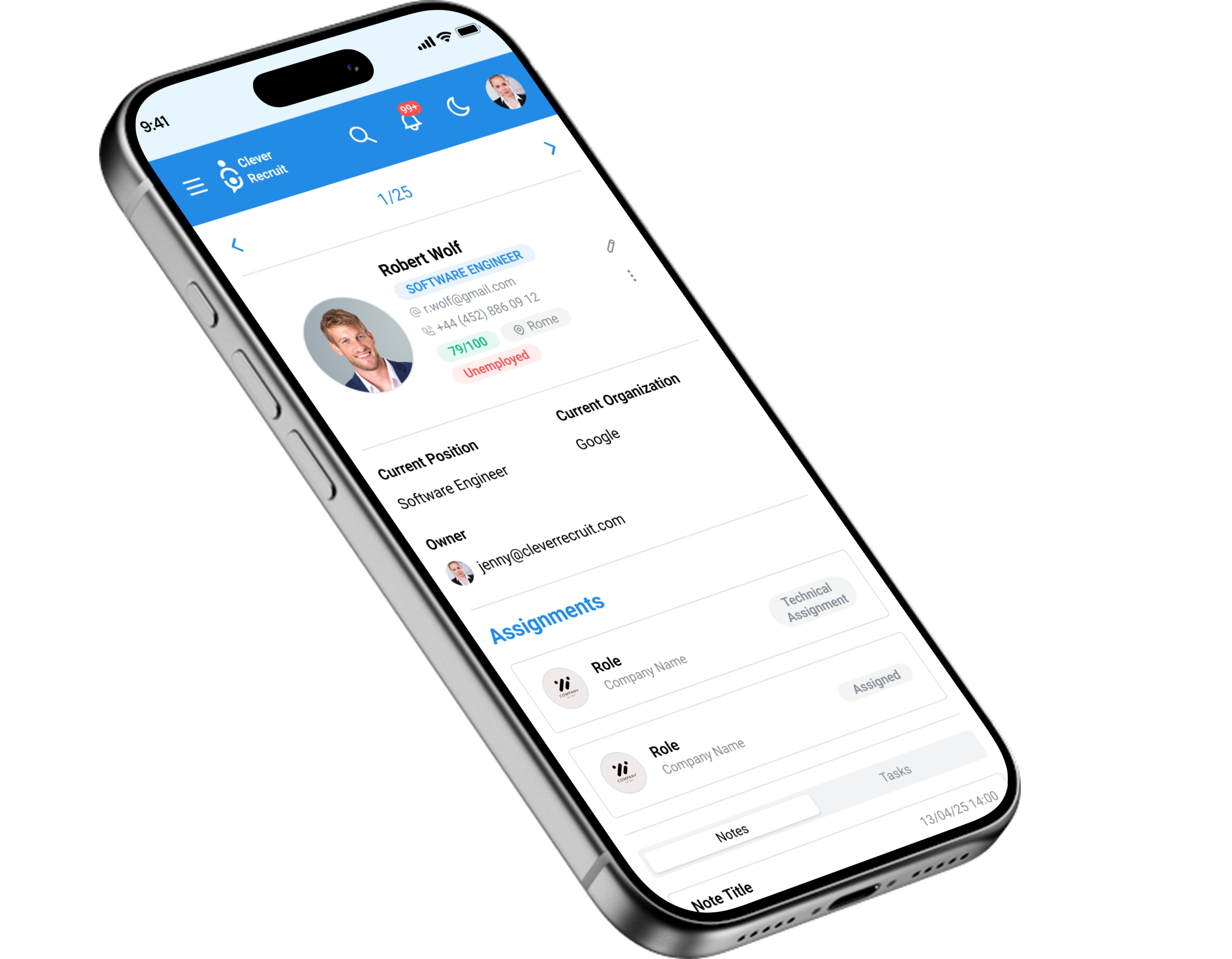
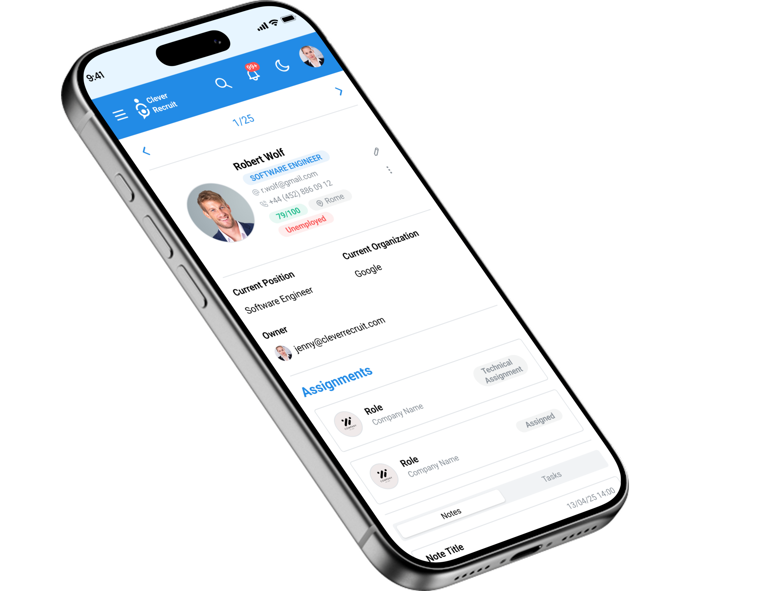
CleverRecruit is an all-in-one recruitment platform with a status-driven candidate pipeline at its core, designed in Figma with a scalable design system. Every candidate entry shows current stage (colour-coded), job title, contact details, and next action — visible at a glance from the master list. The responsive mobile companion app is purpose-built for hiring manager approvals — not a shrunken desktop.
Two distinct user types shaped every design decision: recruiters who need high-density overview of all candidates at once, and hiring managers who need focused, actionable information about a specific role — primarily on mobile.
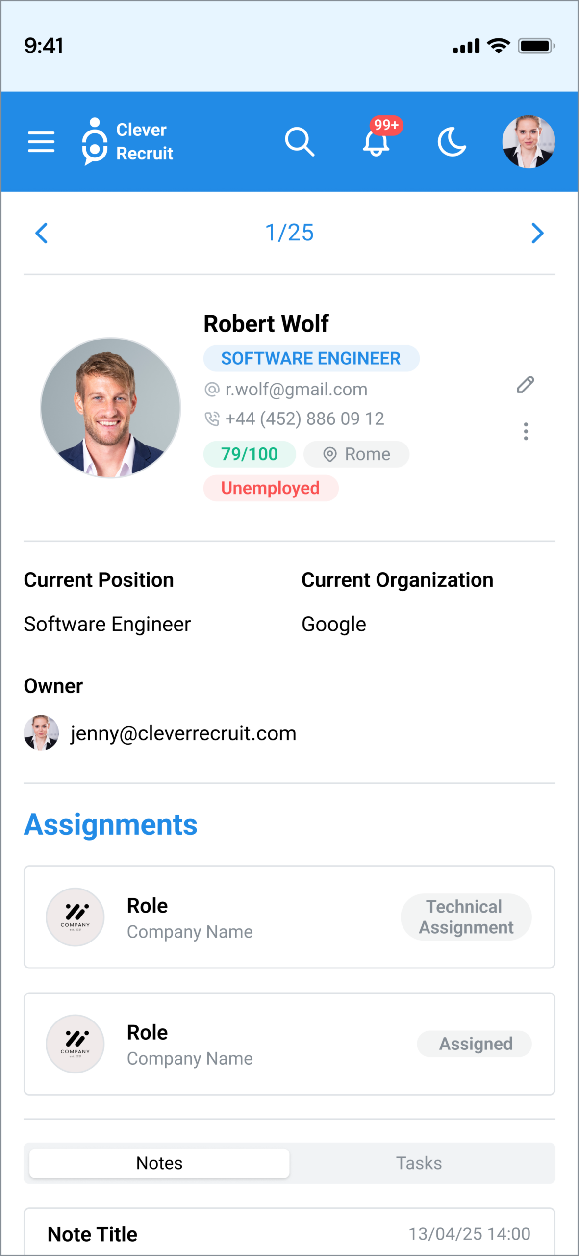
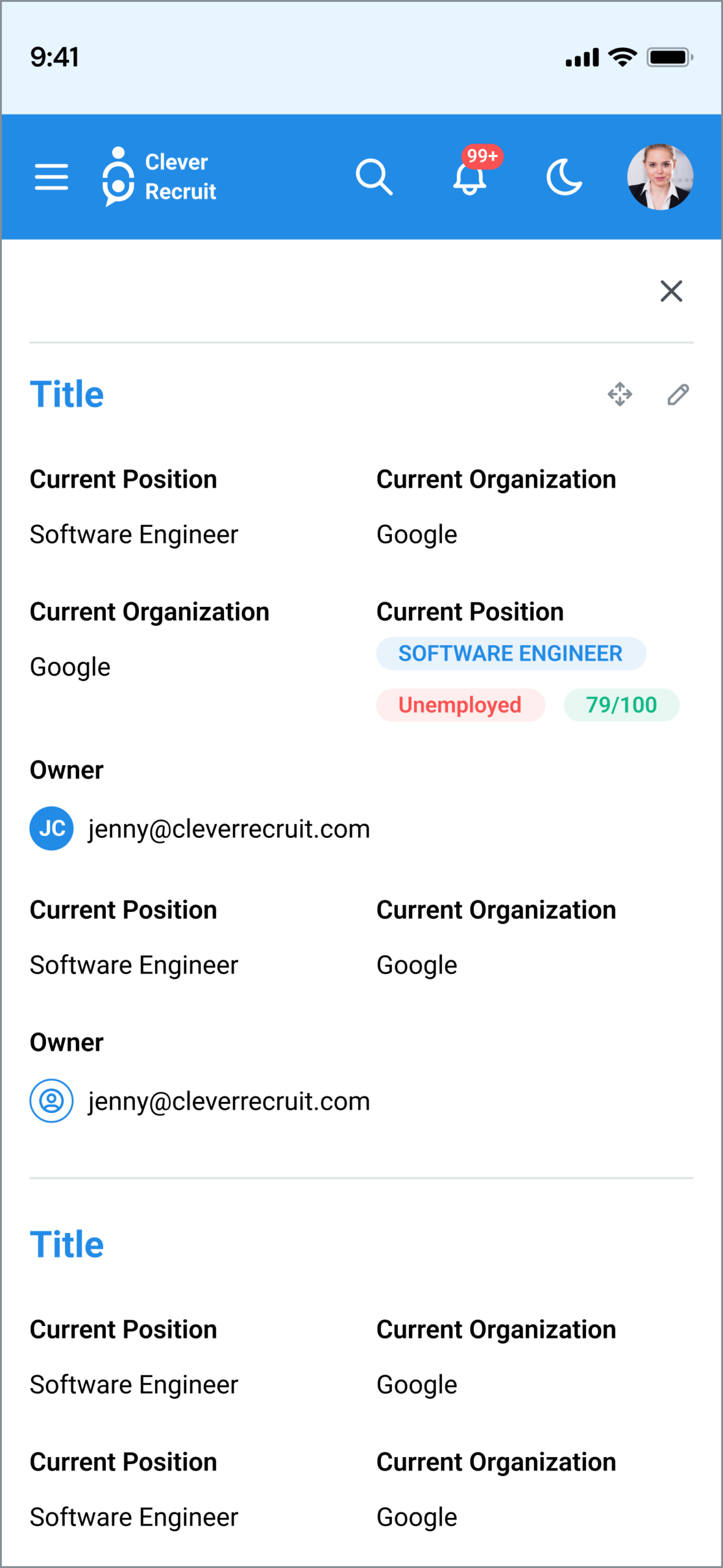
Key screens: Candidate pipeline (table view) · Candidate detail · New candidate form · Job listings · Job detail (pipeline per role) · Interview scheduler · Reports · Mobile pipeline · Mobile candidate card
Designed for
two users
- See all 200+ candidates across 15 roles at once
- Move candidates through pipeline with minimal clicks
- Get quick decisions from hiring managers without chasing them
- Loses track of candidates across email threads
- No single source of truth for pipeline status
- Hiring managers respond slowly without structured prompts
- Review shortlisted candidates quickly on mobile
- Give structured feedback without navigating a complex system
- Make hiring decisions without leaving the tool
- Gets unstructured CV attachments via email with no context
- No clarity on why a candidate was shortlisted
- Mobile experience on most ATS tools is practically unusable
Research
findings
| Finding / Insight | Design Response |
|---|---|
| Recruiters need to scan 20+ candidates at once — density is a feature, not a problem | Table view as default: sortable columns, status colour-coding, bulk actions. Whitespace is a liability for power users. |
| Hiring managers primarily use the system for approvals, not pipeline management | Mobile companion designed specifically for the approval use case — not a shrunken desktop. |
| Status is the primary organiser in every recruiter's mental model | Status as the dominant visual element — colour-coded, always visible, sortable by default. |
| Bulk operations are essential for recruiters processing high daily volumes | Bulk select with checkbox column; bulk action toolbar appears on any selection. |
| Saved filters are essential for recruiters managing multiple simultaneous roles | Persistent filters at session level; named filter presets for saved common views. |
From research
to prototype
• ATS competitive audit
• Pain point mapping
• Role-based IA comparison
• Cross-platform responsive strategy
• Mobile-first approval view
• Filter system interaction design
• Status colour system
• Responsive breakpoints
• Hiring manager mobile test
• Iteration on key flows
Every screen
mapped
| Screen / State | Purpose | Key elements & decisions |
|---|---|---|
| Dashboard | Pipeline overview & metrics | Candidates by stage · Recent activity · Outstanding actions · Quick filters |
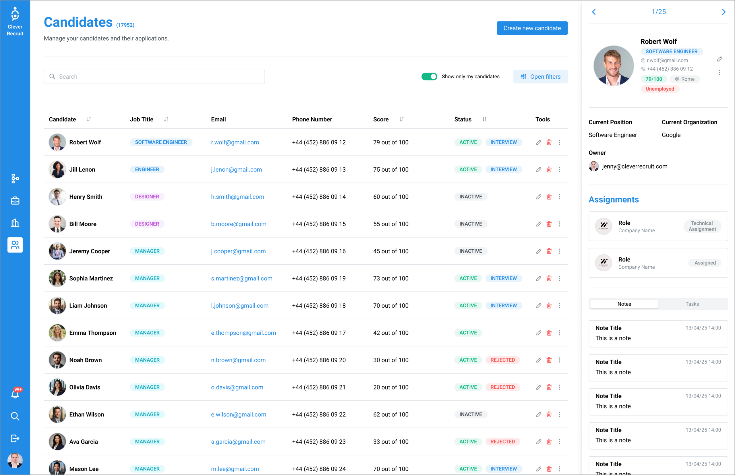
| Candidates (master list) | Full candidate database with filtering | Sortable table: name, title, email, stage (colour-coded), last contact · Bulk select · Search · Add new |
| Candidate Detail | Single candidate profile | Contact info · Application history · Interview notes · Status timeline · File attachments · Email log |
| New Candidate | Manual candidate creation form | Name · Contact · Role · Source · Stage assignment · CV upload — minimal required fields |
| Jobs | Active role management | Job list with candidate count per stage · Open/filled/paused status · Create new job |
| Job Detail | Per-role pipeline view | Kanban or table view per job · Candidates grouped by stage · Stage move actions |
| Interview Scheduler | Calendar-based interview management | Available time slots · Send invite · Calendar integration · Confirmation flow |
| Reports | Pipeline analytics | Time-to-hire · Source effectiveness · Stage conversion rates · Export to CSV |
| Mobile: Pipeline | Condensed pipeline for hiring manager approvals | Card view by stage · Swipe for quick status change · Filter by role |
| Mobile: Candidate | Candidate detail on mobile | Key info · Quick action buttons (approve/decline/message) · Notes input |
| Settings | System configuration | User management · Stage name customisation · Email templates · Notification rules |
Step-by-step
journeys
Every choice
justified
| Decision Made | Why — Rationale | Alternative Rejected |
|---|---|---|
| Table view as default | Recruiters with 200+ candidates need density. A table shows 20+ rows simultaneously with sortable columns. Whitespace is a liability for power users. | Kanban as default — available as a per-job view for hiring managers, but too sparse for the master candidate list. |
| Status colour-coding | Stage must be readable scanning 50 rows in 0.5 seconds. Colour achieves this; text labels alone require reading time. | Text-only status labels — tested slower for scan-and-identify tasks in competitive audit. |
| Mobile as approval tool | Full desktop parity on mobile compresses a dense B2B tool into unusability. Different users, different jobs, different designs. | Responsive desktop — tested and rejected; table-based workflows do not compress to mobile without losing core value. |
| Persistent filters | Recruiters who filter by role or stage need that filter to persist. Resetting on every page load adds repetitive friction for daily users. | Reset-on-navigate — standard pattern but hostile to power users who filter once and work within that view all day. |
| Bulk actions | Recruiters process candidates in batches after screening calls. One-at-a-time stage changes for 15 candidates is 15× the work. | Individual actions only — simpler to build but fails the primary use case of batch processing. |
Results that
matter
Screen-level design
Desktop screens
Hiring manager experience
Brand system
Design case study exploring the tension between information density and usability in B2B recruitment tools. Full information architecture, user stories, interaction design, cross-platform Figma prototype, and design system completed; not implemented in production.