MindPeace —
Designing for Warm Precision: A Mental Health Platform
Mental health care has a continuity problem. Patients see a therapist for 50 minutes a week and then go silent. MindPeace was designed to fill that gap — connecting patients and clinicians through structured mood tracking, clinical assessments, and between-session communication.
Warm precision as
design principle
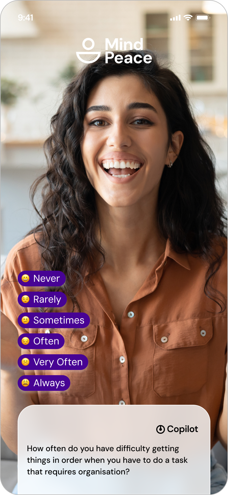
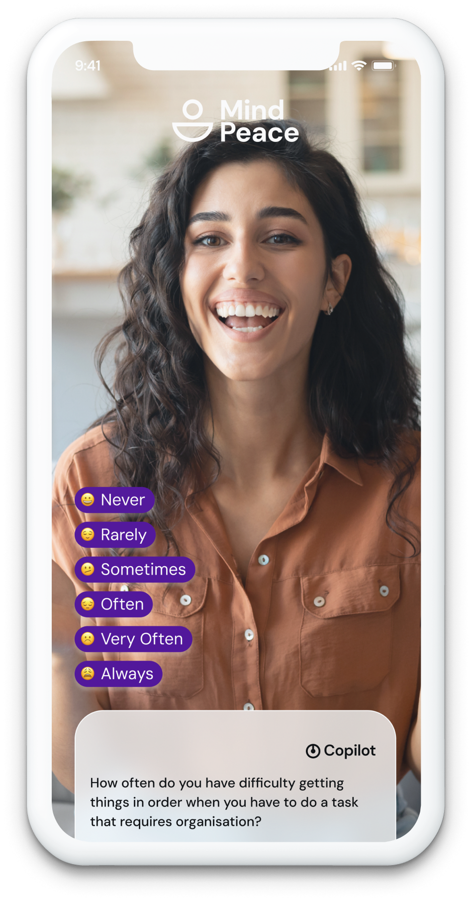
MindPeace connects patients and clinicians through three core modules designed in Figma with a full design system: structured mood and wellbeing tracking (maximum 4 questions per daily check-in to prevent abandonment), a clinician-administered test and assessment library, and a direct messaging channel for between-session contact.
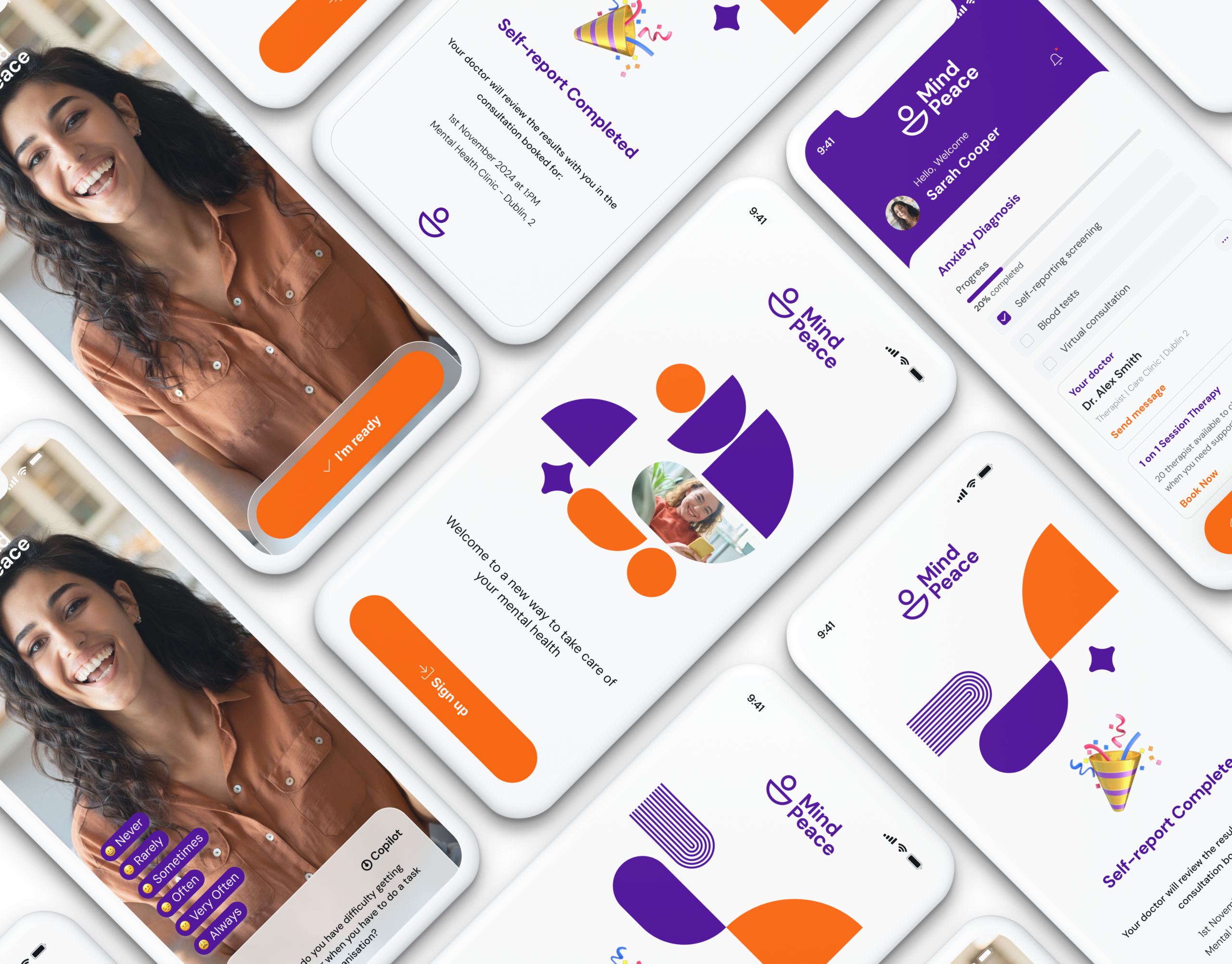
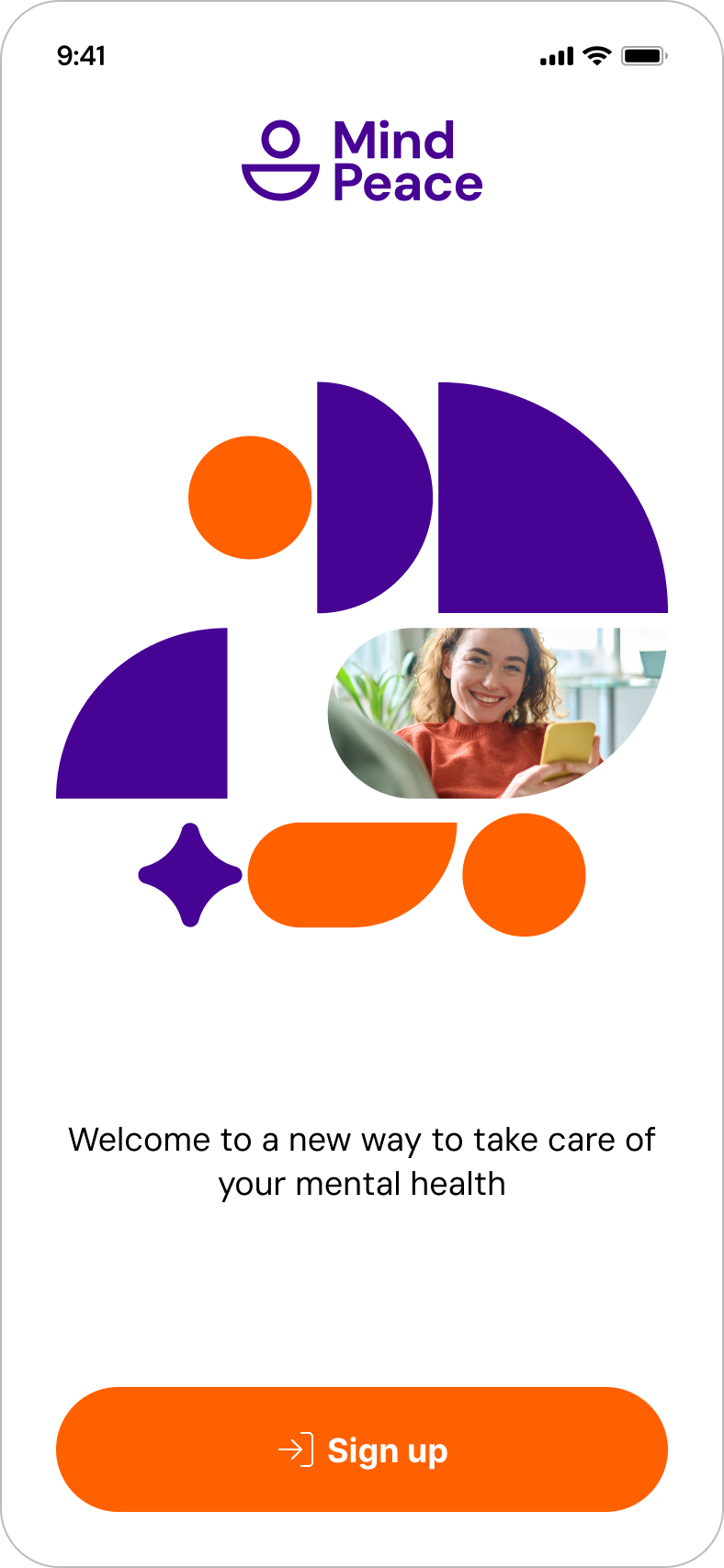
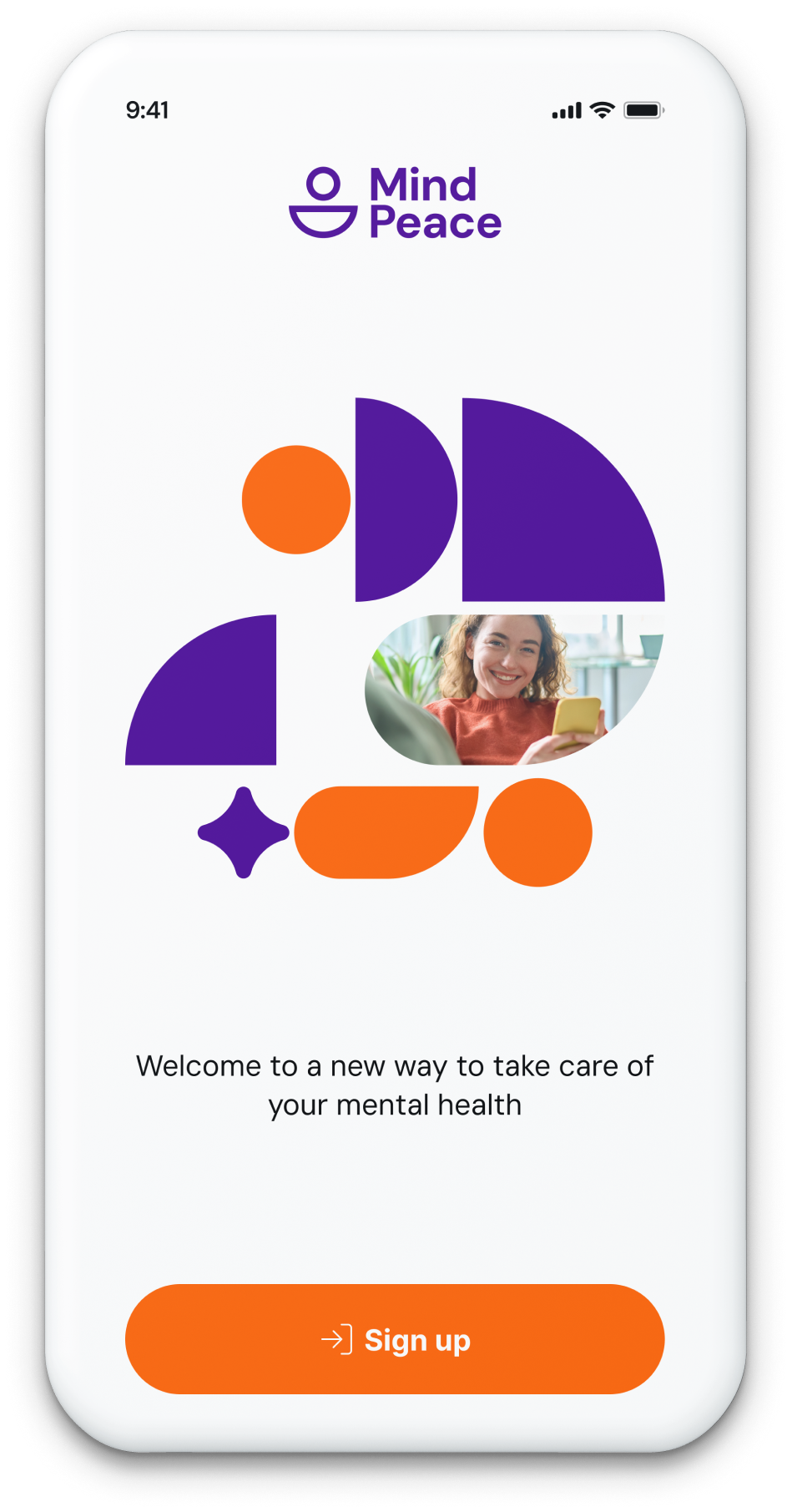
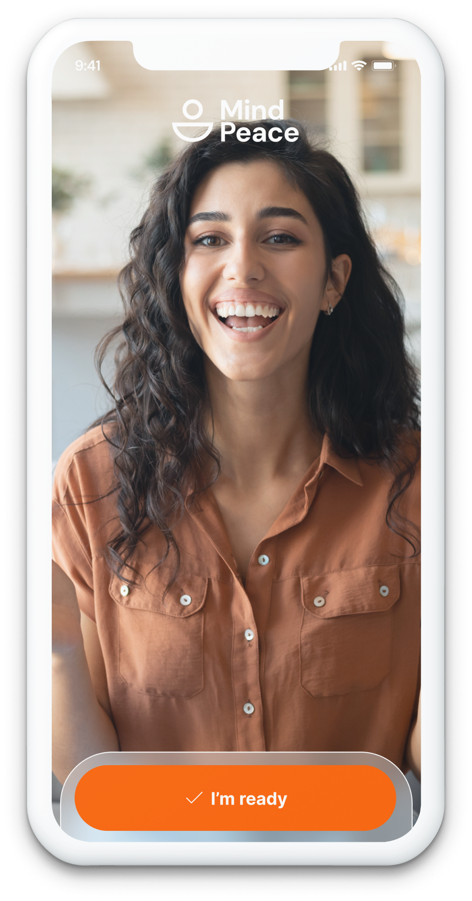
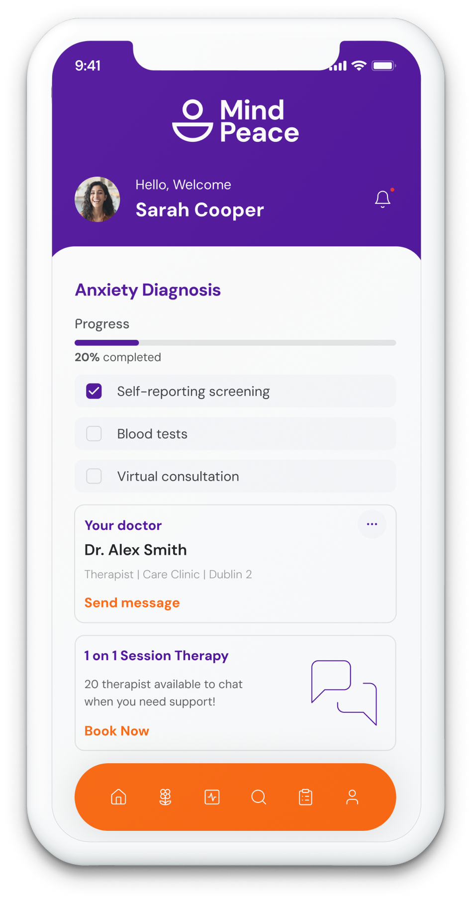
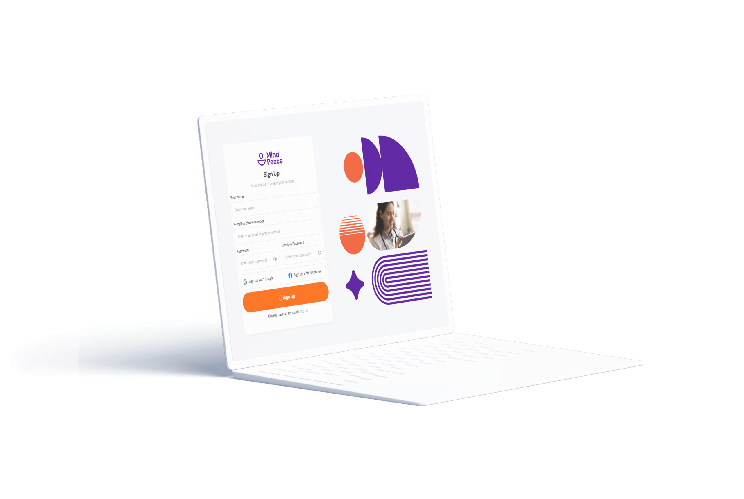
The visual system had to work across both audiences simultaneously. The brand palette — deep purple paired with warm orange — was chosen deliberately: purple communicates clinical credibility and expertise; orange communicates warmth and human energy.
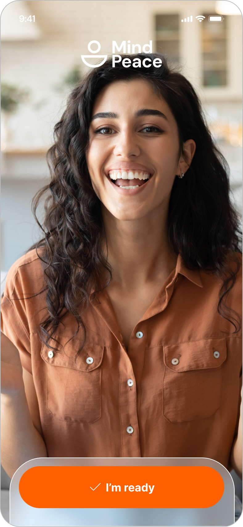
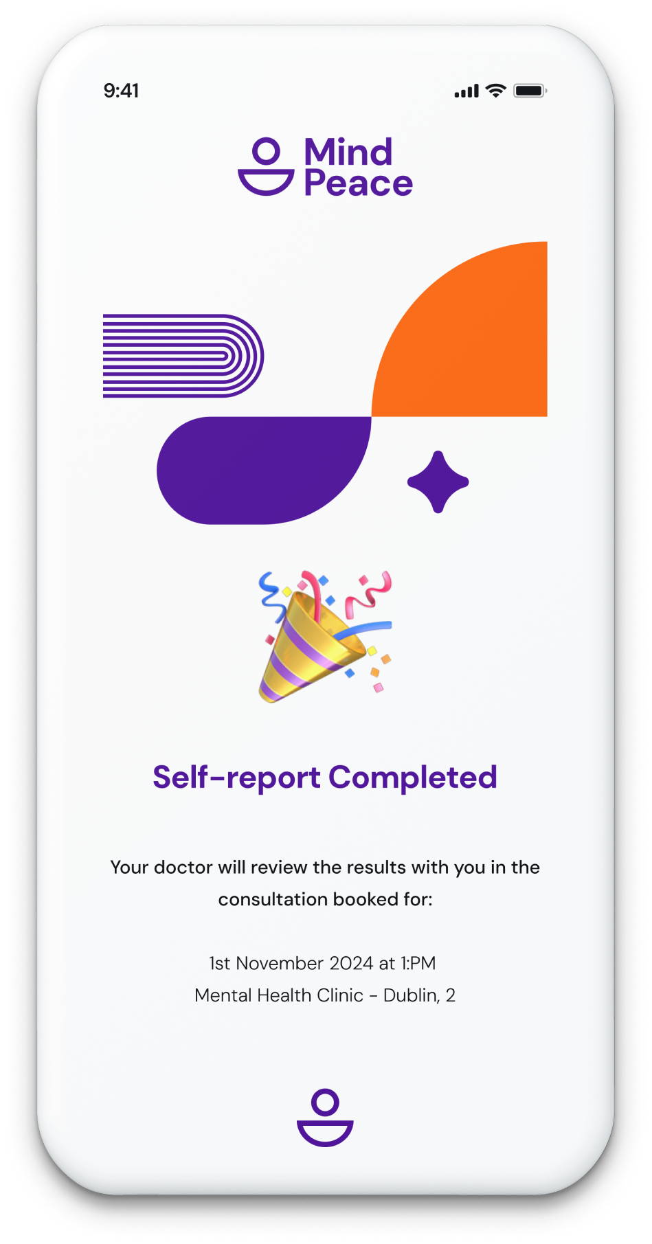
Key screens: Onboarding · Home (patient) · Daily check-in · Assessment flow · Results view · Clinician dashboard · Flagged patients view · Messaging · Session history · Data transparency screen
Designed for
two users
- Track mood without it feeling clinical
- Contact therapist between sessions when needed
- Understand her own patterns over time
- Daily check-ins feel like homework if they take too long
- Clinical language makes her feel like a case, not a person
- Worried about who can see her data
- Review patient progress efficiently before sessions
- Identify patients who need urgent attention without reviewing every record
- Export session data for clinical records
- Switching between tools to find patient data
- Patients who don't complete check-ins between sessions
- Consumer apps that clinicians don't trust clinically
Research
findings
| Finding / Insight | Design Response |
|---|---|
| Daily check-in abandonment is highest when it takes more than 30 seconds | Maximum 4 questions per daily check-in. Full validated scales (PHQ-9, GAD-7) used for periodic formal assessments only. |
| Clinicians distrust platforms showing 'wellness scores' without transparent methodology | Raw data views provided alongside interpreted scores. Clinicians see underlying responses, not just summaries. |
| The between-session gap is when patients most need contact but clinicians are unavailable | Async messaging channel connects patient and clinician outside appointment scheduling — no booking required. |
| Onboarding drop-off is highest when apps ask too much upfront | Progressive disclosure: collect only what is needed for each step. History collected over time, not at registration. |
| Mental health data privacy is a primary concern for patient adoption | Explicit data transparency screen — patients see exactly what their clinician can see, and when it was shared. |
From research
to prototype
• Competitive audit
• Persona development
• Core user flows & user stories
• Assessment flow logic
• Typography system
• Figma design system & component library
• Clinician dashboard
• Interaction design (assessment flow)
• Messaging
• Copy review
• WCAG accessibility audit
Every screen
mapped
Patient-side IA
| Screen / State | Purpose | Key Elements & Decisions |
|---|---|---|
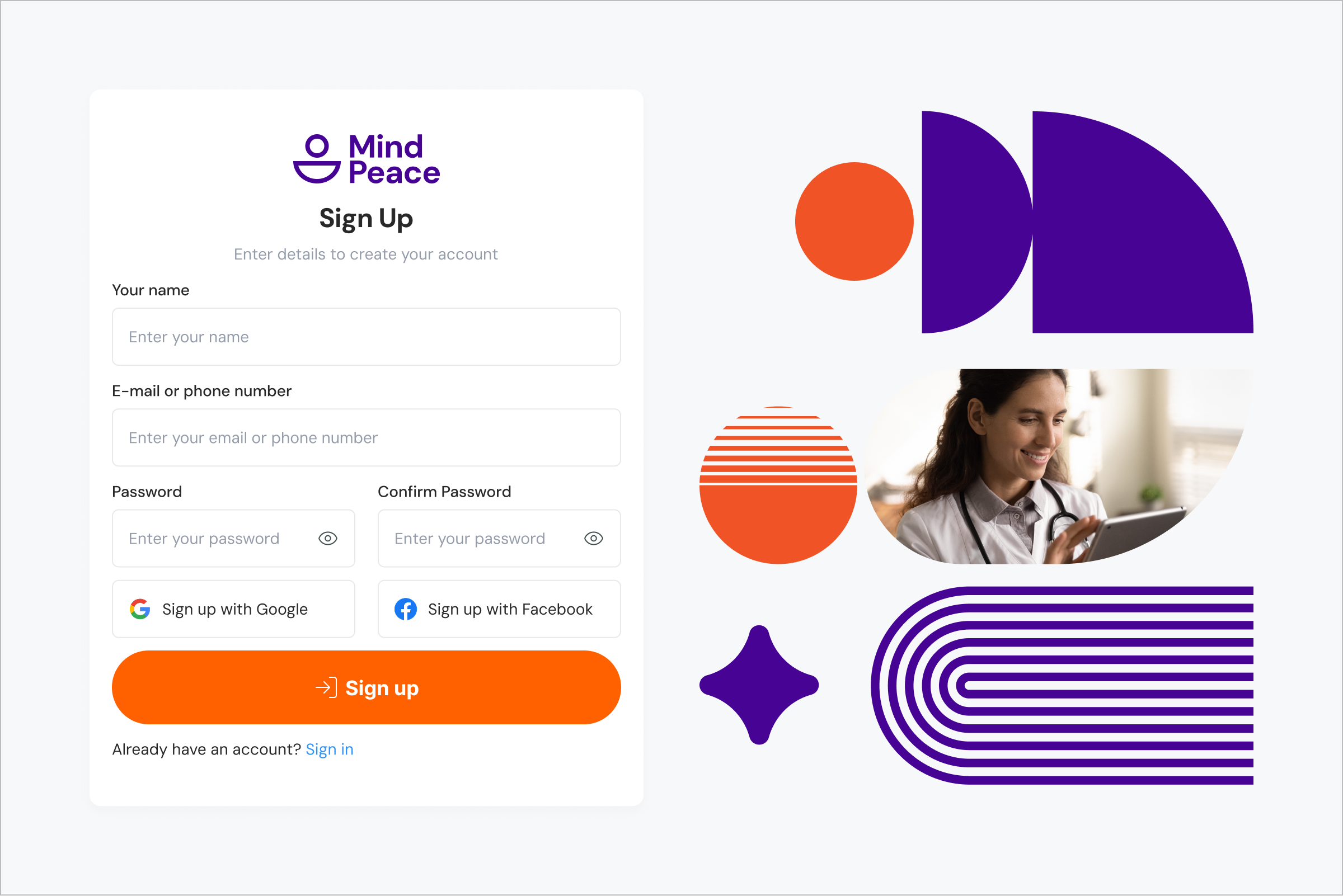
| Onboarding | Setup and progressive consent | Name · Assigned clinician · Condition (optional) · Notification preferences — minimal at registration |
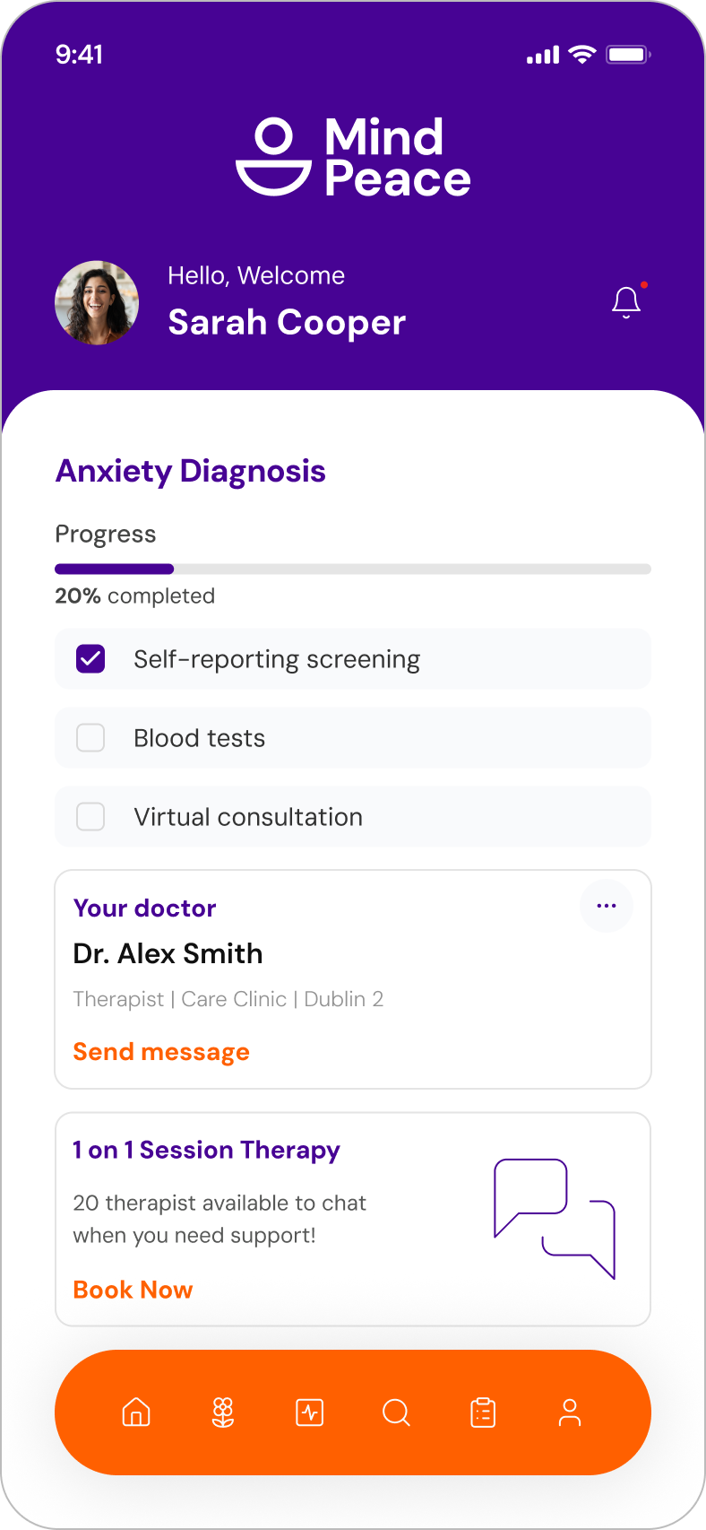
| Home (Patient) | Daily entry point | Today's check-in prompt · Mood trend sparkline · Upcoming appointment · Quick message CTA |
| Daily Check-in | 4-question mood capture | Validated mood scale · Energy · Sleep · Optional notes · target: < 30 seconds to complete |
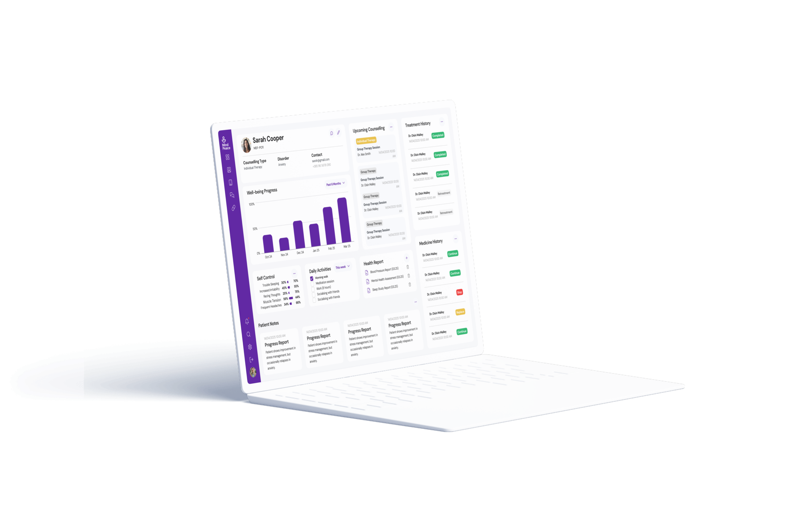
| My Progress | Personal trend view | Mood over time chart · Symptom frequency · Assessment history · Streak indicator |
| Assessments | Clinician-assigned formal tests | Assigned test list · Completion status · Start / Continue / Review states |
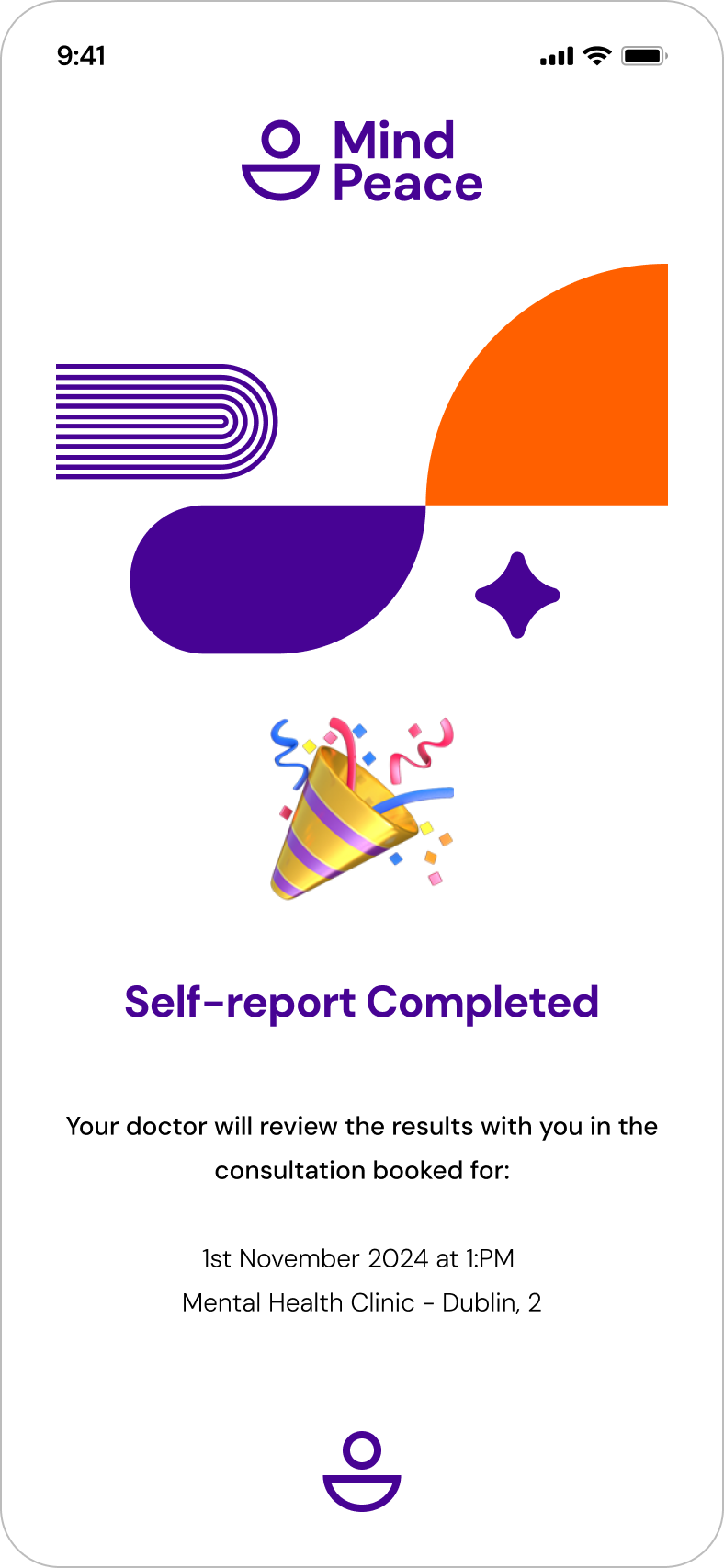
| Assessment Flow | Test completion | Question-by-question · Progress indicator · Save-and-continue · No skipping |
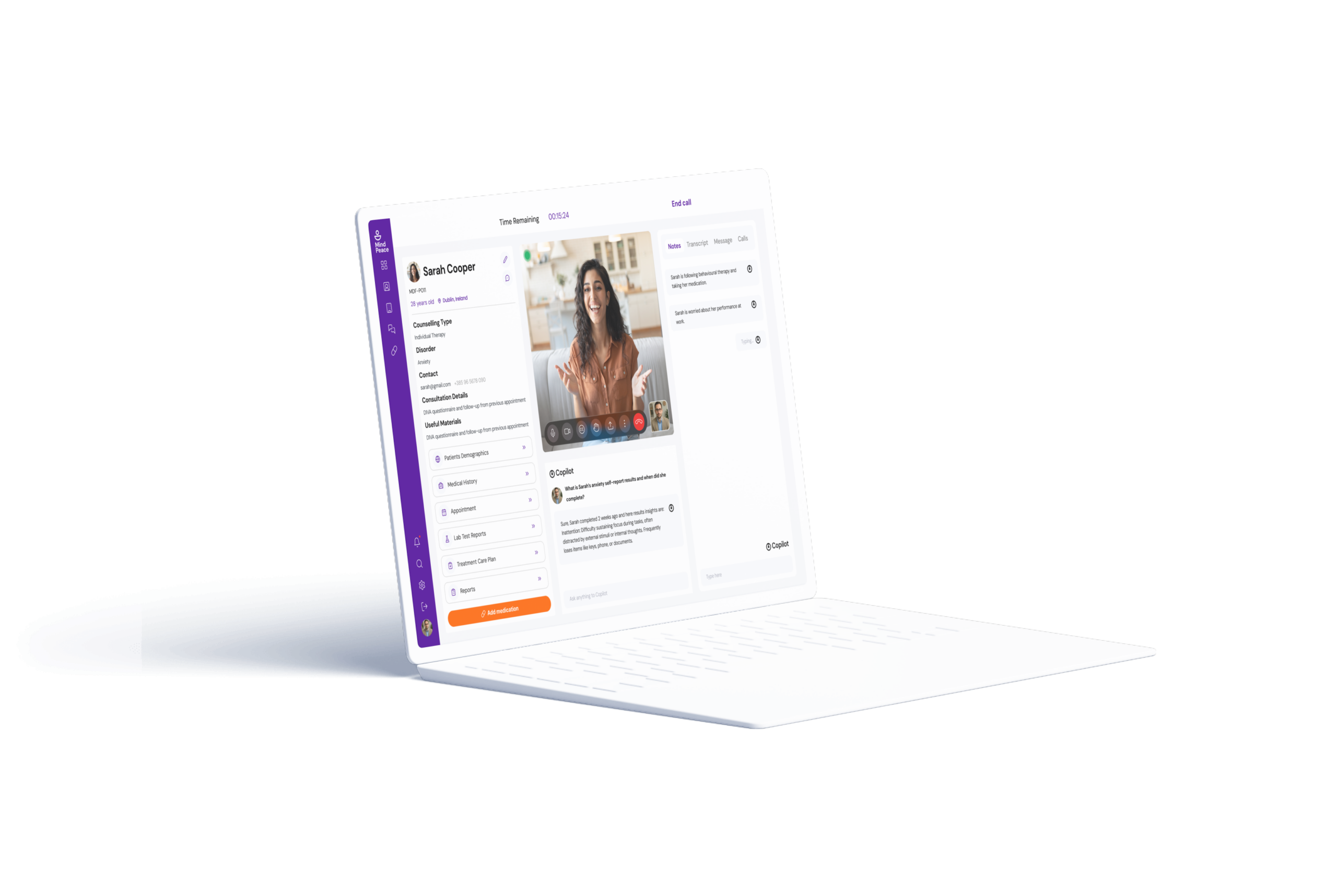
| Messages | Async clinician communication | Thread view · Message input · Read receipts · File attachment option |
| Data Transparency | What clinician can see | Explicit list of shared data types · Last-shared timestamps · Privacy controls |
Clinician-side IA
| Screen / State | Purpose | Key Elements & Decisions |
|---|---|---|
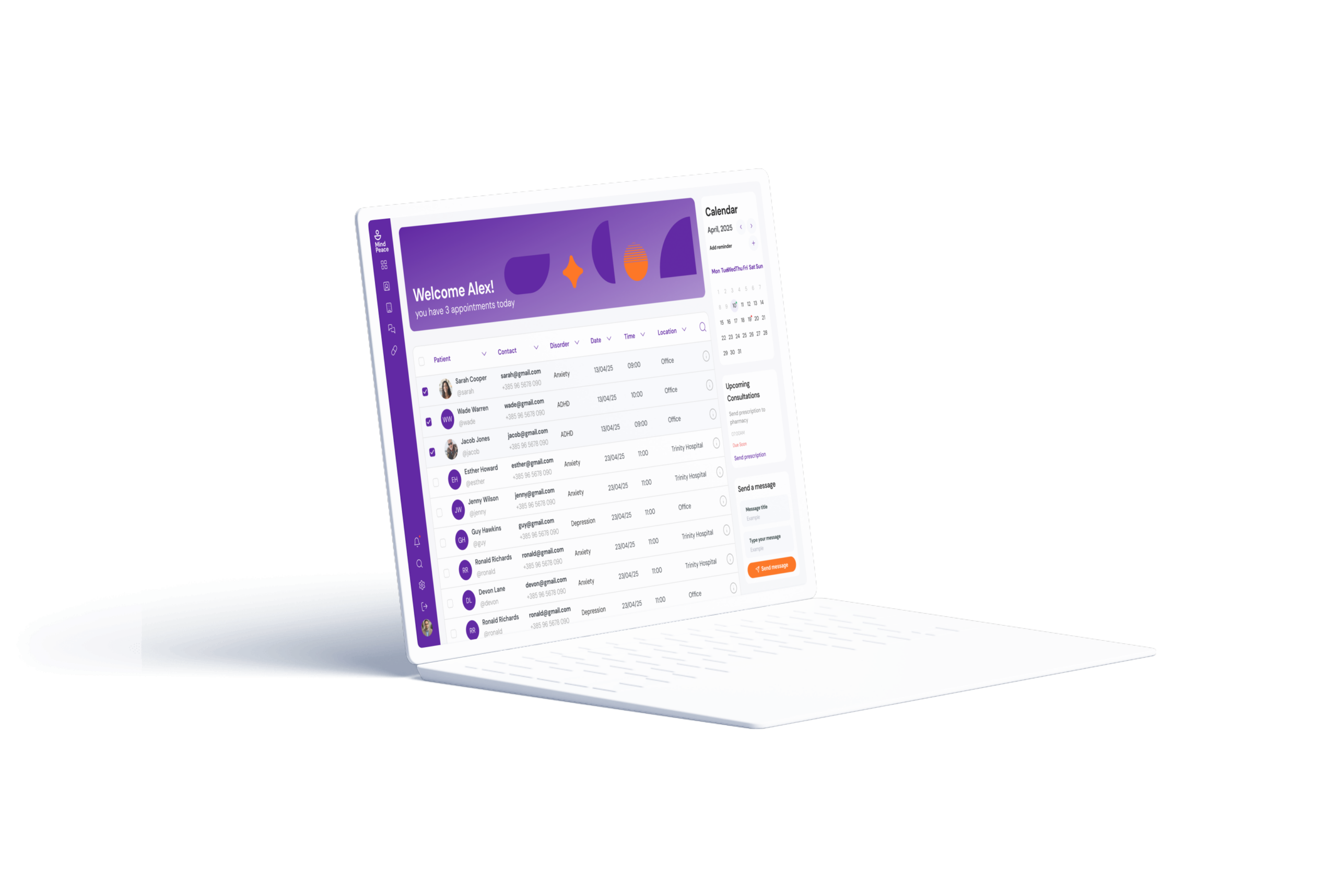
| Dashboard | Patient roster with triage view | Patient list · Last check-in date · Red flags (missed check-ins, high scores) · Search |
| Patient Detail | Individual patient overview | Mood trend · Assessment history · Recent messages · Upcoming appointment |
| Assign Assessment | Test allocation to patient | Assessment library · Select patient · Set deadline · Optional instructions |
| Assessment Results | Review completed test results | Score · Normative comparison · Individual responses · PDF export option |
| Messages | Communication with patients | Thread view organised by patient — same model as patient side |
Step-by-step
journeys
Every choice
justified
| Decision Made | Why — Rationale | Alternative Rejected |
|---|---|---|
| Purple + orange palette (not blue/green wellness) | Blue/green is the default mental health palette. Purple = clinical credibility + technology. Orange = warmth + human energy. Strategic, not aesthetic. | Blue/green — rejected; blends into the saturated wellness app space; fails to signal clinical credibility |
| 4-question daily maximum | Completion rate drops sharply above 4 questions for daily tracking. Full validated scales kept for fortnightly assessments. | Full PHQ-9/GAD-7 daily — rejected; 7–9 questions daily is clinically impractical |
| Flagging system for clinicians | Clinicians triage by need, not alphabetically. The system surfaces patients requiring attention without daily review of every profile. | Chronological list only — rejected; doesn't match how clinicians prioritise their caseload |
| Shared thread model for messaging | One conversation, not two parallel systems. Reduces the clinical distance that patients find alienating. | Separate clinician notes and patient messages — rejected; increases complexity |
| Data transparency screen for patients | Mental health data sharing anxiety is real and documented. Active transparency builds trust that passive privacy policies cannot. | Privacy policy link only — rejected; no user reads privacy policies |
Results that
matter
MindPeace demonstrates how intentional product design — grounded in user research, information architecture, and interaction design — can serve two audiences with fundamentally different needs in the same product without sacrificing either.
Screen-level design
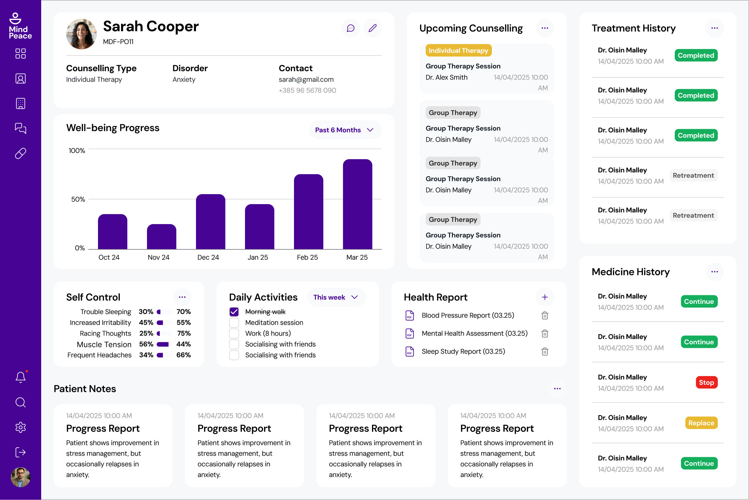
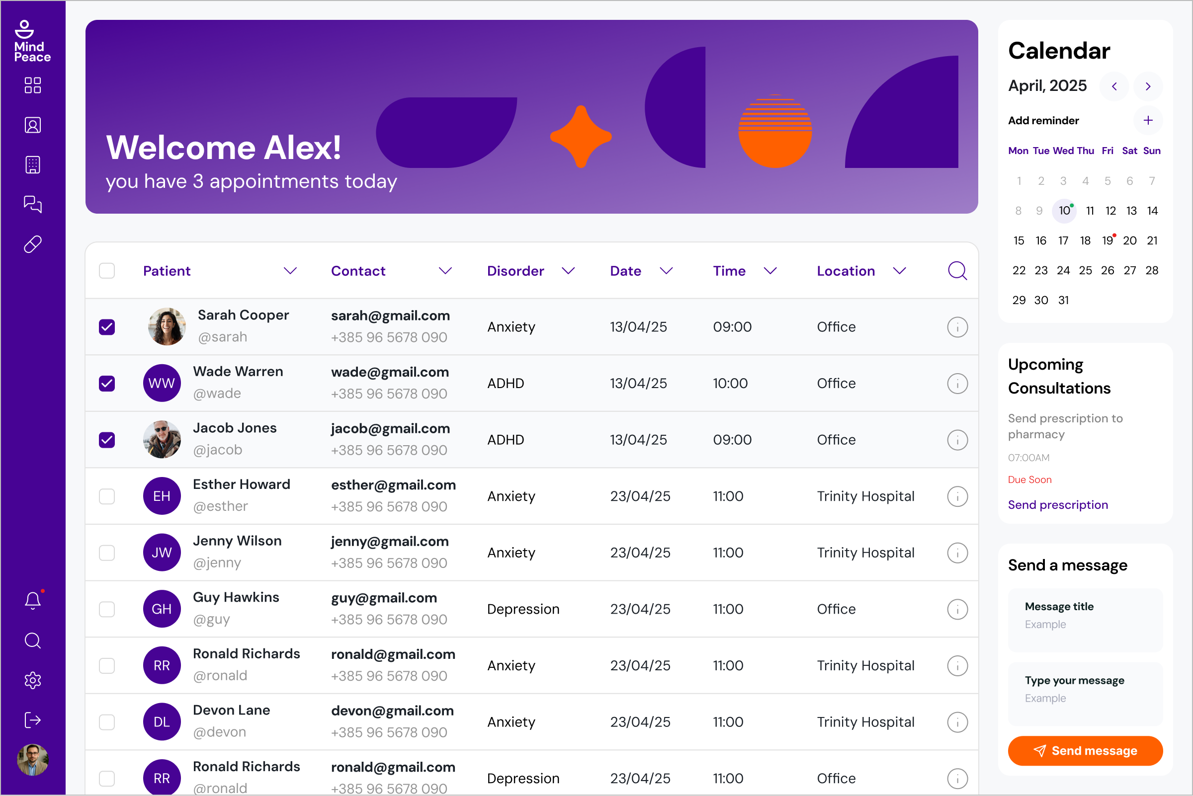
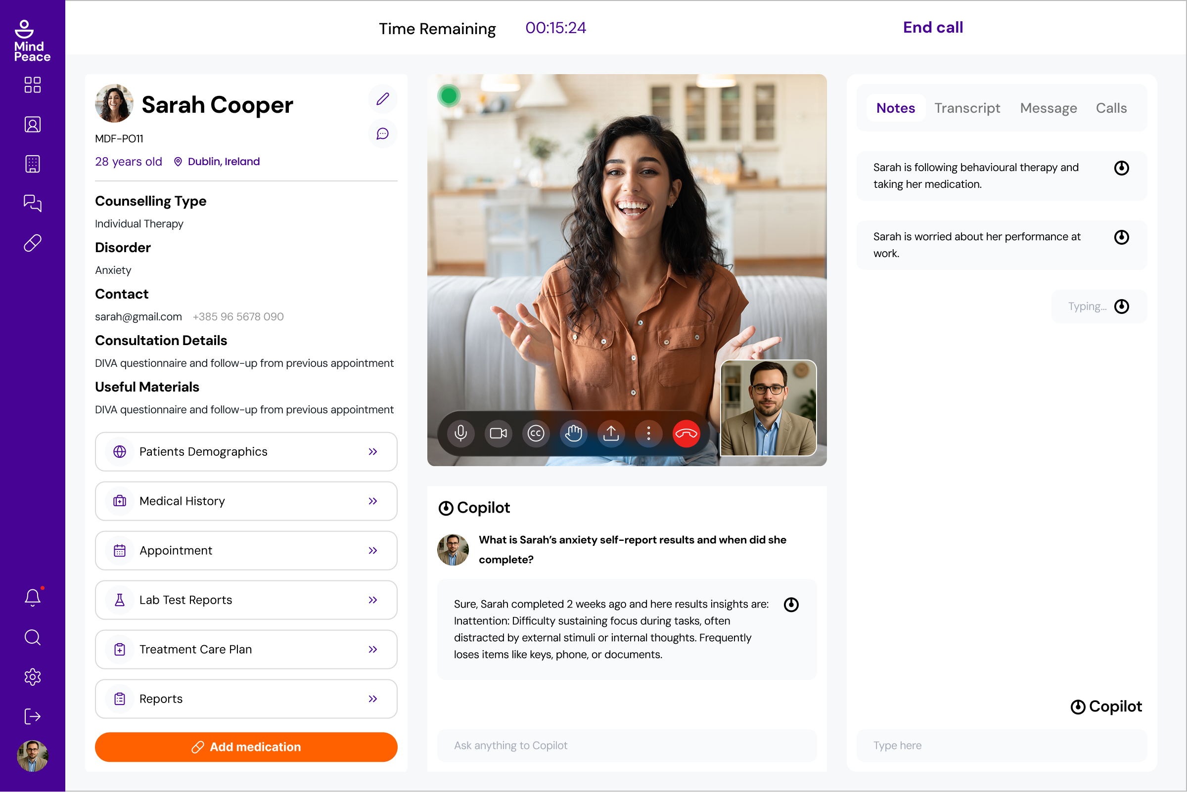
High-fidelity screens
Clinician dashboard
Brand system
Product design case study exploring the dual-user challenge in clinical mental health platforms. Full process from user research, user stories, and information architecture through wireframing, Figma prototyping, and responsive design for mobile and desktop — not implemented in production.
The colour decision taught me that visual identity choices in healthcare products are strategic before they are aesthetic. Blue and green are the default wellness palette — and every app that uses them blends into the same category. Choosing purple (clinical credibility) and orange (human warmth) was a deliberate positioning decision that would have been impossible without first mapping the competitive landscape. I now start every brand-adjacent decision with a competitive colour audit.