Doggio —
Designing Trust Signals into a Service Marketplace
Dog owners struggle to find trustworthy walkers. Existing options — fragmented listings, opaque vetting, unclear pricing — create anxiety around handing a pet to a stranger. Doggio was designed to solve the trust problem through radical transparency at every step of the booking journey.
Solving the
trust problem
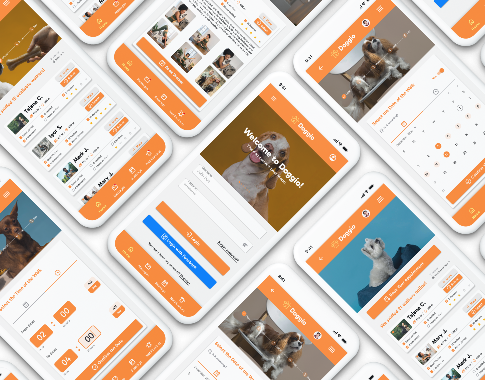
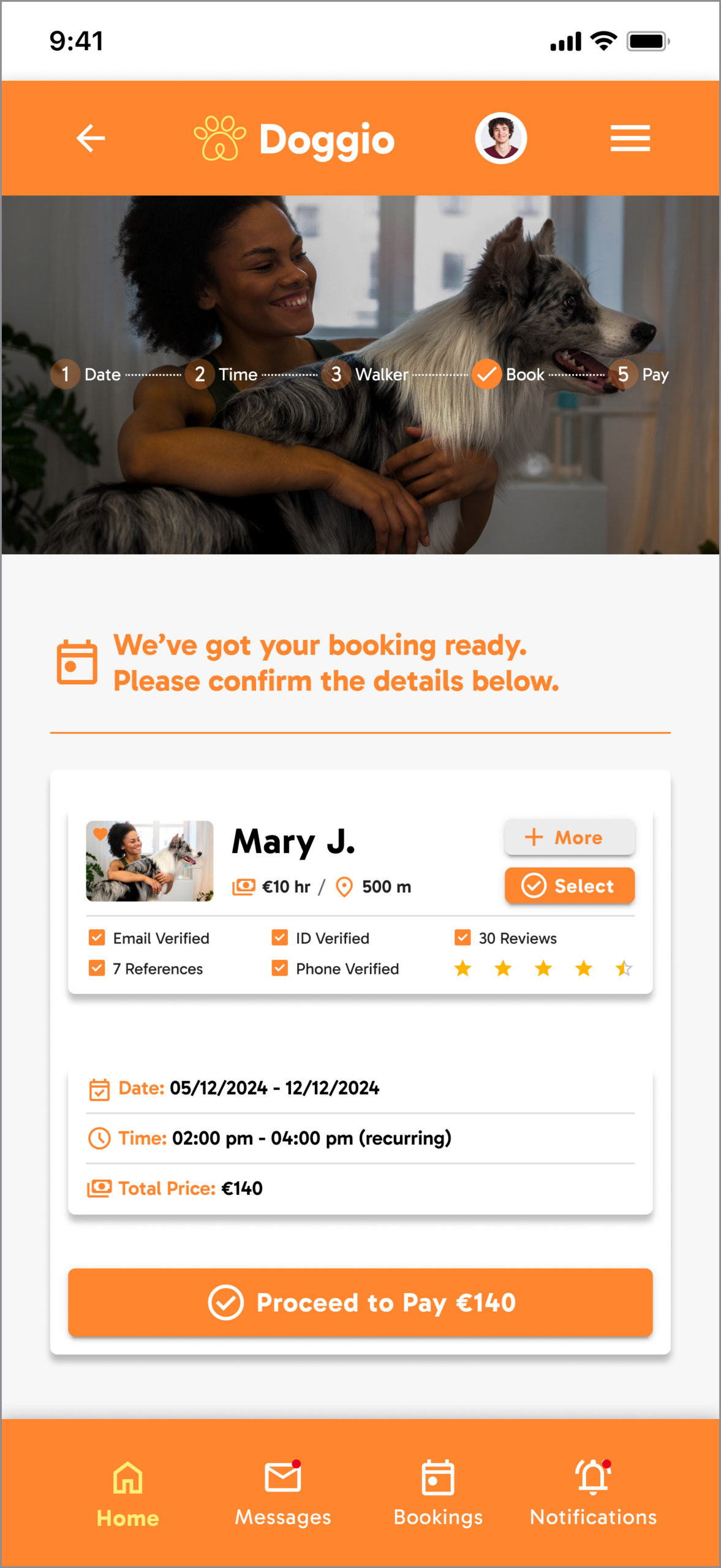
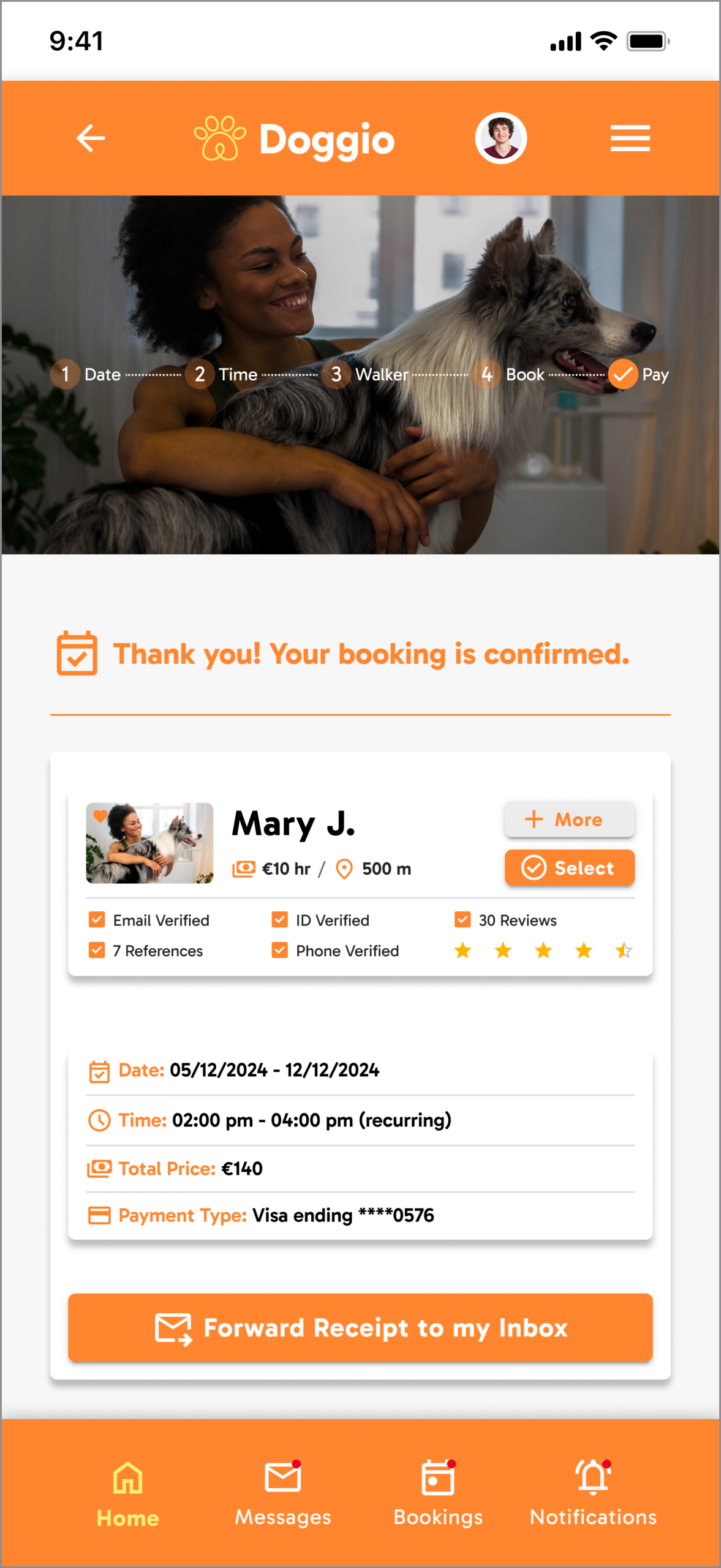
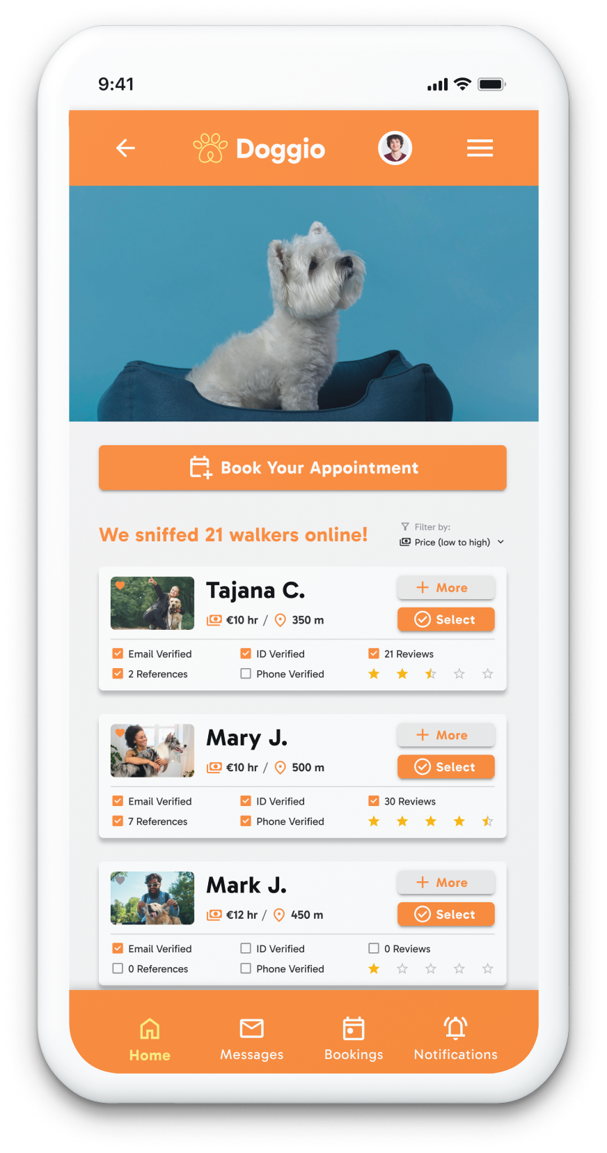
Doggio is a comprehensive mobile-first platform connecting dog owners with verified professional walkers. Designed in Figma from user research through interactive prototype, the app prioritises trust signals throughout: walkers display verification badges (Email Verified, ID Verified, Phone Verified), reference counts, star ratings, and proximity — all visible before a single tap. The booking flow is deliberately minimal: browse, select, book, pay — a single linear path with no dead ends.
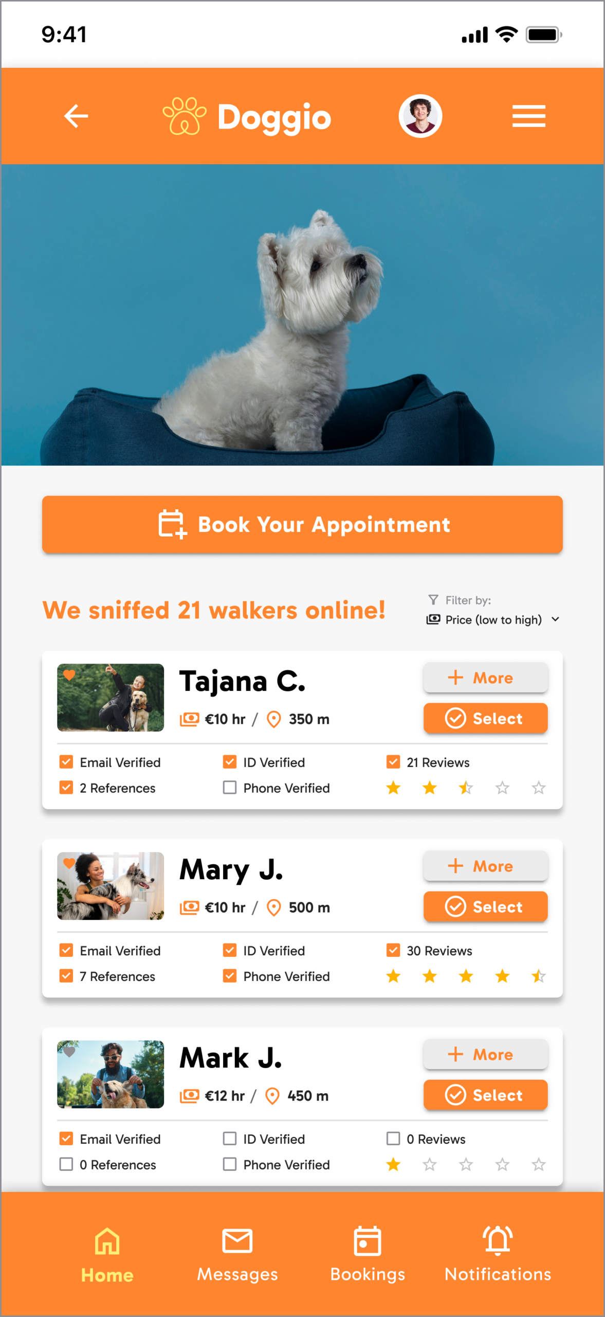
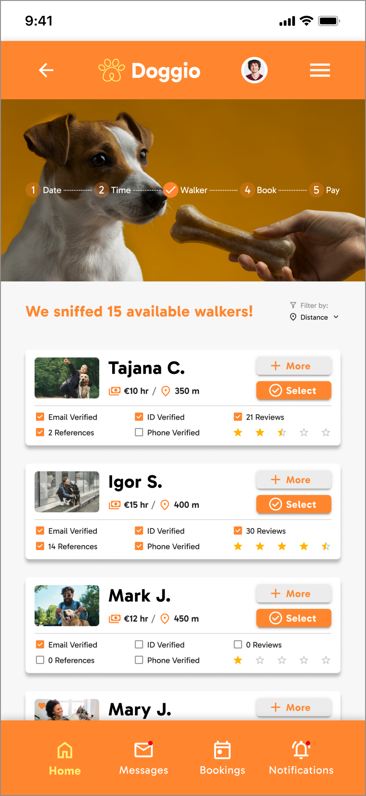
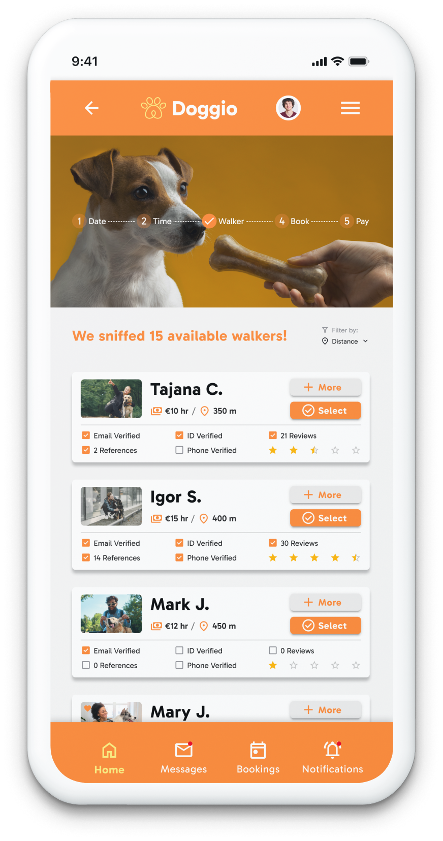
The walker list card surfaces all trust signals at a glance — badge row, rating, review count, price, and distance — so owners make informed shortlist decisions without drilling into individual profiles.
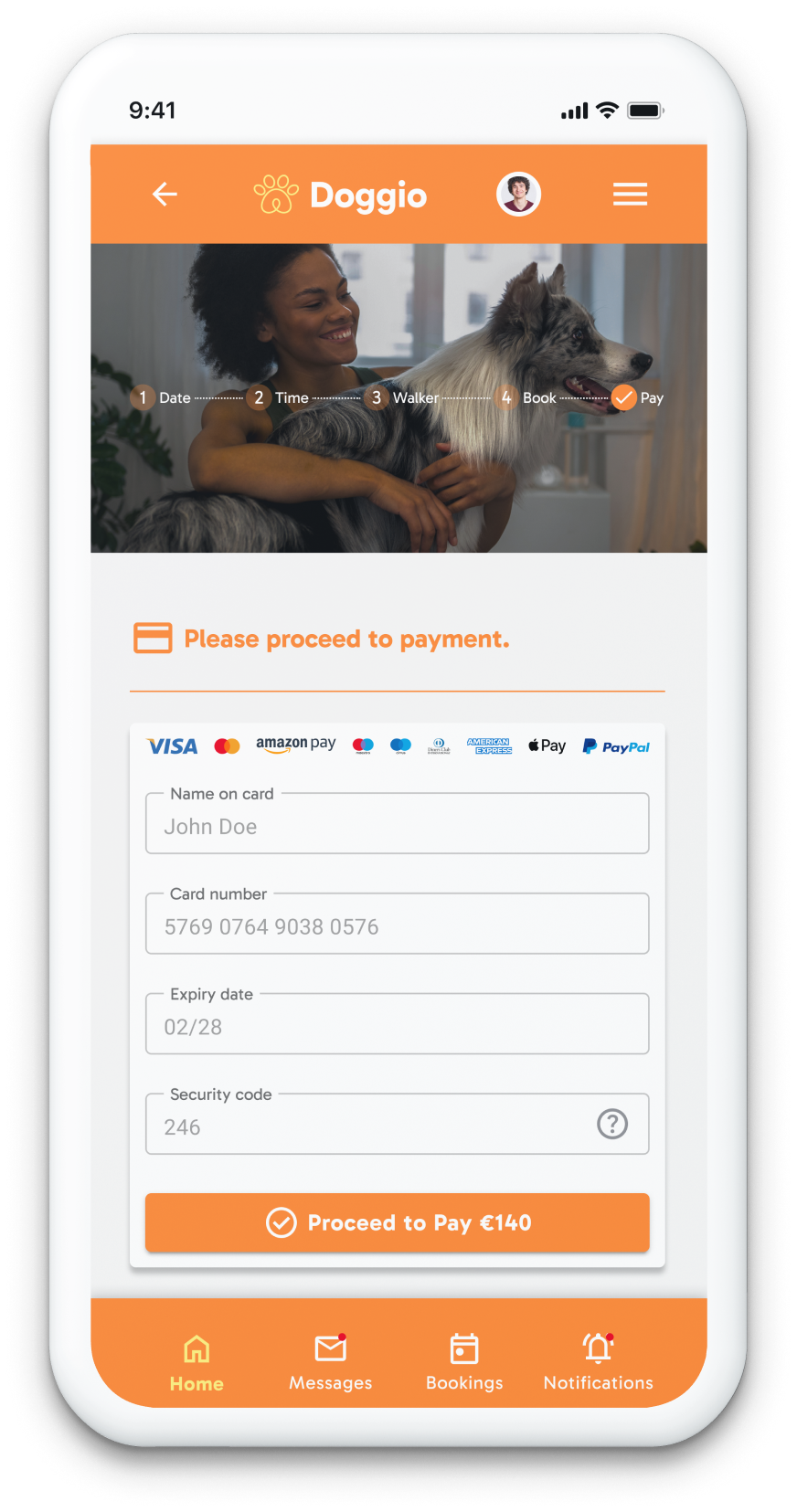
Screens covered: Login · Registration · Walker browse (with filters) · Walker profile · Booking calendar · Recurring booking toggle · Payment · Booking confirmation · Messaging · Bookings history · Notifications
Designed for
two users
- Find a trustworthy walker quickly
- Book recurring walks without friction
- Know her dog is safe at all times
- Can't quickly assess if a stranger is trustworthy
- Too many options without enough differentiation
- Rebooking a good walker takes too many steps
- Get discovered by owners in her area
- Build credibility through verified badges
- Manage multiple bookings without confusion
- Competing with unverified, cheaper alternatives
- No way to show qualifications upfront
- Calendar management across platforms is fragmented
Research
findings
| Finding / Insight | Design Response |
|---|---|
| Trust is the primary conversion barrier for first-time bookings | Verification badges (Email / ID / Phone) surfaced directly on the browse list card — visible before opening a profile |
| Users shortlist 2–3 walkers before deciding — comparison is the core browse behaviour | Filter bar (price, distance, rating) persistent on browse view; all key comparators visible on the card |
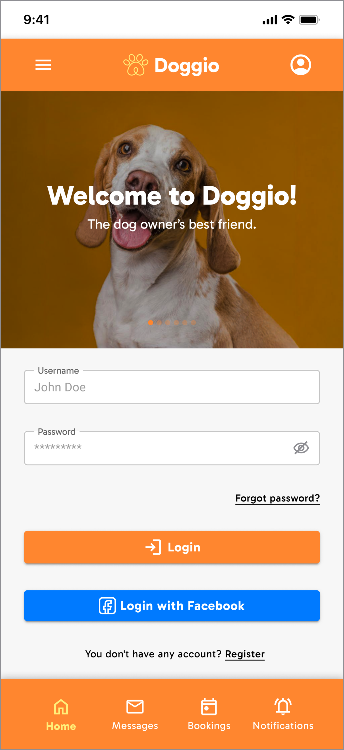
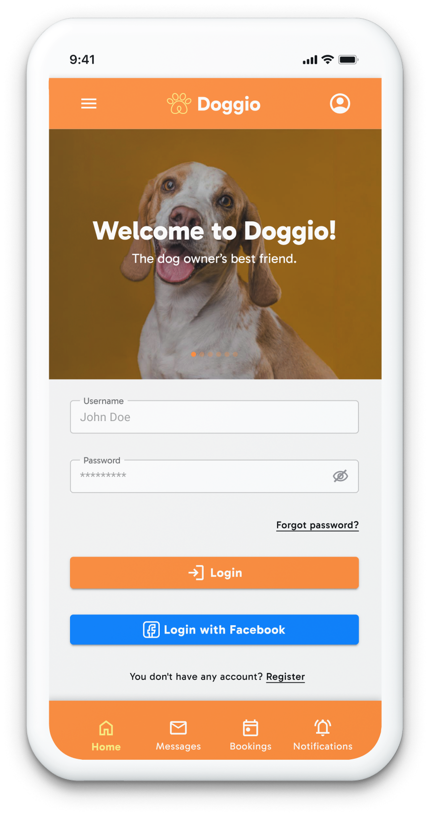
| Login friction causes app abandonment before first booking | Facebook SSO + standard email/password — two paths, both visible, neither suppressed |
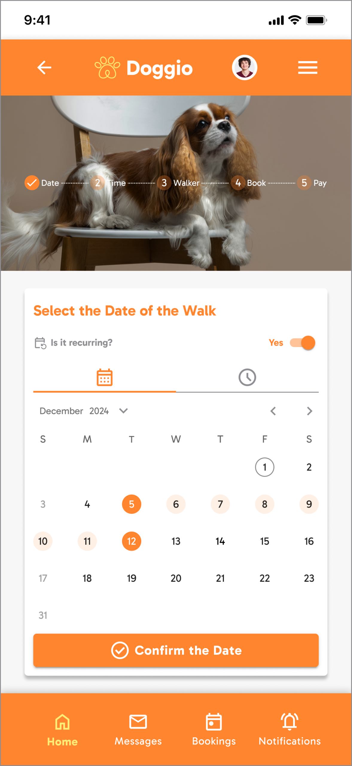
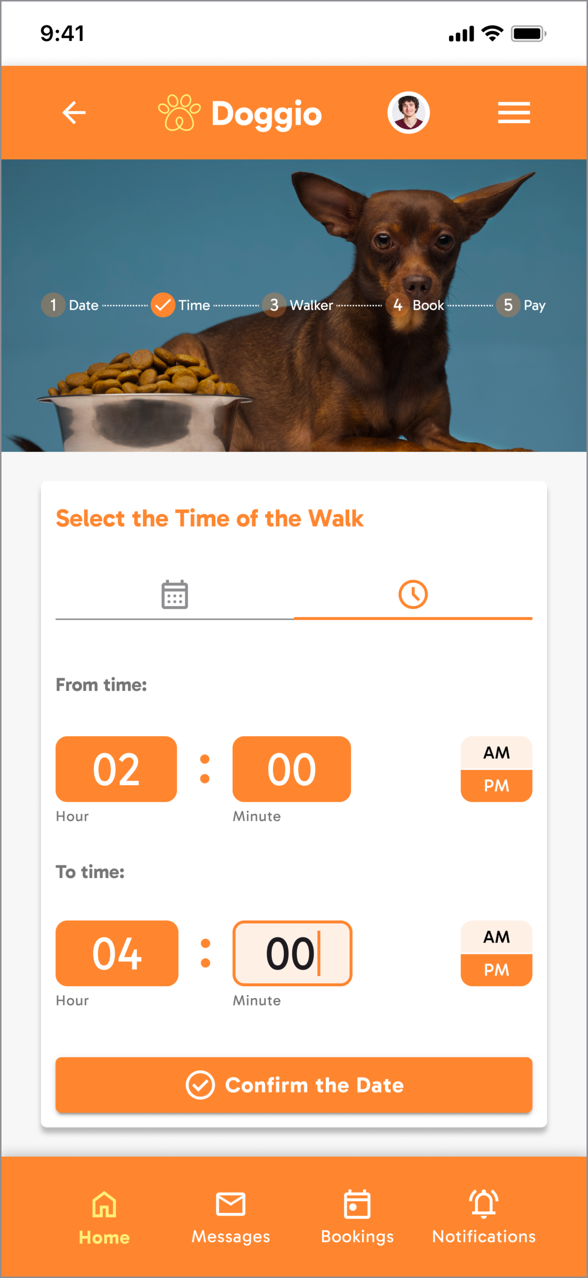
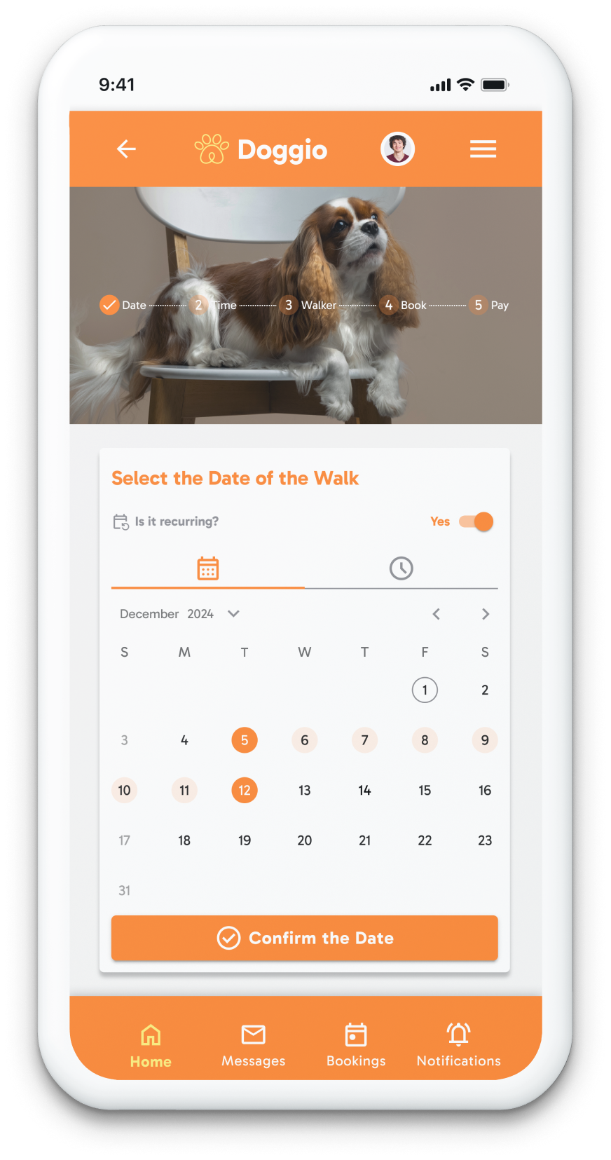
| Recurring bookings are a primary use case for committed users | Recurring toggle in the booking flow itself, not buried in account settings |
| Review volume is the strongest trust proxy in service marketplaces | Review count displayed on list card alongside star rating — quantity and quality both visible simultaneously |
From research
to prototype
• User research & interview synthesis
• Persona development
• User flow diagrams
• Booking flow logic
• Trust signal hierarchy
• Onboarding flow
• Interaction design (walker cards)
• Design system & component library
• 5-user usability testing
• Iteration on filter UX
Every screen
mapped
| Screen / State | Purpose | Key Elements & Decisions |
|---|---|---|
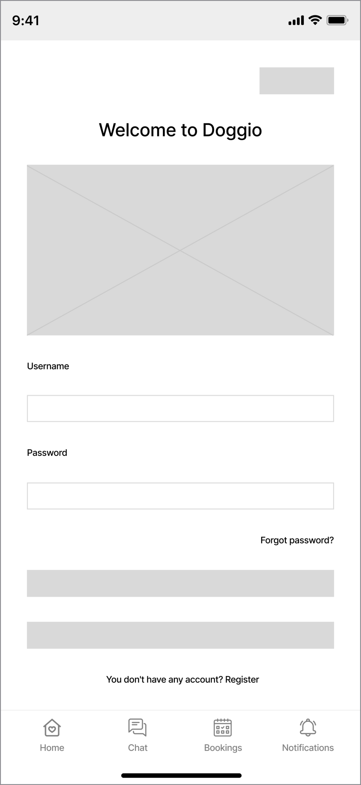
| Login / Register | Authentication entry point | Email/password · Facebook SSO · Register link · Forgot password path |
| Home | Primary dashboard | Greeting · Nearby walker summary · Quick book CTA · Bottom nav (5 tabs) |
| Browse Walkers | Walker discovery | List of walker cards · Filter bar (price/distance/rating) · Sort options |
| Walker Card | At-a-glance trust summary | Photo · Name · Price/hr · Distance · Star rating · Review count · 3 verification badges · Select CTA |
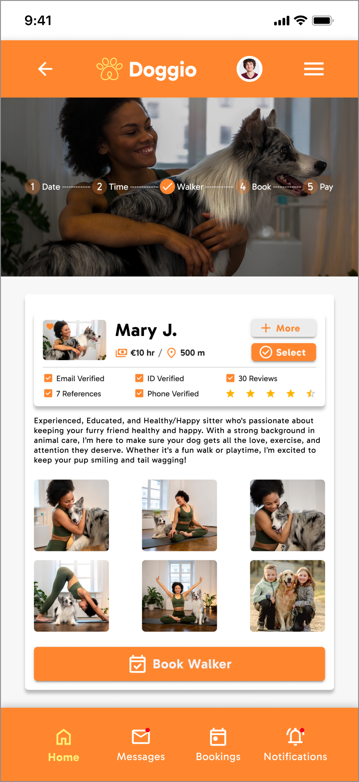
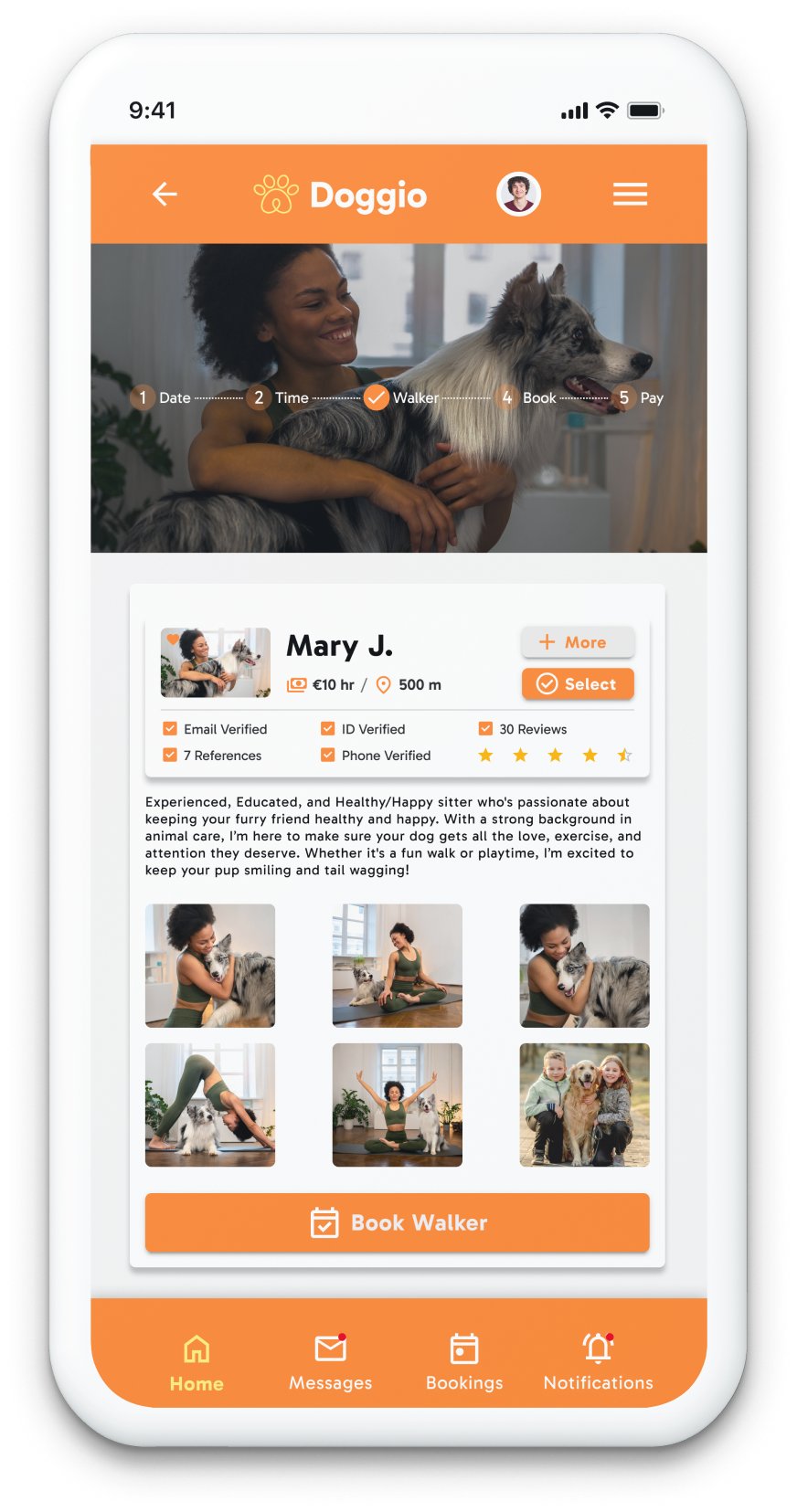
| Walker Profile | Full walker detail | Bio · All badges · Full review list · Photo gallery · Availability calendar · Book CTA |
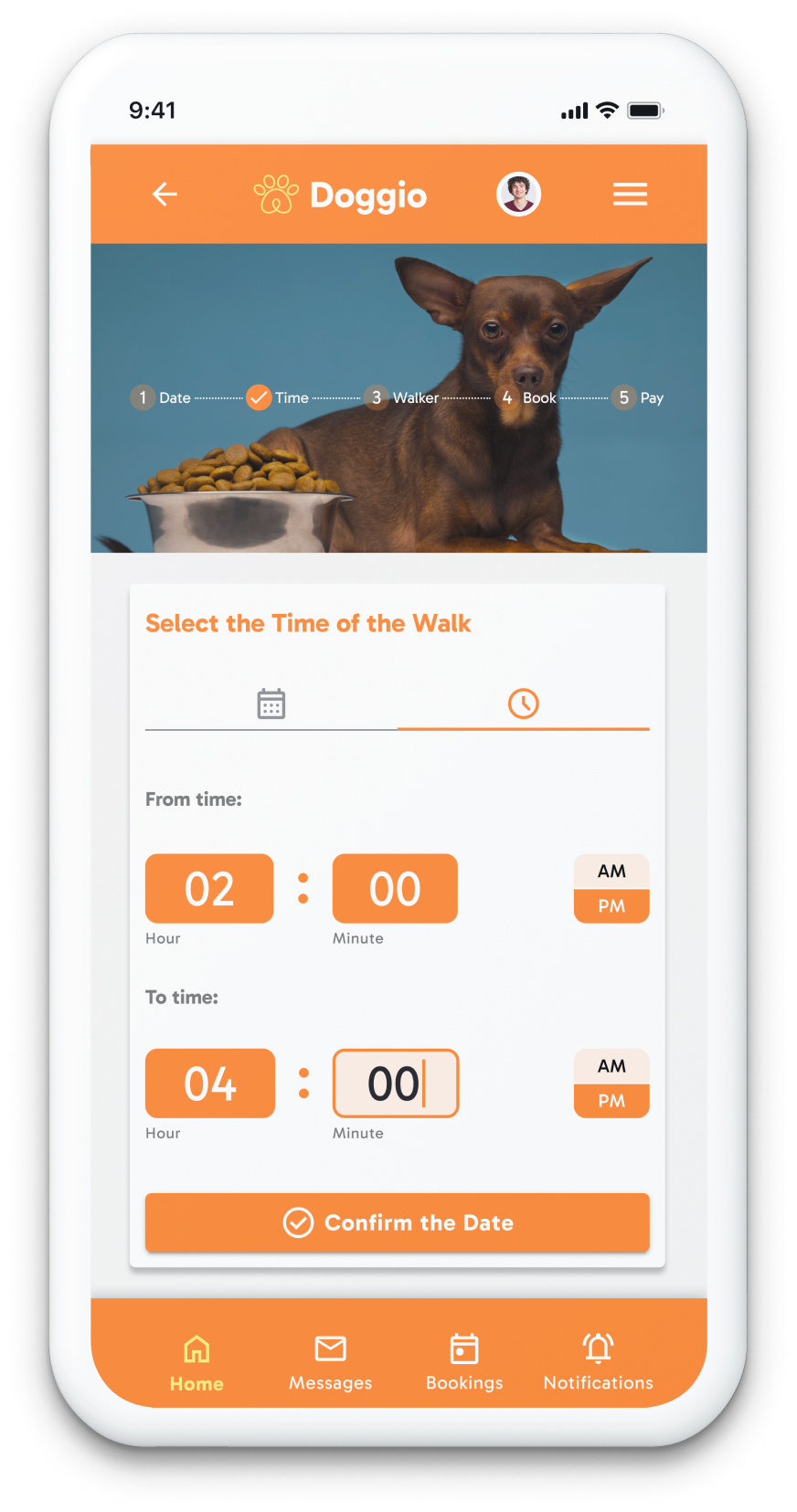
| Book: Select Date | Calendar booking | Monthly calendar · Available/unavailable date states · Recurring toggle · Frequency selector |
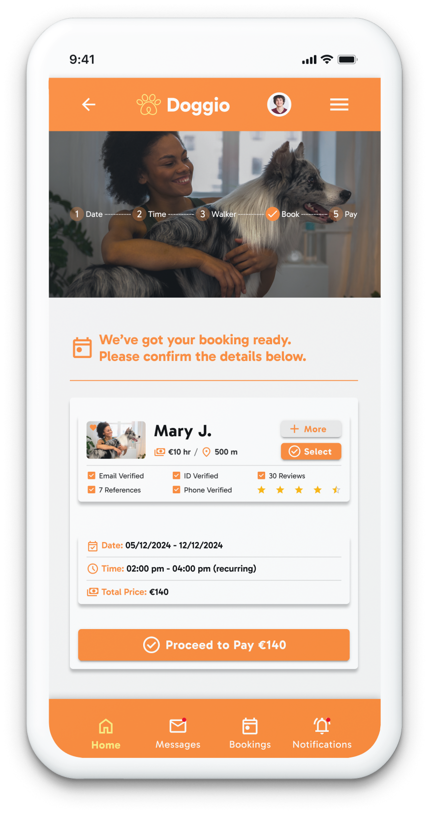
| Book: Confirm | Pre-payment review | Walker summary · Date/time · Service type · Price total · Confirm CTA |
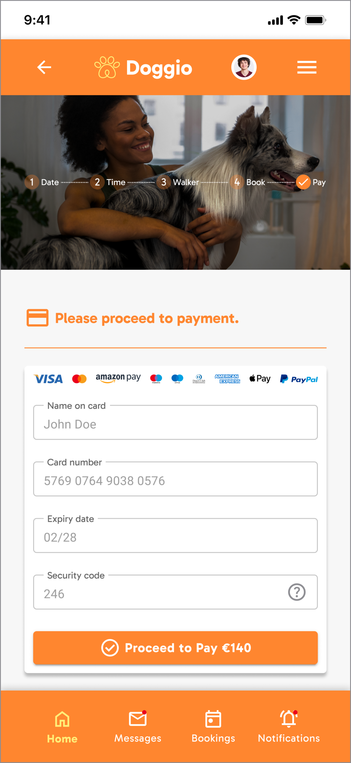
| Payment | Transaction completion | Saved card display · Total · Pay CTA |
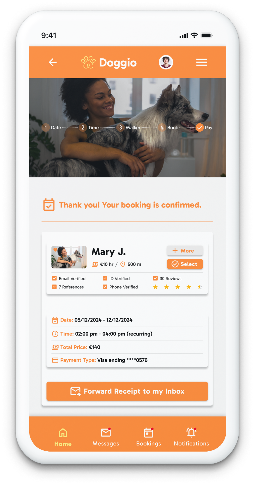
| Booking Confirmed | Success state | Booking ID · Walker · Date/time · Add to calendar option |
| Messages | Owner–walker communication | Thread list · Conversation view · Message input · Read receipts |
| Bookings | Past and upcoming bookings | Status-coded list · Timeline view · Rebook shortcut on completed bookings |
| Profile / Settings | Account management | Personal info · Payment methods · Notification prefs · Logout |
Step-by-step
journeys
Every choice
justified
| Decision Made | Why — Rationale | Alternative Rejected |
|---|---|---|
| Trust signals on list card (not only in profile) | Shortlisting happens at the card level. Trust only visible in profile means opening 5–6 profiles before any trust check — adding friction before the first decision. | Trust info in profile only — rejected; most users never reach a profile if the card doesn't earn initial trust |
| Price per hour on card (not total cost) | Total cost depends on walk duration which varies. Hourly rate is the fair comparator. Total shown at booking confirmation once duration is set. | Show total cost on card — rejected; pre-duration total creates false comparison across walkers |
| Recurring toggle in booking flow | Recurring is a booking-time decision. Users decide this while booking, not in settings weeks later. | Recurring in account settings — rejected; users who want recurring walks wouldn't think to look in settings |
| 5-tab bottom navigation | Home, Browse, Bookings, Messages, Profile are 5 equal primary destinations. Bottom nav is the mobile standard for ≤5 destinations. | Hamburger menu — rejected; hides primary destinations, increases depth, violates mobile consumer conventions |
| Review count alongside star rating | 50 reviews at 4.8★ is more trustworthy than 3 reviews at 5.0★. Volume and quality are both meaningful trust signals. | Star rating alone — rejected; removes the volume context that makes the quality signal meaningful |
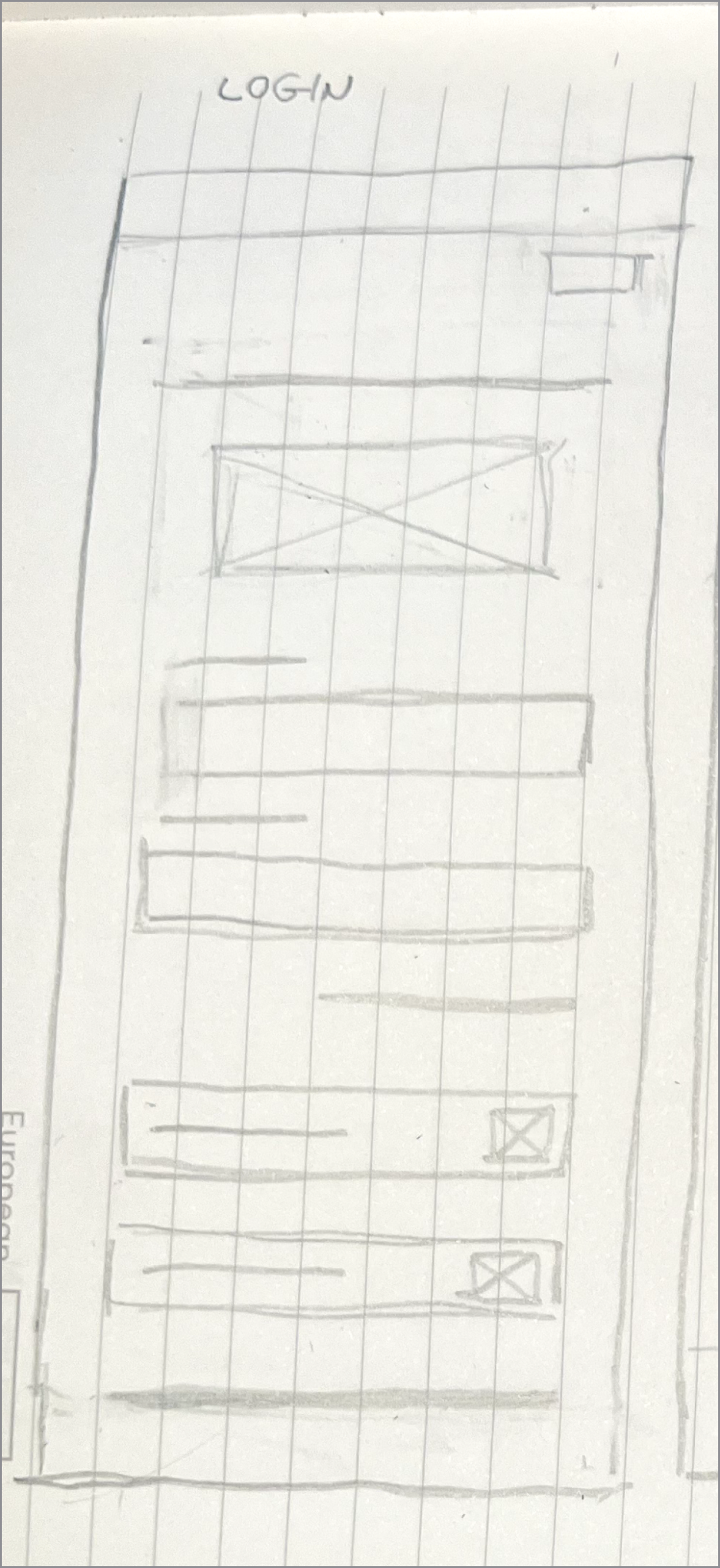
Early explorations
Screen-level design
High-fidelity screens
Brand system
Results that
matter
Doggio demonstrates how trust can be systematically designed into a marketplace product through deliberate information hierarchy and transparency at every interaction point.
Design case study exploring trust as a conversion lever in service marketplace UX. Full process from user research and information architecture through wireframing, Figma prototyping, interaction design, and usability testing with 5 participants; not implemented in production.