Density as a design value
Clever Recruit is a B2B recruitment platform concept I took from problem definition to a working front end. One question ran through the whole thing: how do you put 20+ rows on screen at once, across a pipeline of 200+ candidates, and still make the screen readable to a hiring manager who logs in twice a month?
I did all of it. Teardowns of five ATS products first, then the personas, the information architecture, wireframes, and a component library in Figma. Then I built the front end in React. That is where the states I had waved past in Figma stopped being optional: empty tables, error paths, a filter that returns nothing.
- Dashboard
- Candidates (full CRUD + filtering)
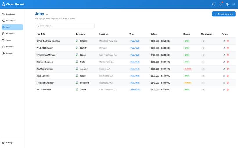
- Jobs (lifecycle management)
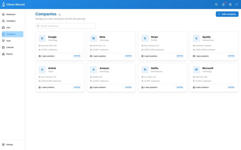
- Companies
- Team
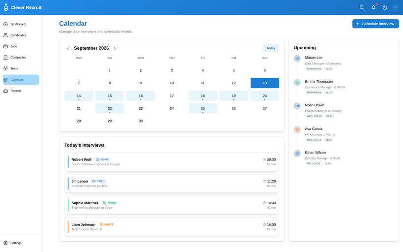
- Calendar/Interviews
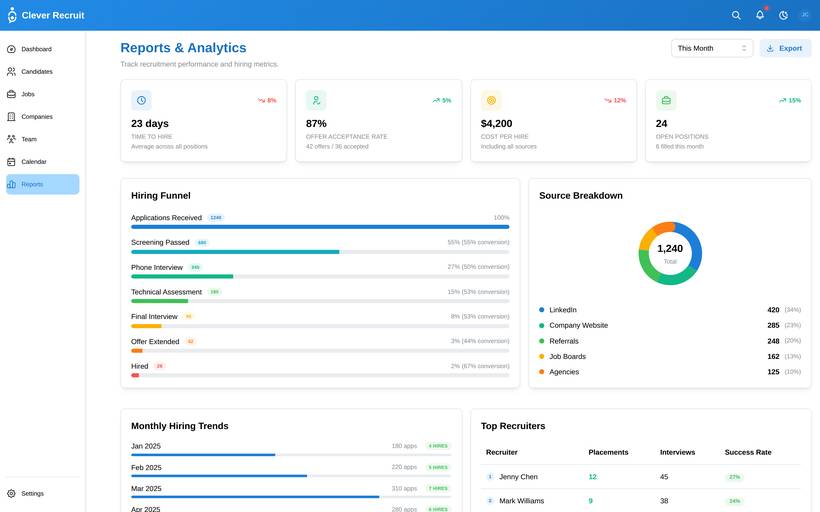
- Reports/Analytics
- Settings (profile, appearance, notifications)
- Authentication
- Dark mode
- Global search (⌘K)
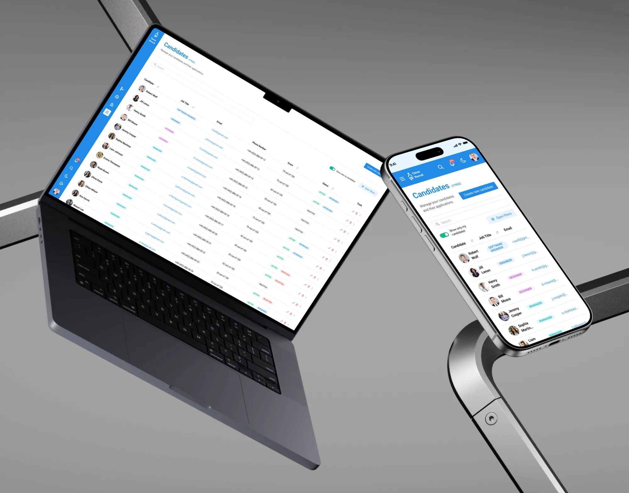
Designed for two users
- See all 200+ candidates across 15 roles at once
- Move candidates through pipeline with minimal clicks
- Get quick decisions from hiring managers without chasing them
- Loses track of candidates across email threads
- No single source of truth for pipeline status
- Hiring managers respond slowly without structured prompts
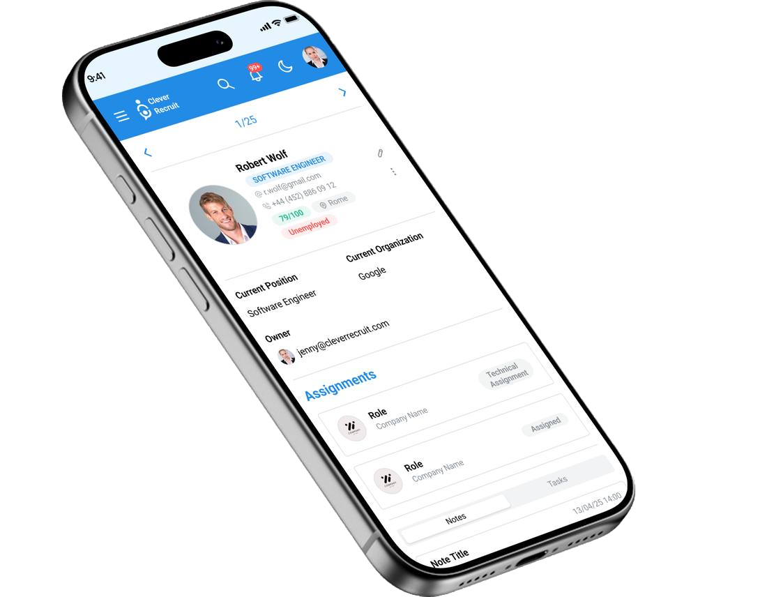
- Review shortlisted candidates quickly on mobile
- Give structured feedback without navigating a complex system
- Make hiring decisions without leaving the tool
- Gets unstructured CV attachments via email with no context
- No clarity on why a candidate was shortlisted
- Mobile experience on most ATS tools is practically unusable
The assumptions this rests on
This was a self-directed concept. I didn't interview any recruiters, so nothing below is a finding. These are the assumptions I designed from, pulled out of ATS teardowns and out of how other dense B2B tools handle the same problems. I've written each one as a claim a real study could knock down, next to what I built on it:
| Assumption | Design Response |
|---|---|
| Recruiters need to scan 20+ candidates at once — density is a feature, not a problem | Table view as default: sortable columns, status colour-coding, bulk actions. Every bit of padding I added cost a visible row. |
| Hiring managers primarily use the system for approvals, not pipeline management | Mobile companion designed specifically for the approval use case — not a shrunken desktop. |
| Status is the primary organiser in every recruiter's mental model | Status as the dominant visual element — colour-coded, always visible, sortable by default. |
| Bulk operations are essential for recruiters processing high daily volumes | Bulk select with checkbox column; bulk action toolbar appears on any selection. |
| Saved filters are essential for recruiters managing multiple simultaneous roles | Persistent filters at session level; named filter presets for saved common views. |
From assumptions to working code
Five phases. Each one had to hand something concrete to the next, or it wasn't finished.
- ATS competitive teardown (5 tools)
- Jobs-to-be-done mapping
- Assumption mapping
- Pain point synthesis
- Information architecture
- Personas & user stories
- Role-based navigation strategy
- Cross-platform scope definition
- Low-fi wireframes (desktop + mobile)
- Design system & component library
- High-fidelity mockups
- Interaction specifications
- Self-walkthrough against the recruiter task list
- Mobile pass on the hiring-manager views
- Interaction refinement
- Accessibility review
- React front-end implementation
- Design-to-code validation
- Edge case resolution
- Deployed build for review
Every screen mapped
| Screen / State | Purpose | Key elements & implementation |
|---|---|---|
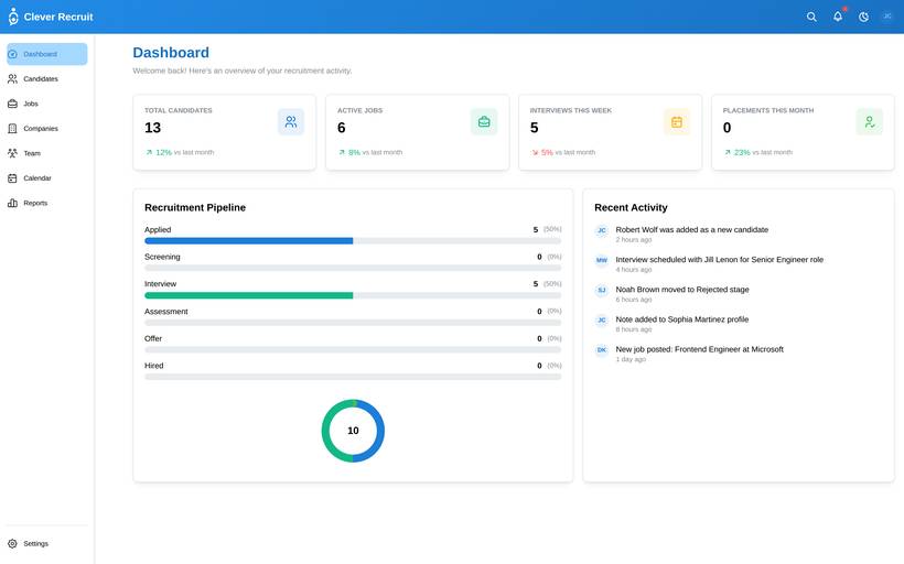
| Dashboard | Pipeline overview & metrics | Stat cards (candidates, jobs, interviews, hires) · Recent activity feed · Clickable navigation to detail pages |
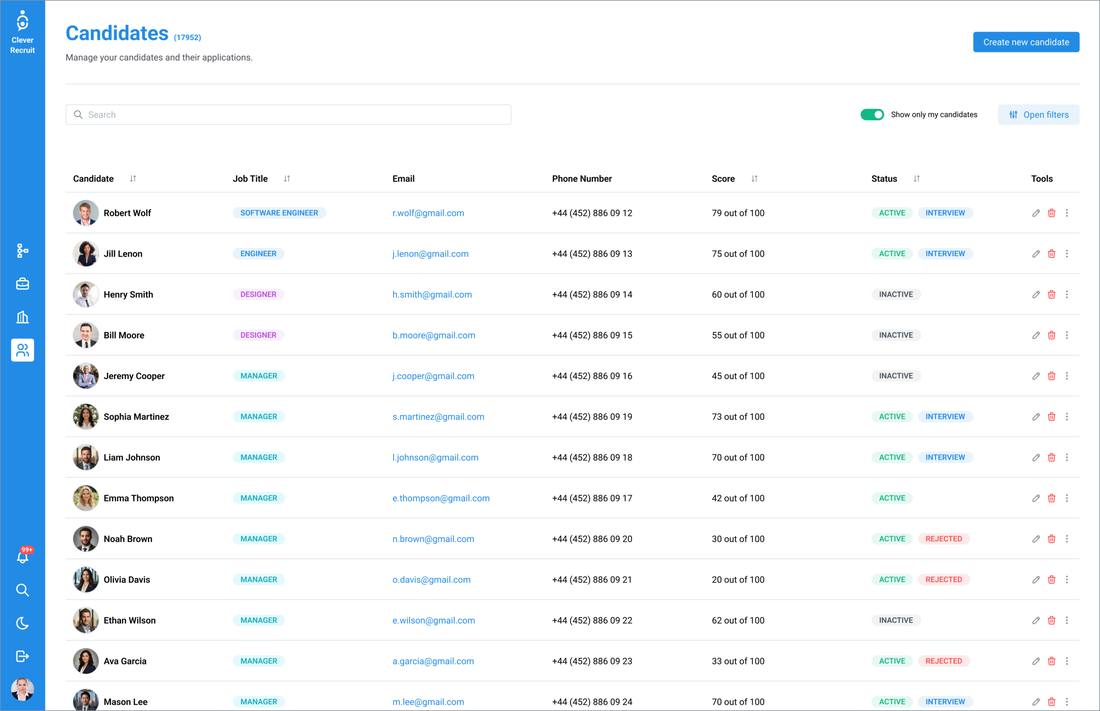
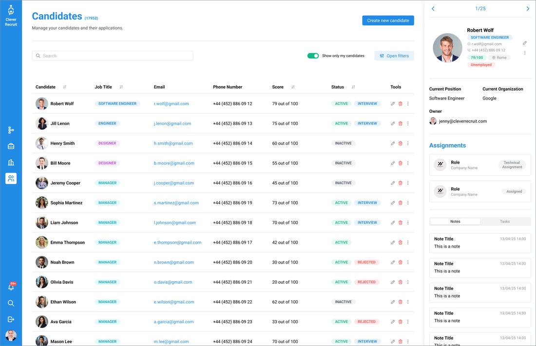
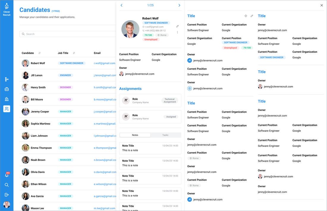
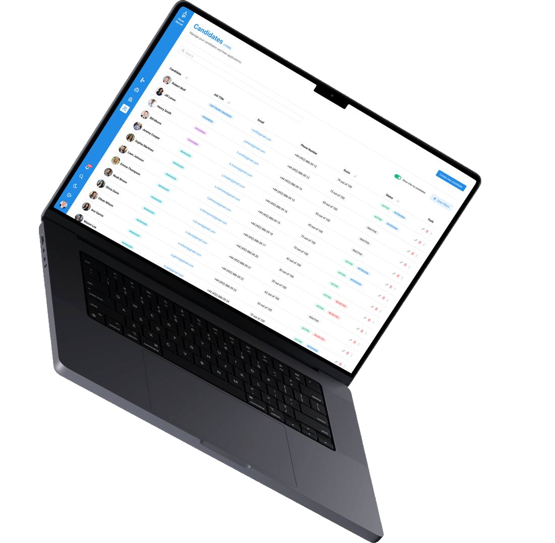
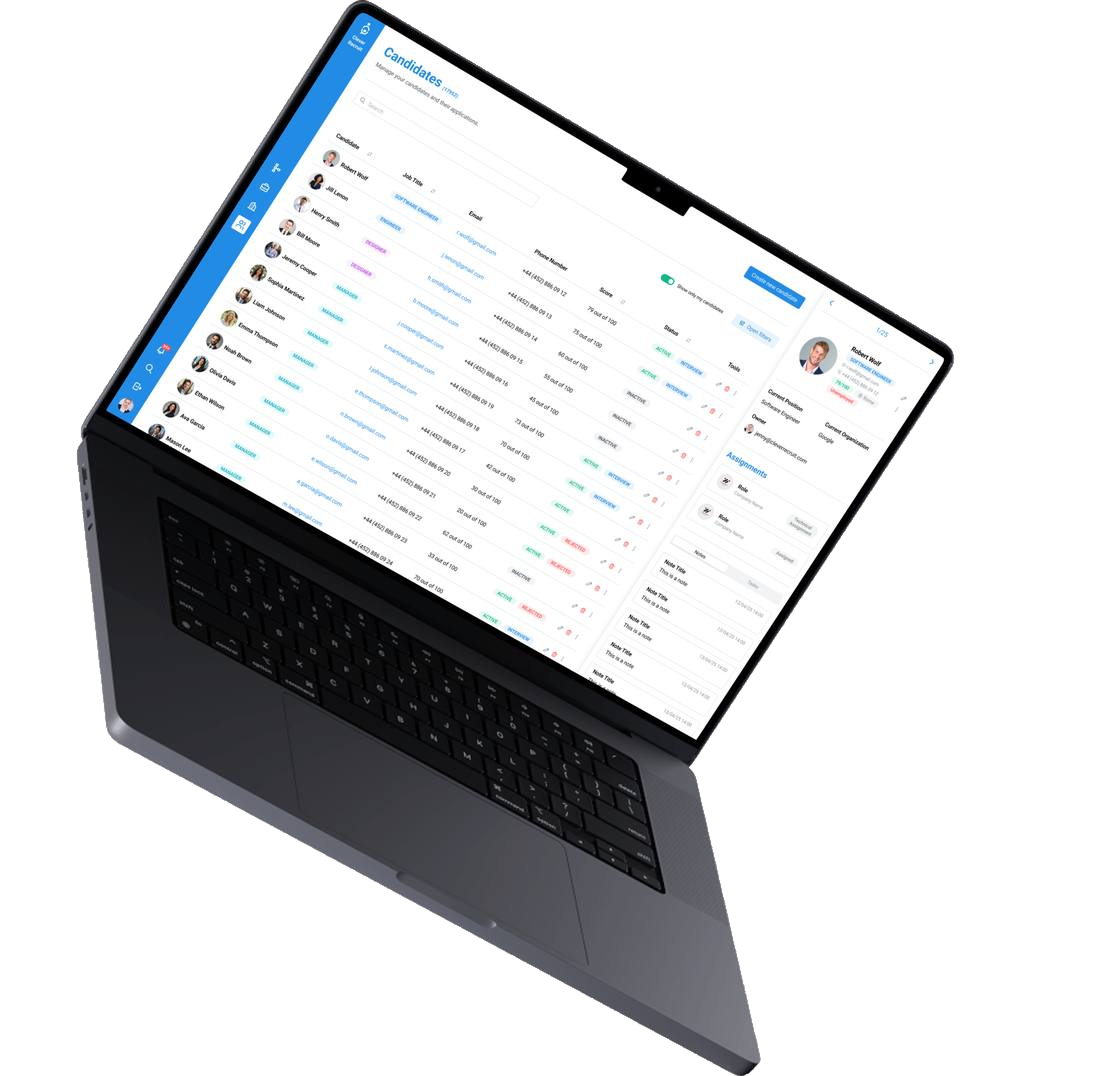
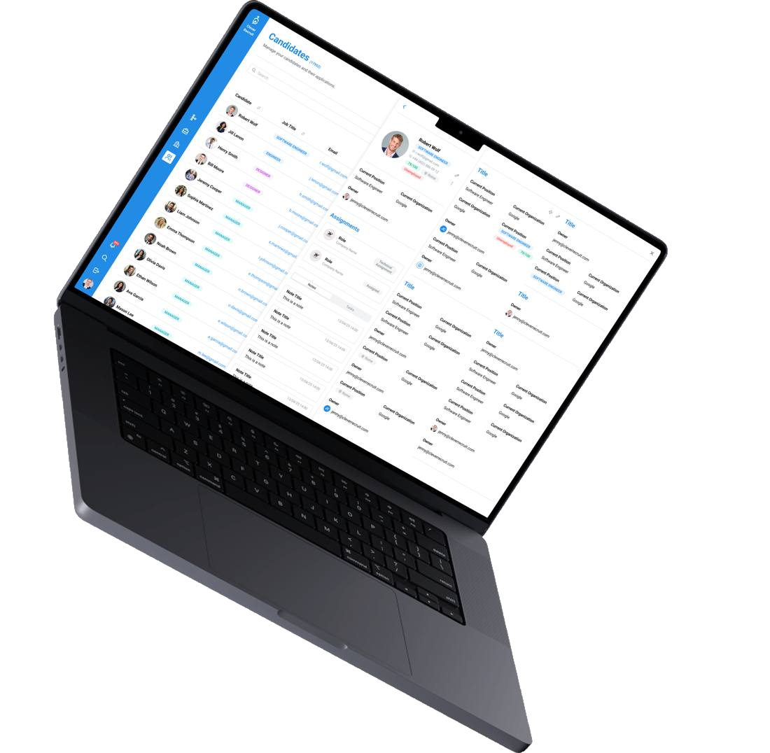
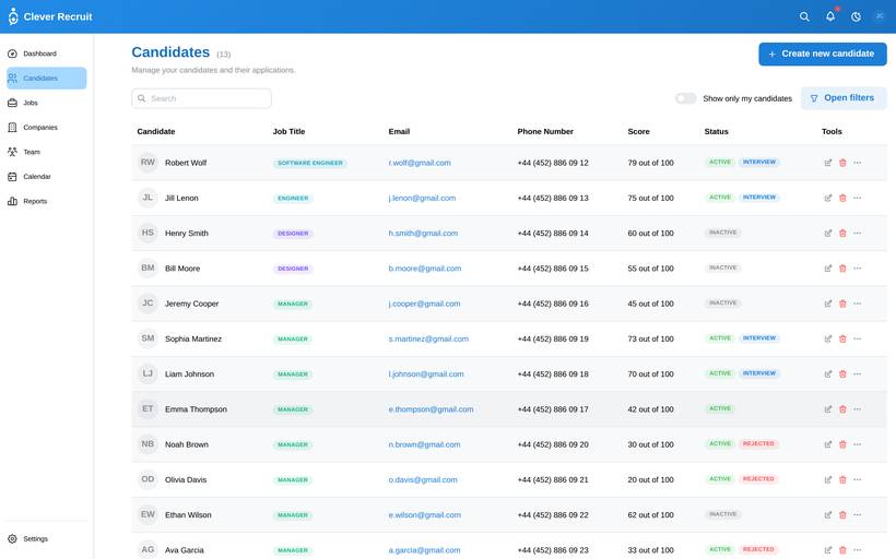
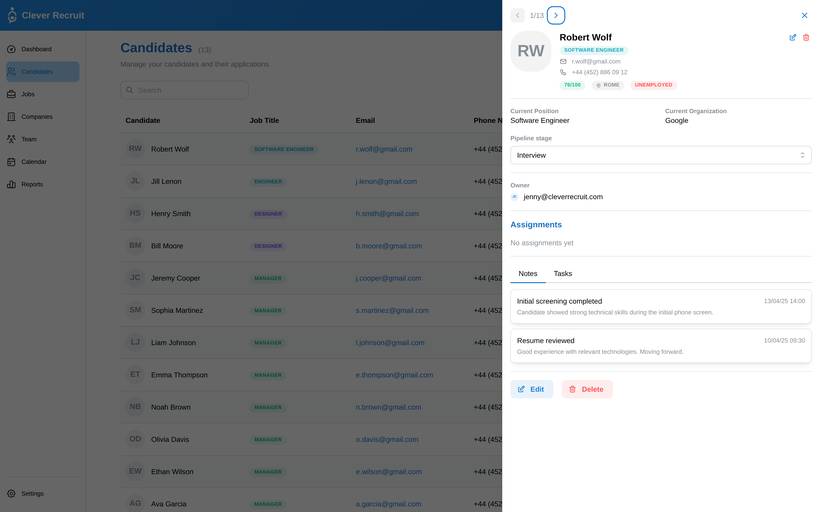
| Candidates | Full candidate database with CRUD | Sortable table with colour-coded status · Create/Edit/Delete modals · Filter by stage · Detail drawer with timeline · Search |
| Jobs | Active role management | Job table with company logos · Create/Edit/Delete · Close/Reopen actions · Detail drawer with candidate count |
| Companies | Company profiles & management | Card grid with live logos (DeBounce API) · Add/Edit/Delete · Detail drawer · Open positions count |
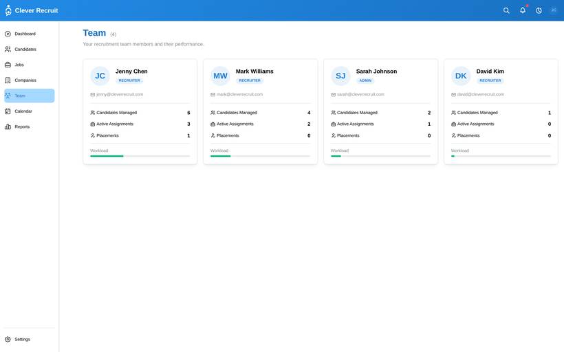
| Team | Team member directory | Member cards · Clickable detail drawer with stats · Managed candidates list · Role-based display |
| Calendar / Interviews | Interview scheduling | Month calendar view · Navigation arrows · Today button · Schedule interview modal · Event indicators |
| Reports / Analytics | Pipeline analytics | Time period selector · Pipeline funnel · Source effectiveness · Time-to-hire metrics · CSV export |
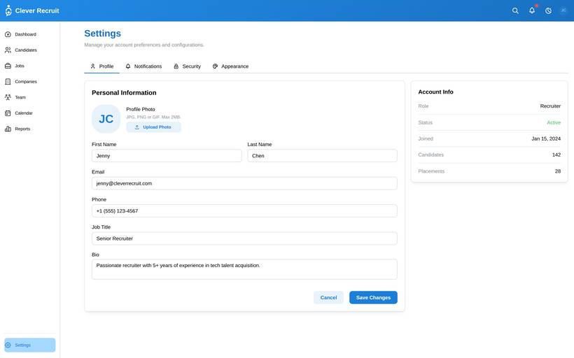
| Settings | User & app configuration | Profile management with avatar upload · Notification preferences · Appearance (light/dark) · Password change with validation |
| Login / Auth | Authentication & access control | JWT-based auth · Protected routes · UserContext for global state · Persistent sessions |
| App Shell | Global layout & navigation | Collapsible sidebar · Global search (⌘K) · Notifications panel · Light/Dark mode toggle · Responsive mobile drawer |
Three zones, drawn as they actually route
The table above is every screen, flat. Grouped by who can reach it, it is three zones and one gate between them.
/careersJobs directory — browse, filter, search/careers/:jobIdJob detail — closed roles get their own state, not a 404/careers/:jobId/applyApplication form + CV upload/careers/statusStatus lookup by email + reference/loginAuthentication
/dashboardRole-aware overview/jobsDraft → preview → publish lifecycle/candidatesFull table + detail drawer/pipeline/:jobIdKanban board, bulk actions/interviews · /calendarScheduling, shared across both views
/admin/usersInvite, list, change role/admin/rolesPer-user role assignmenteverything aboveRecruiter surface, plus the two routes here
Permission boundaries
A permission-denied attempt renders a dedicated state — never a blank page or a silent redirect.
| Action | Recruiter | Hiring Manager | Admin | Candidate |
|---|---|---|---|---|
| Create, edit or close a job | ✓ | — | ✓ | — |
| View candidates for a job | ✓ | ✓ | ✓ | — |
| Change a candidate’s stage | ✓ | — | ✓ | — |
| Leave feedback on a candidate | ✓ | ✓ | ✓ | — |
| Schedule an interview | ✓ | — | ✓ | — |
| Invite a user or change a role | — | — | ✓ | — |
| Apply to a job | — | — | — | ✓ |
| View own application status | — | — | — | ✓ |
What the sidebar actually shows
The zones above are what each role can reach. The sidebar is a stricter subset — items are hidden, not just guarded, so nobody sees a link a route guard would then turn away.
DashboardCandidatesPipelineInterviewsJobsCompaniesTeamCalendarReportsSettings
DashboardCandidatesPipelineInterviewsCalendarSettings
DashboardCandidatesPipelineInterviewsJobsCompaniesTeamCalendarReportsAdminuser list · invite · role changeSettings
Step-by-step journeys
Six of these carry a decision
The three above are the happy path. These six are where a wrong assumption would actually show up — the branch, and what each side of it does.
Recruiter creates and publishes a job
Candidate applies to a role
Candidate uploads a CV
Recruiter bulk-moves a pipeline stage
Recruiter schedules an interview
Admin changes a user’s role
The states between empty and perfect
A screenshot only ever shows the happy path. These are the states I designed for instead — most are live in the build below; a few are specified for whoever extends this next.
“No open roles yet” on /careers, a “create your first job” prompt on /jobs — never an unexplained empty table.
A distinct no-results state on /candidates, separate from the true-empty state.
De-emphasised and filterable everywhere it appears — never deleted outright.
Inline, field-level error on blur or submit — submit stays blocked until it’s resolved.
A specific message, not “invalid input” — and phone accepts international formats.
Ellipsis + tooltip for names; line-clamp + “read more” for longer notes and descriptions.
Caught by email + job match — “you’ve already applied”, not a silent duplicate row.
A warning, not a hard block — scheduling anyway is sometimes the right call.
Submission is blocked with a clear message; nothing the candidate typed is lost.
Required by default — an optional toggle per job is future scope, not built.
Names the actual limit, e.g. “max 5MB — yours is 8MB”, not a generic rejection.
A toast, and the data already entered is never cleared while it retries.
A dedicated permission-denied state — never a blank page or a silent redirect.
A role change that would leave zero admins is blocked, with the reason stated.
Pagination on the candidates table; the pipeline board still needs the same treatment.
Not yet verified against Mantine’s default transitions — the one honest gap in this list.
Every choice justified
A screenshot won't tell you why anything is the way it is. So here's the reasoning behind each of the core decisions, and the option I turned down in each case.
| Decision Made | Why — Rationale | Alternative Rejected |
|---|---|---|
| Table view as default | Recruiters with 200+ candidates need density. A table shows 20+ rows simultaneously with sortable columns. Whitespace is a liability for power users. | Kanban as default — available as a per-job view for hiring managers, but too sparse for the master candidate list. |
| Status colour-coding | You have to be able to read stage while scanning 50 rows in half a second. Colour does that on its own. | Text-only status labels. Rejected — a label has to be read row by row, which is exactly the cost I was trying to get rid of. |
| Mobile as approval tool | Squeezing the whole desktop tool onto a phone makes a dense B2B product unusable. The hiring manager isn't running the pipeline anyway, so mobile does the one thing he came to do. | Responsive desktop. Rejected — a table-based workflow loses the thing that makes it useful the moment you shrink it. |
| Persistent filters | If you filter down to one role, you want to still be in that role after opening a candidate and coming back. Resetting on every page load is a small annoyance you pay over and over. | Reset-on-navigate. It's the common pattern, and it's the wrong one for someone who filters once and lives in that view all day. |
| Bulk actions | Recruiters process candidates in batches after screening calls. One-at-a-time stage changes for 15 candidates is 15× the work. | Individual actions only. Simpler to build, and it falls over on the exact job recruiters do most. |
What shipped, end to end
Screen-level design
Desktop
Mobile
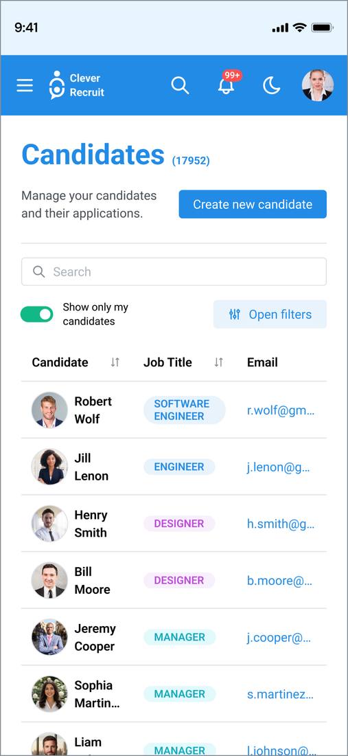
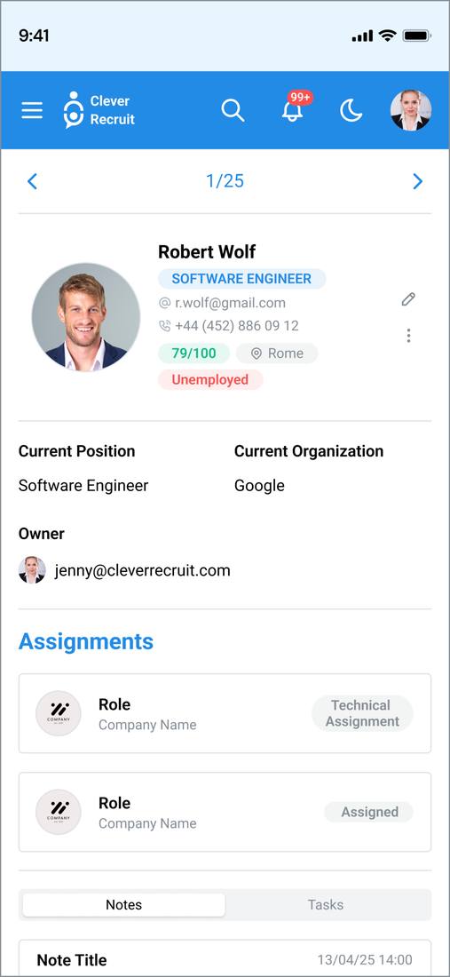
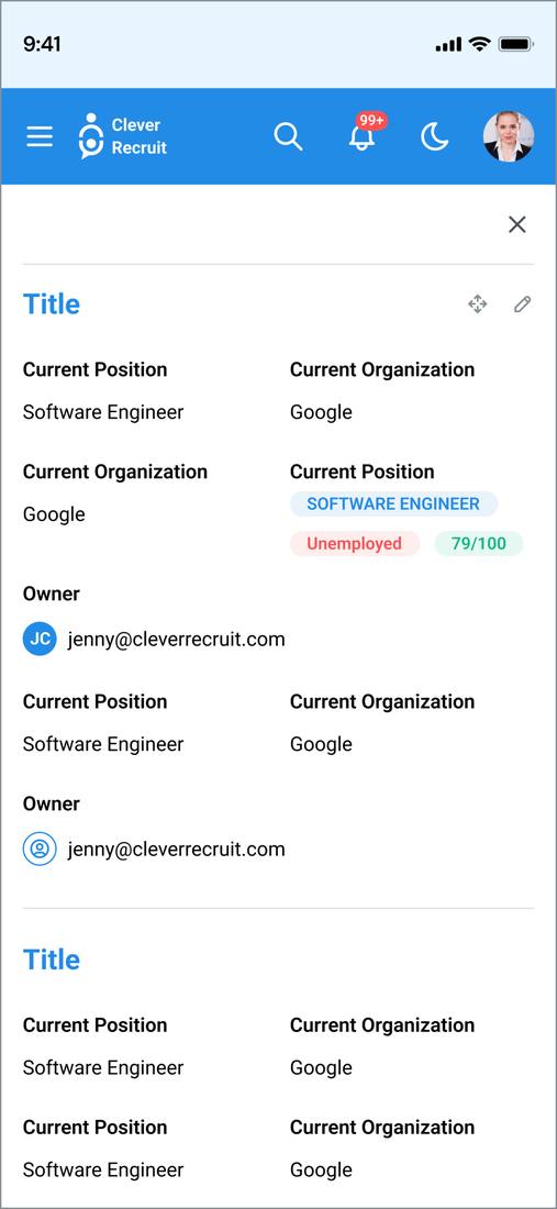
Desktop screens
Hiring manager experience
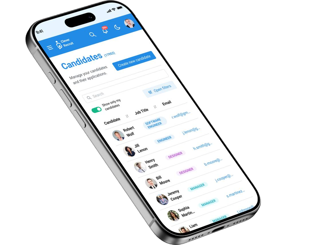
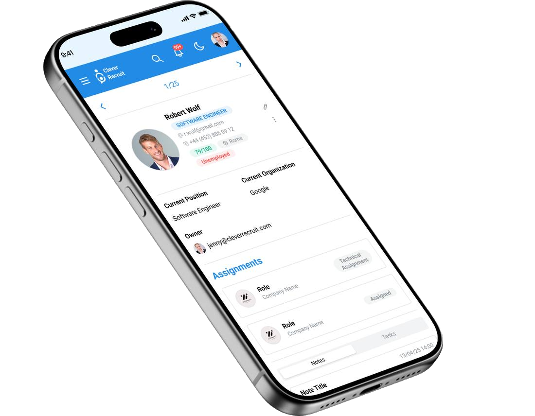
Mobile does one job: the hiring manager's approval loop. Read the shortlist, leave a note, approve or decline. Everything else stays on desktop. Tap through the live prototype below.
The prototype below is the running build — click it to interact.
Interactive walkthrough
The live desktop app is below. Move a candidate through the pipeline, open a job, try the global search. The hiring manager's mobile flow is in the Mobile section above.
Tap the menu to navigate on mobile · Open in new tab
The pipeline, screen by screen
Captured from the running build. The candidates table is the centre of gravity — everything else is built to get a recruiter back to it.
From design to code
| Layer | Technology | Why chosen |
|---|---|---|
| Frontend | React 18 · Vite · TypeScript | Component-based architecture matches the design system; Vite for fast development iteration |
| UI Library | Mantine v7 | Accessible components and dark mode out of the box, so I wrote very little custom CSS |
| Icons | Tabler Icons | Consistent stroke-based icon set; native Mantine integration |
| Backend | Node.js · Express · TypeScript | Same language as frontend; Express for lightweight RESTful API |
| Database | PostgreSQL · Prisma ORM | Type-safe database access; auto-generated migrations; relational data model suits recruitment pipelines |
| Auth | JWT · bcryptjs | Stateless authentication; protected routes via React Context |
| State | TanStack Query · React Context | Server state caching with TanStack; global user/theme state via Context API |
Brand system
The product’s own theme, not a moodboard: five colour tuples straight out of theme/index.ts, Roboto at weight 700 for headings, and one radius — md — shared by every button, input, select and card.
The one system worth calling out: pipeline-stage colour. Dashboard, Candidates and the Reports funnel each carried their own map, and disagreed — Hired was green on two screens and red, the app’s own rejection colour, on the third. Reconciled into one map, used everywhere a stage renders:
| Stage | Colour |
|---|---|
| Applied | Blue |
| Screening | Cyan |
| Interview | Teal |
| Assessment | Yellow |
| Offer | Orange |
| Hired | Green |
| Rejected | Red |
| Withdrawn | Gray |
I took this one from a blank page to a deployed app on my own. I wrote the assumptions down first, built the information architecture around them, made the component library in Figma, then built it in React to find out where I was wrong. The limit worth naming: no recruiter has used this yet, so everything in the discovery table is still an assumption rather than a finding. View source on GitHub