The fragmentation is the problem
Every freelance designer I've spoken to runs client work across the same scattered set of tools: email for the proposal, a Figma link for the work itself, Slack or email again once feedback starts, a Google Doc for notes nobody re-reads, and a separate invoicing app to actually get paid. Loop is my answer to that: one narrow, opinionated tool that does the whole loop, rather than one more all-in-one platform trying to do everything.
This case study covers the full pass end to end — competitive research and personas, information architecture and user flows, a wireframe stage, a hi-fi Figma design system, and a second pass that rebuilt the same product as a working React app on shadcn/ui and Tailwind, re-themed through Figma variable modes rather than as a second, parallel design system.
Three things break, every time
Feedback gets scattered across threads instead of pinned to the work itself. Revision rounds quietly run past what was scoped and agreed, because nothing is counting them. And invoices go out late, because nothing tells the freelancer the moment work is actually approved. None of these is a single missing feature — they're what happens when a relationship spans five disconnected tools and nothing owns the handoffs between them.
| Tool category | What it's good at | What it's missing |
|---|---|---|
| All-in-one client tools (Dubsado, Plutio, Bonsai, HoneyBook) | Bundle proposals, contracts and invoicing in one login | Feedback tools are an afterthought — no pinned comments, no revision limits |
| Dedicated review tools (Filestage, Markup.io) | Strong pinned-comment feedback on the work itself | No billing at all — still a separate invoicing step |
| Marketplaces (Upwork) | Protects payment well, with upfront milestone funding and a structured dispute path | Only for work arranged on the marketplace — no help once you're direct with a client |
Nothing in the market combines structured, limited-round feedback with escrow-style protected payment for independent freelancers working directly with their own clients. That gap is Loop's whole reason to exist.
Design principle set from day one: the freelancer gets a full tool; the client only ever sees what's waiting on them, reached through a magic link, no password required.
Research, flows, IA — before a single screen
I worked in the order below, and it mattered more than it usually gets credit for: research and flows before wireframes, wireframes before hi-fi, a validated Figma system before any code, and a full QA pass before calling the prototype done.
- 5 tools scored on strengths and gaps (Upwork, HoneyBook, Bonsai, Moxie/Plutio/Dubsado, Filestage/Markup.io)
- 2 personas
- 30 user stories across 9 stages
- 24 edge cases
- Proposal
- Feedback & revision
- Approval & payment
- Project states
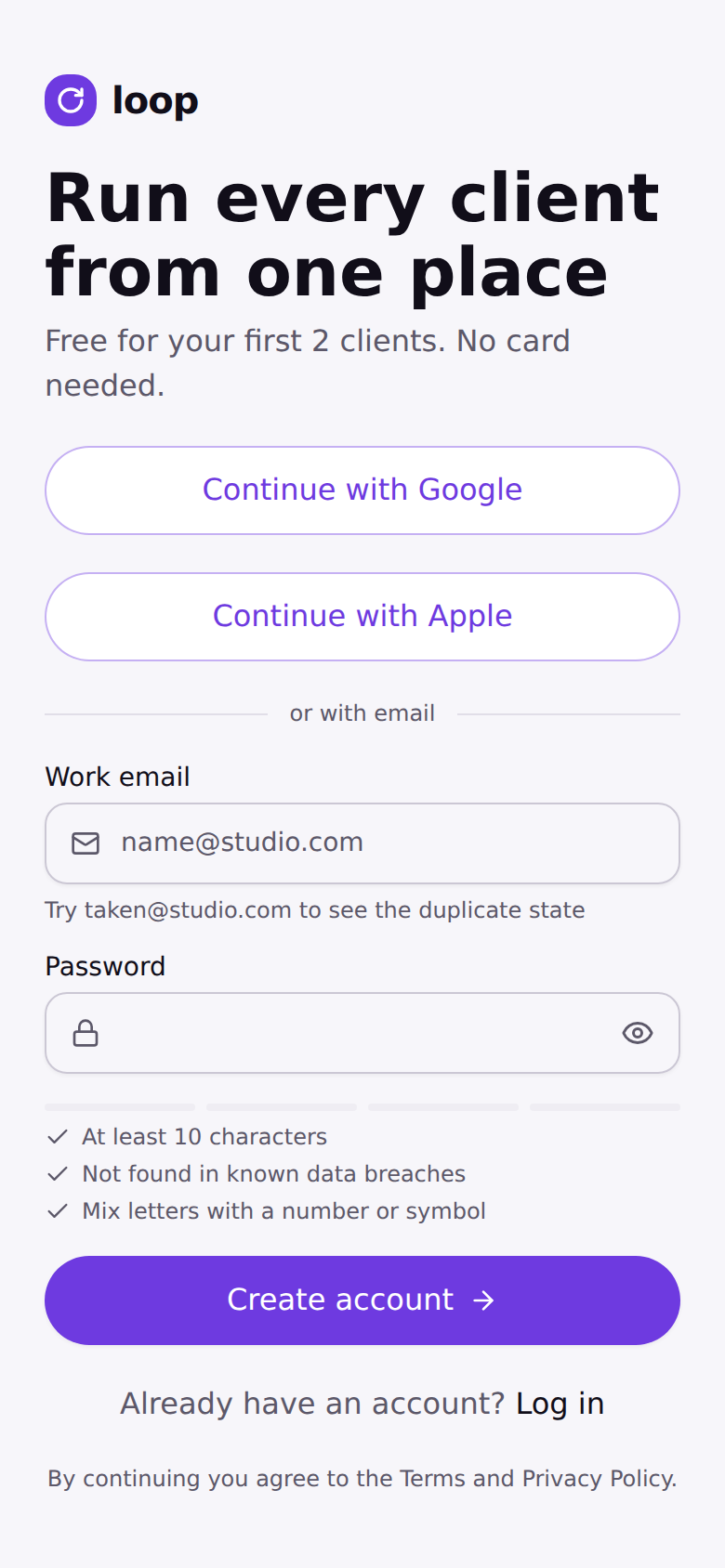
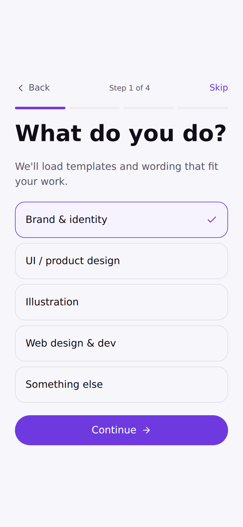
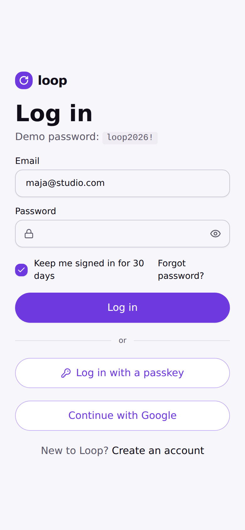
- Sign-up, log-in, password reset
- Milestone payments & disputes
- Freelancer app navigation fixed first
- Client portal kept deliberately flat
- Route map for all 23 screens agreed before wireframing
- 14 mobile wireframes
- 5 desktop wireframes
- 6 wireframe emails
- Content priority settled before any visual design
- 98 variables across light/dark
- 15 text styles · 37 icons · 18 component sets
- 8 hi-fi screens + 4 hi-fi emails built from it
- Reused shadcn/ui's architecture instead of a second system
- 23 routes hand-ported to React + Tailwind
- Tokens ported line-for-line into the app's CSS theme
- All 23 routes at 390px and 1440px
- Real browser screenshots, not just the design files
- Caught and fixed real overflow bugs — see Key decisions
Two surfaces, one magic link between them
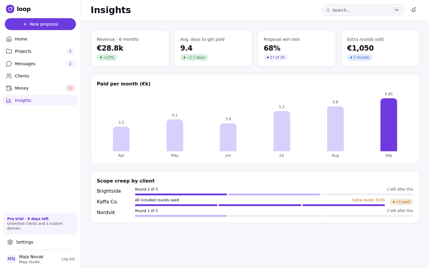
The freelancer app has 6 top-level sections — Home, Projects, Messages, Clients, Money, Settings — plus Insights on desktop only. A project drills into three sub-views: Milestones, Review (with pins and version compare), and the proposal itself. The client side is intentionally flat: one page listing everything currently waiting on that client, reached by magic link, no account required.
- Home
- Projects
- Messages
- Clients
- Money
- Settings
- Insights (desktop only)
- Proposal — sign & pay
- Signed confirmation
- Review — comment & approve
- Files delivered
The two surfaces never share a login: a client reaches the portal only through an emailed link scoped to one project, and every approval or payment they make there writes straight back into the freelancer’s Money and Home views.
| Area | Mobile (390px) | Desktop (1440px) |
|---|---|---|
| Navigation | Bottom tab bar, 4 tabs + a floating New button | Left sidebar, collapsible |
| Home | Stack of "needs you" cards | Cards + pipeline board + revenue summary |
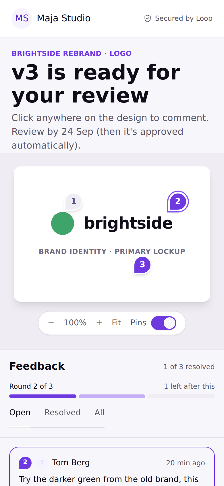
| Feedback | Tap a pin to open a bottom sheet | Canvas with a comment panel on the right |
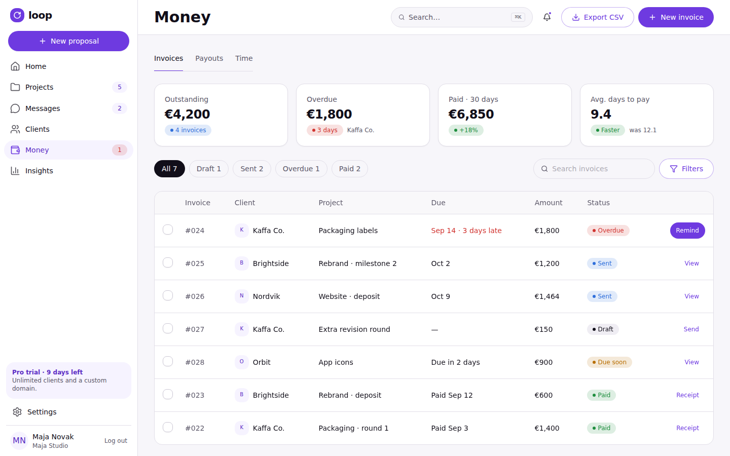
| Invoices | List, send, mark as paid | Table with filters and bulk actions |
| Client portal | Primary use case, one-tap approve | Side-by-side review |
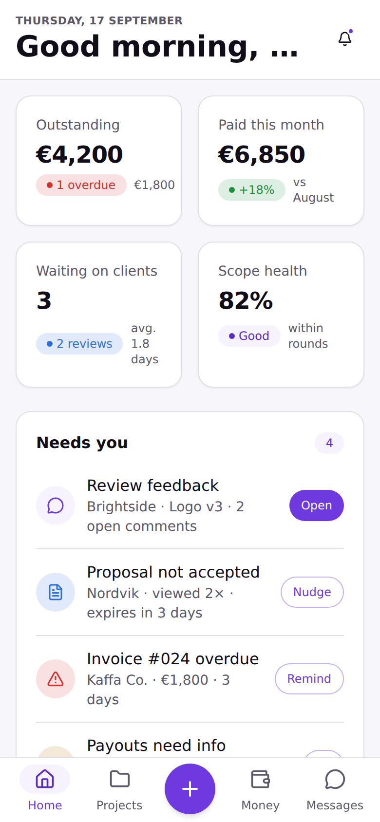
Bottom tab bar, four destinations, plus a floating New button that starts a proposal from anywhere.
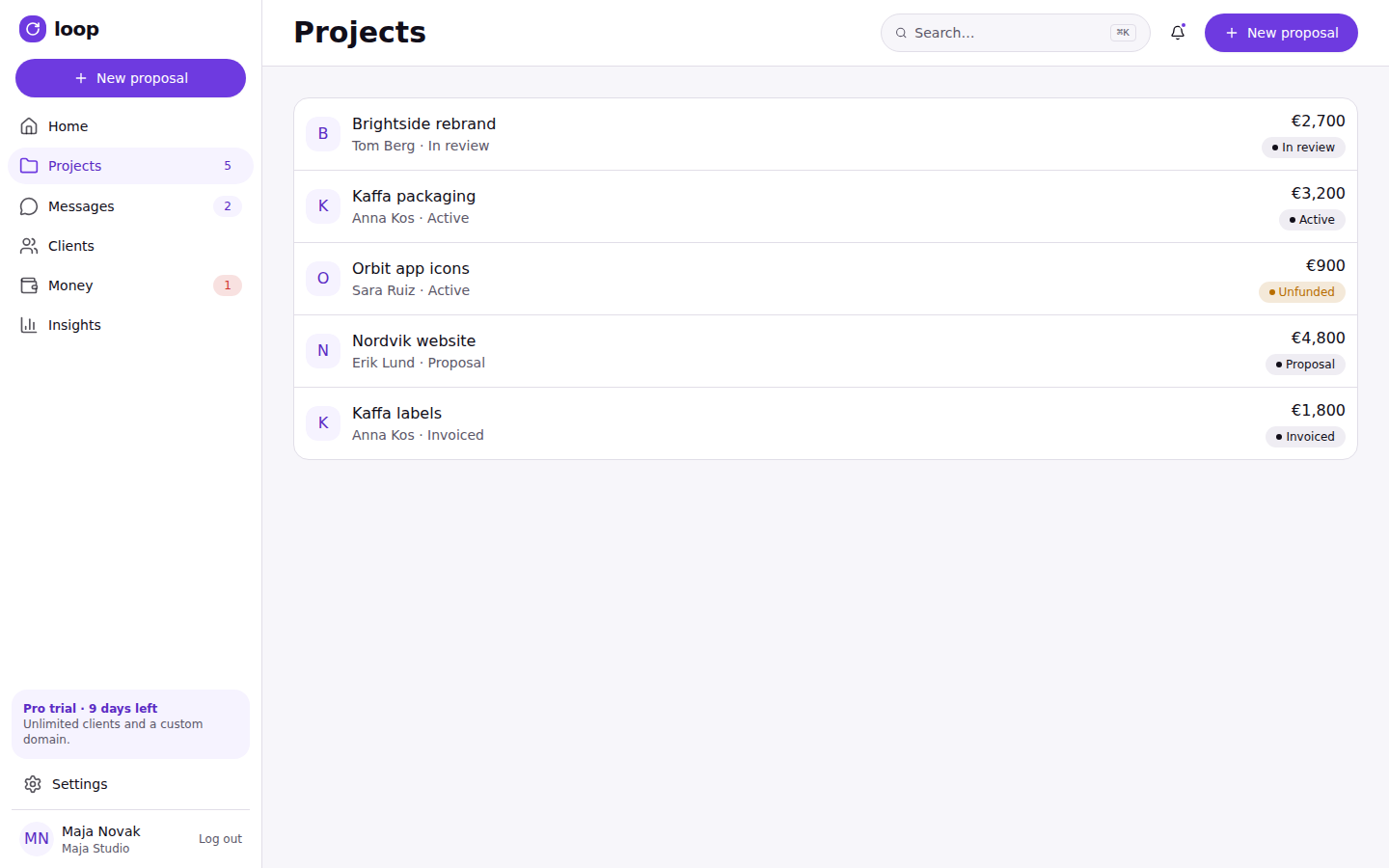
Collapsible sidebar, all seven sections including Insights, which mobile drops for space.
Route map: Auth: sign-up, check email, onboarding, log in, forgot password, reset password, two-factor code. App shell (Home, Projects, Project detail, Messages, Money, Clients, Insights, Settings) sits behind the sidebar/tab-bar layout; the proposal builder and the review screen are deliberately full-screen and outside it, since both are focused, single-task flows. Client portal: proposal (sign & pay), signed confirmation, review, and files-delivered. Plus a reference page listing all 34 notification emails the product sends. 23 routes in total.
The magic link is what makes the client side possible without an account. Below is that handshake end to end: Tom opens the link from his email, Loop validates a single-use token scoped to that one project, and only then does the portal render — with the loop closing back to Loop itself the moment he signs and pays.
A themed variant of shadcn, not a second system
Once Loop DS v1 was validated in Figma, the question became how to get it into code. Rather than hand-building a bespoke component library from the Figma files, Loop's components are shadcn/ui's own primitives, re-themed through one shared variable collection — same Radix UI foundations underneath, same component APIs, same file structure a shadcn user already knows. Any frame or app instance set to "Loop light" or "Loop dark" re-skins every button, badge, input, sidebar and table to Loop's brand, with nothing manually recolored.
| Category | Components |
|---|---|
| Buttons | Button (5 variants: default, secondary, outline, ghost, destructive) |
| Badges & status | Badge, Progress, Skeleton |
| Avatars | Avatar, AvatarFallback |
| Form controls | Input, Label, Checkbox, Switch, Textarea, RadioGroup, Select |
| Navigation | Tabs, Breadcrumb, Sidebar (header, menu, footer), Sheet (mobile drawer) |
| Cards & lists | Card (header/content/footer), Table, ScrollArea, Separator |
| Feedback | Alert (4 variants), Tooltip, Sonner (toast) |
| Overlays | Dialog, DropdownMenu |
Interaction principles, carried from the hi-fi design system into the coded rebuild: One next action · Status in words, never color alone · No surprise costs · Undo over confirm · Content before chrome on mobile
Rendered live below, in the browser, from the same token set the app itself uses — not screenshots of the Figma file.
Every colour is a variable, not a value
Every colour, radius and typeface in Loop is a variable — defined once in Figma as variable modes and mirrored exactly in the codebase as CSS custom properties, so a change to one source of truth updates every button, badge and chart in both places without touching a single component.
Dark mode ("Loop dark") redefines the same token names rather than introducing new ones — background becomes #110E19, primary lightens to #A283F7 for contrast against the dark surface — so every component that references --primary, not a hardcoded hex, repaints correctly when the mode switches, with no per-component dark-mode logic. Typography: Geist for UI text throughout, Instrument Serif used sparingly for marketing-flavored moments like the client portal's project title. Radius: 0.75rem base with a derived scale, each step shifted by 4px so nested elements — a badge inside a card inside a dialog — nest their corners believably instead of all sharing one radius.
Every call, and what it cost
This was built end to end by one person, so these are reasoned decisions rather than ones validated against real client and freelancer usage yet — that's next (see Reflection below).
| Decision | Rationale | Alternative rejected |
|---|---|---|
| Reuse shadcn/ui's architecture instead of a parallel system | Inherits shadcn's accessibility work and stays easy for another developer to extend, at a small cost to visual distinctiveness. | A fully bespoke component library built from the Figma files — more distinctive, but a second system to maintain forever. |
| Client access defaults to a magic link, no account required | Early flows required every client to create a password just to approve a proposal or release payment — friction at the exact moment money was about to move. | Requiring an account up front. An optional login is layered on top for clients tracking multiple projects, rather than forcing one model on everyone. |
| Escrow-style milestone funding, plus a structured dispute flow | Borrows Upwork's core idea — the client funds a milestone up front, the freelancer works against secured money — but adds a 5-business-day response window and a defined mediation flow, since Loop has no marketplace trust layer behind it. | No dispute path at all, which is what most off-marketplace escrow tools ship with. |
| "One next action" as the primary interaction principle | Button copy states the actual consequence (“Approve & release €1,200”, not “Confirm”), because the cost of a misread button here is real money changing hands. | Generic confirm/submit buttons — faster to design, easier to misread on a screen with money attached. |
| Bottom tab bar + FAB on mobile, collapsible sidebar on desktop | Maja checks project status from her phone between client meetings far more than she does deep work there; desktop keeps a persistent sidebar for faster cross-project navigation during focused sessions. | One shared layout for both breakpoints — simpler to build, wrong for how each device actually gets used. |
| Hand-rebuilding shadcn's components instead of using its CLI | The CLI installs components by pulling from a live registry at build time; that registry was network-blocked in this build environment, so every component was recreated by hand against the same API surface. | Switching to a different, installable component library — would have meant abandoning the Figma system's shadcn-based architecture. |
Four moments that matter most
A walkthrough of the four moments that matter most in Maja and Tom's relationship: the freelancer's home base, sending a proposal, getting paid, and the client's side of that same transaction.
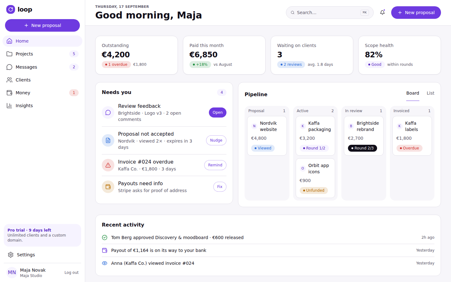
Home — one screen, everything that needs attention today
The dashboard leads with what's waiting on Maja rather than a generic activity feed: overdue invoices, milestones awaiting client approval, and unread messages surface above anything already in a healthy state. Status is always shown in words next to a colour (“Waiting on Tom — 2 days”), never colour alone, so the screen stays legible for a colour-blind user too.
Sending a proposal — milestones, not a lump sum
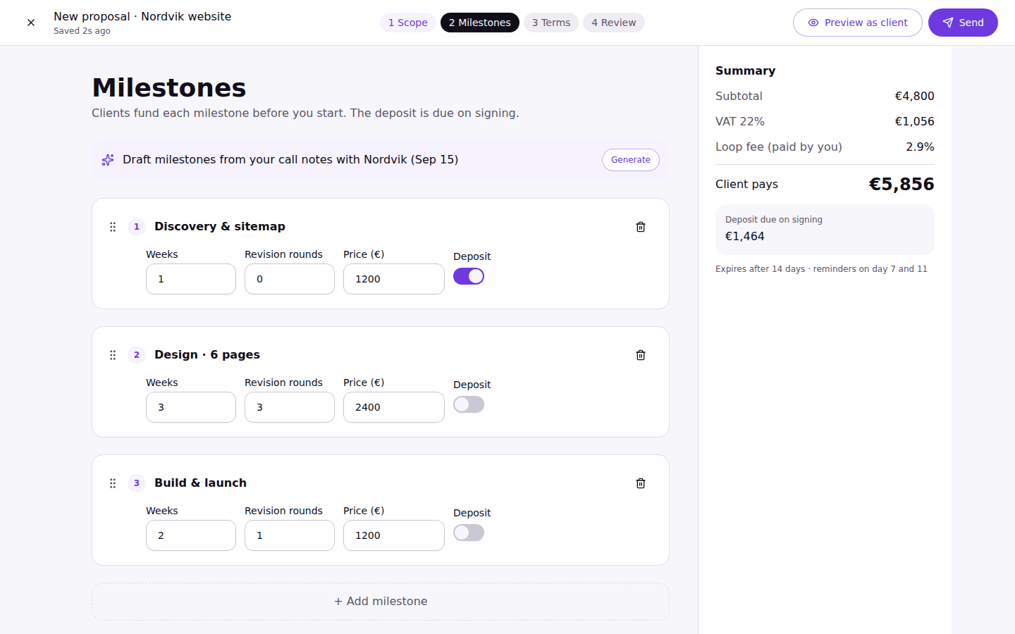
Every proposal is built as a sequence of priced milestones rather than one total, because that structure is what later powers partial funding, partial approval, and per-milestone disputes. The builder reorders milestones by drag, shows a running total as they're added, and validates that the sum matches the quoted project value before it can be sent.
Money — the escrow view
The highest-stakes screen in the product, so it says exactly what will happen before it happens: which milestone is funded, how much is protected, and what button press releases it. “Approve & release €1,200” instead of “Confirm” is applied at its strictest here, since it's the one place in Loop where a misread label has a financial consequence.
A milestone only ever moves forward, except for one branch: a dispute opens a 5-business-day response window rather than an immediate refund, since Loop has no marketplace trust layer behind it the way Upwork does.
The client's side — no account required
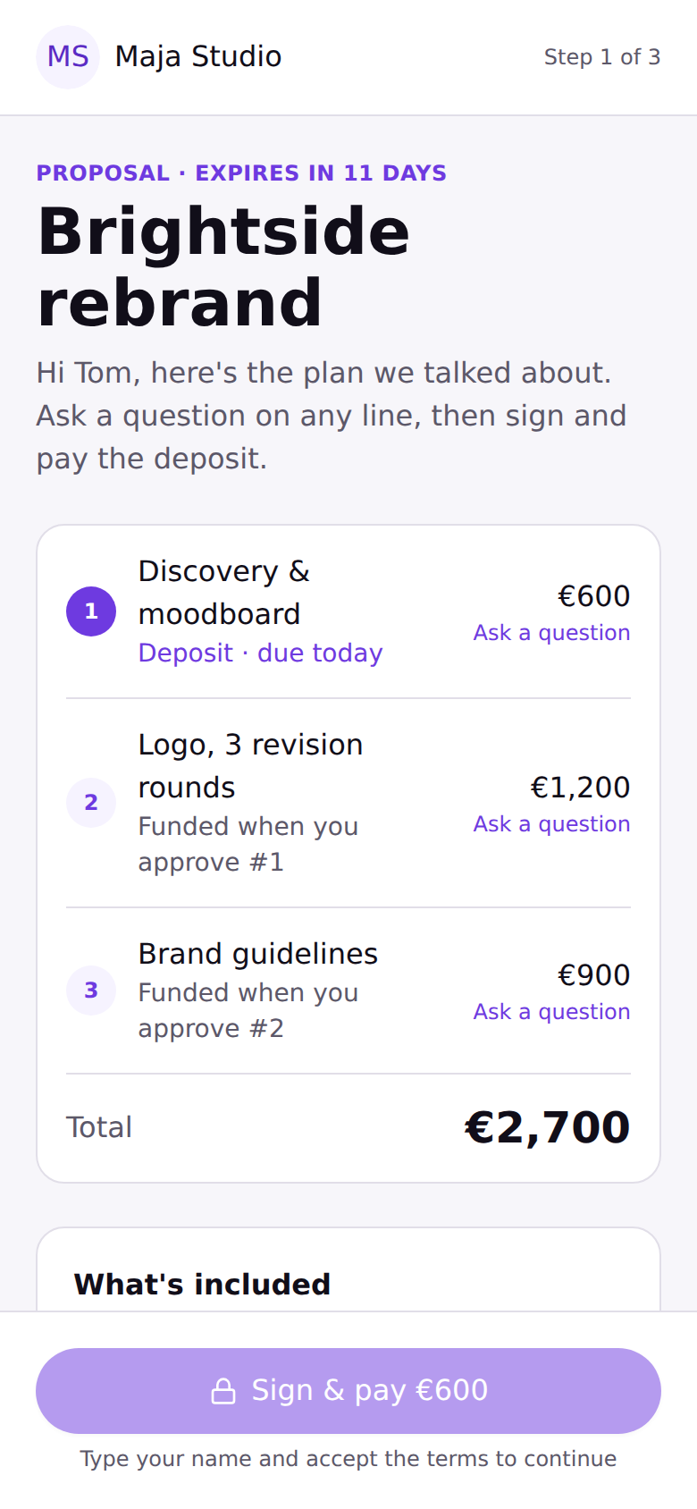
Tom opens a link from his email and lands directly on the proposal, already scoped to that one project, with no login screen in between. He can comment on individual line items, then sign and pay the deposit from the same flow, on his phone, in the gap between meetings — the specific failure mode the original research identified: clients who intended to review a proposal “later” and never did, because later meant finding a password.
34 emails that do the nagging for you
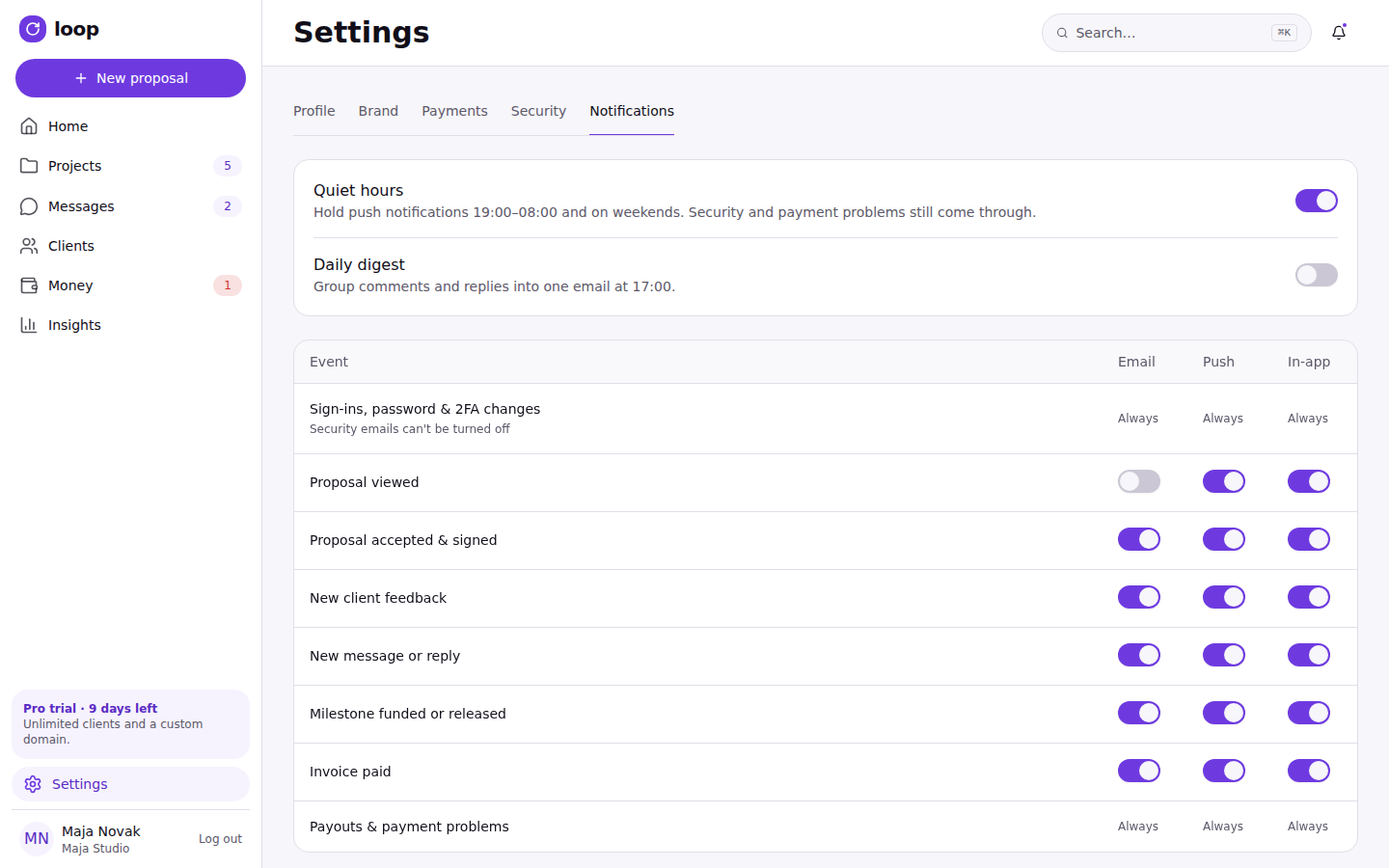
Loop sends 34 notification emails covering every point where a freelancer or client would otherwise have to remember to check back: feedback left, a round about to expire, a payout on its way, a proposal gone quiet. Four of the highest-traffic ones went through the same hi-fi design pass as the app itself; below are four of those, rendered from the same components and tokens rather than as static mockups.
New feedback on Logo v3
Tom Berg left 3 comments on Brightside rebrand, pinned directly to the artwork. You have 1 revision round left after this one.
Open feedback →Payment released
Tom approved Discovery & moodboard. €600 has been released and is on its way to your connected bank account.
View payout →Nordvik hasn't signed yet
Nordvik viewed your proposal twice but hasn't signed or asked a question. A friendly nudge is queued to send automatically tomorrow — or send one now.
Nudge Nordvik →A new plan from Maja Studio
Hi Tom, here's the plan we talked about. Ask a question on any line, then sign and pay the deposit — no account required.
Review & sign →Tap through it yourself
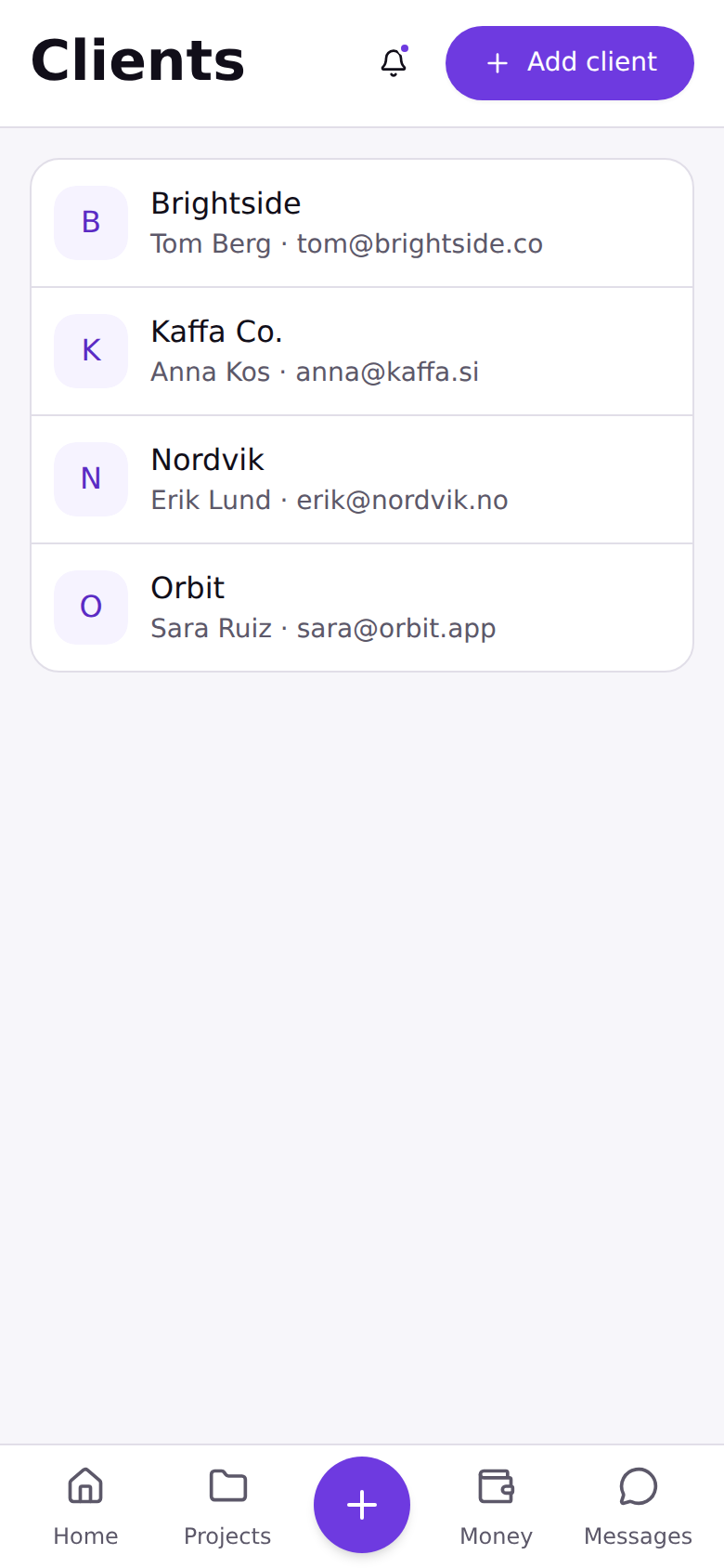
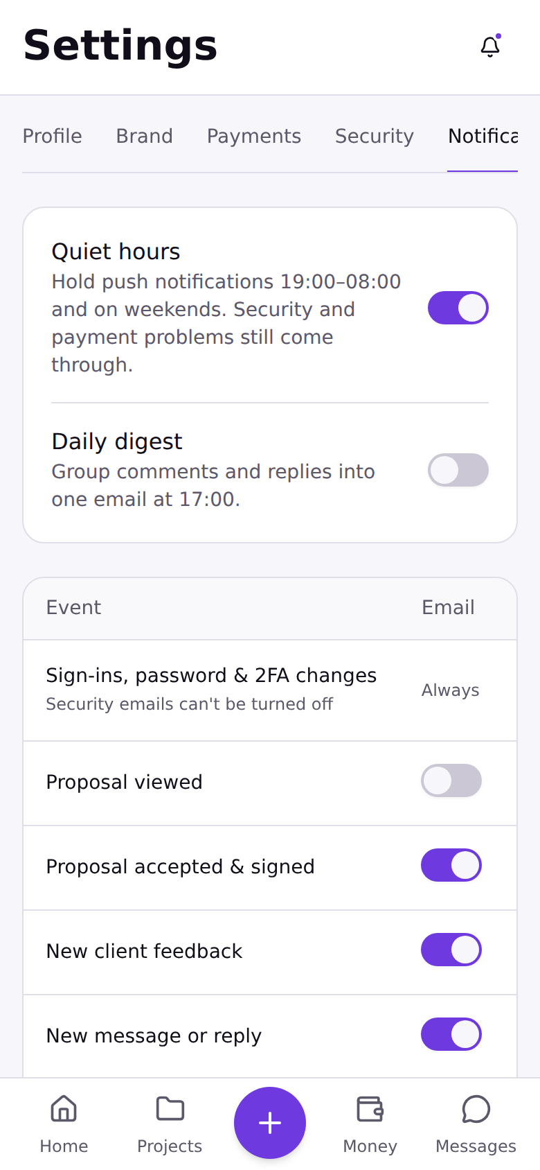
Mobile — 12 core screens
Captured from the running build at 390px. Sign-up through client review, both sides of the loop.
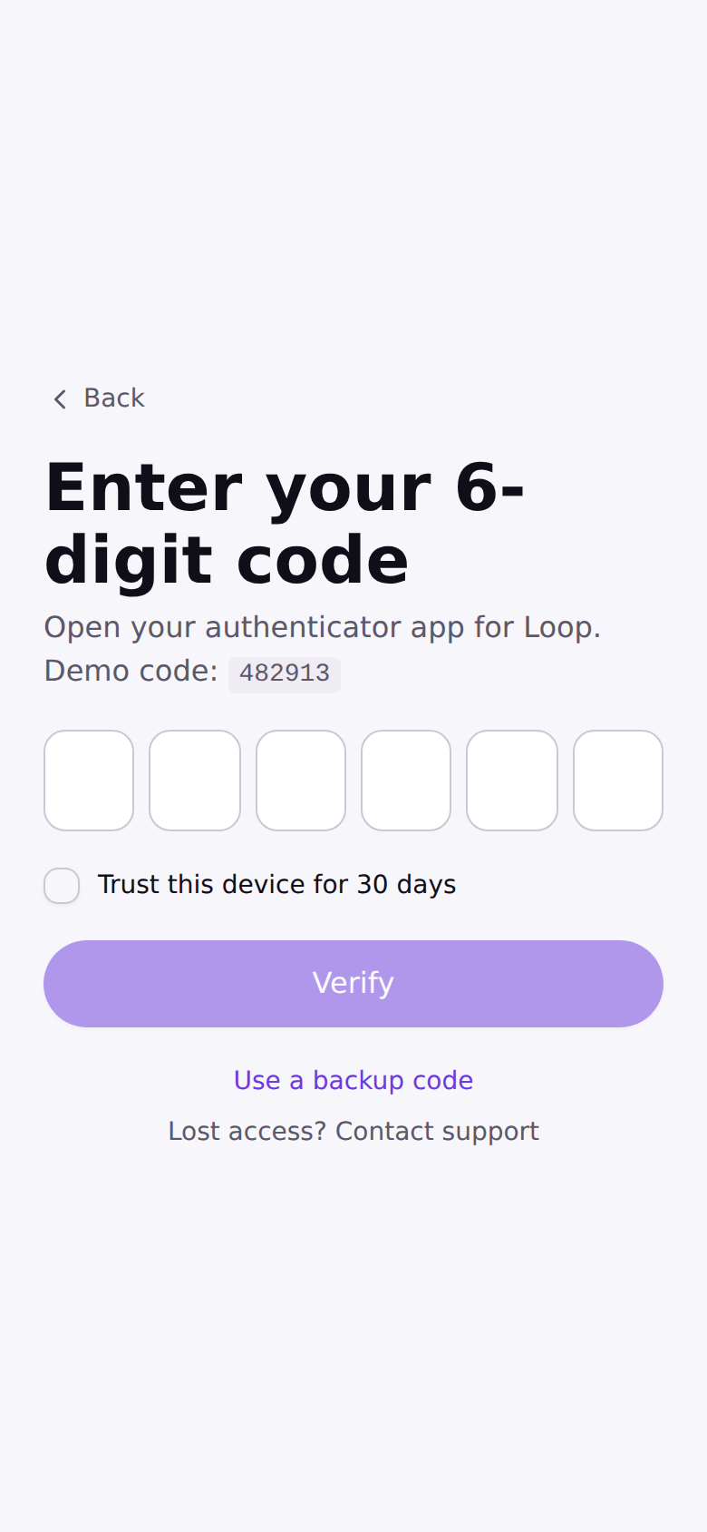
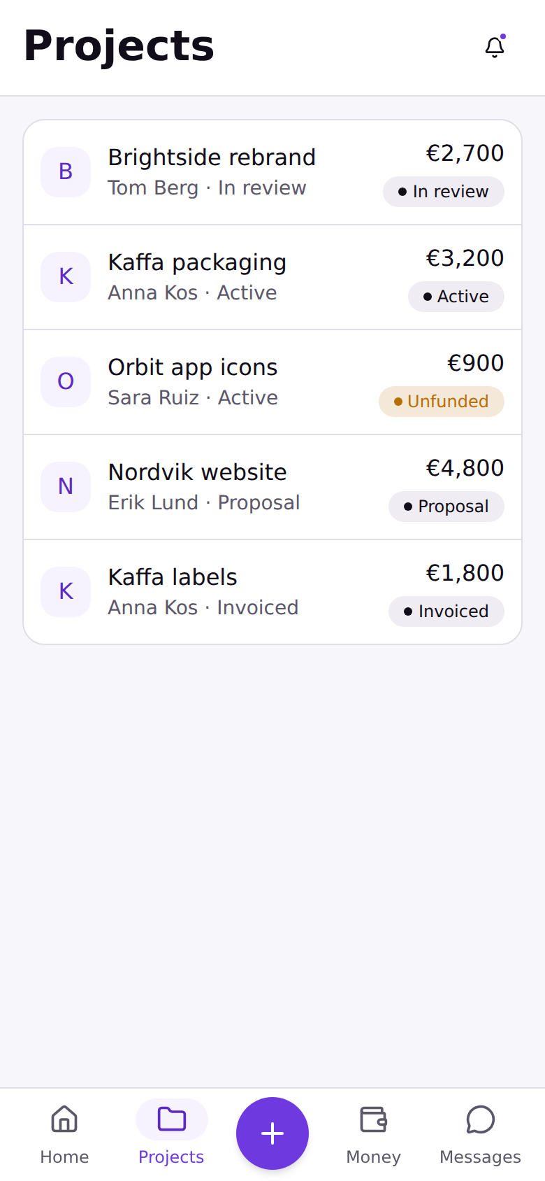
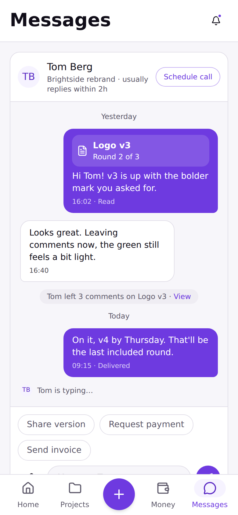
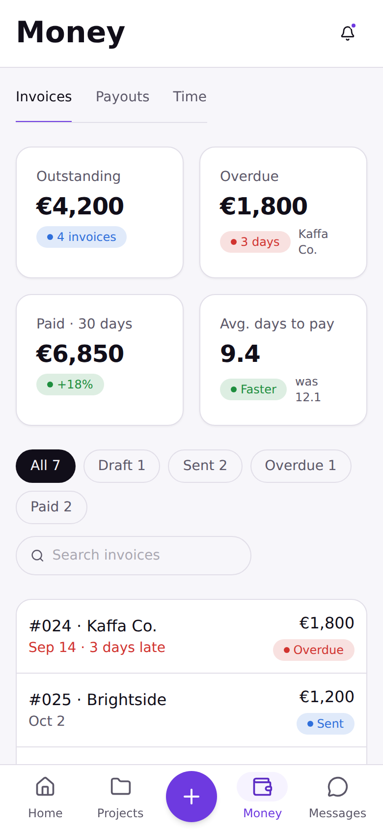
Desktop — the same system at 1440px
One component library, both densities. The sidebar and grid adapt; nothing was re-drawn for the wider layout.
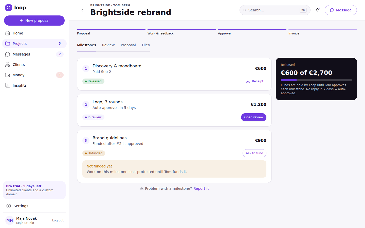
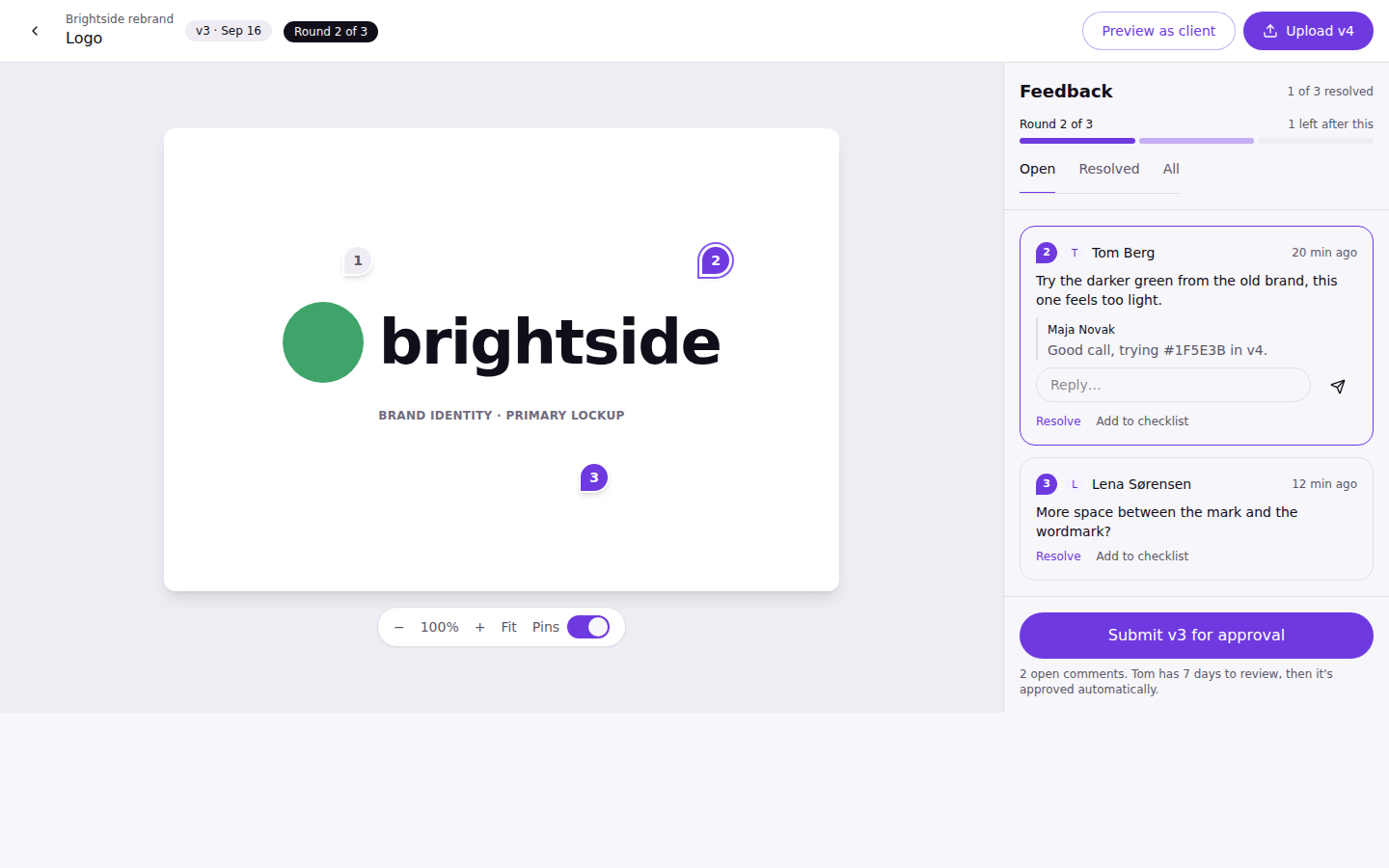
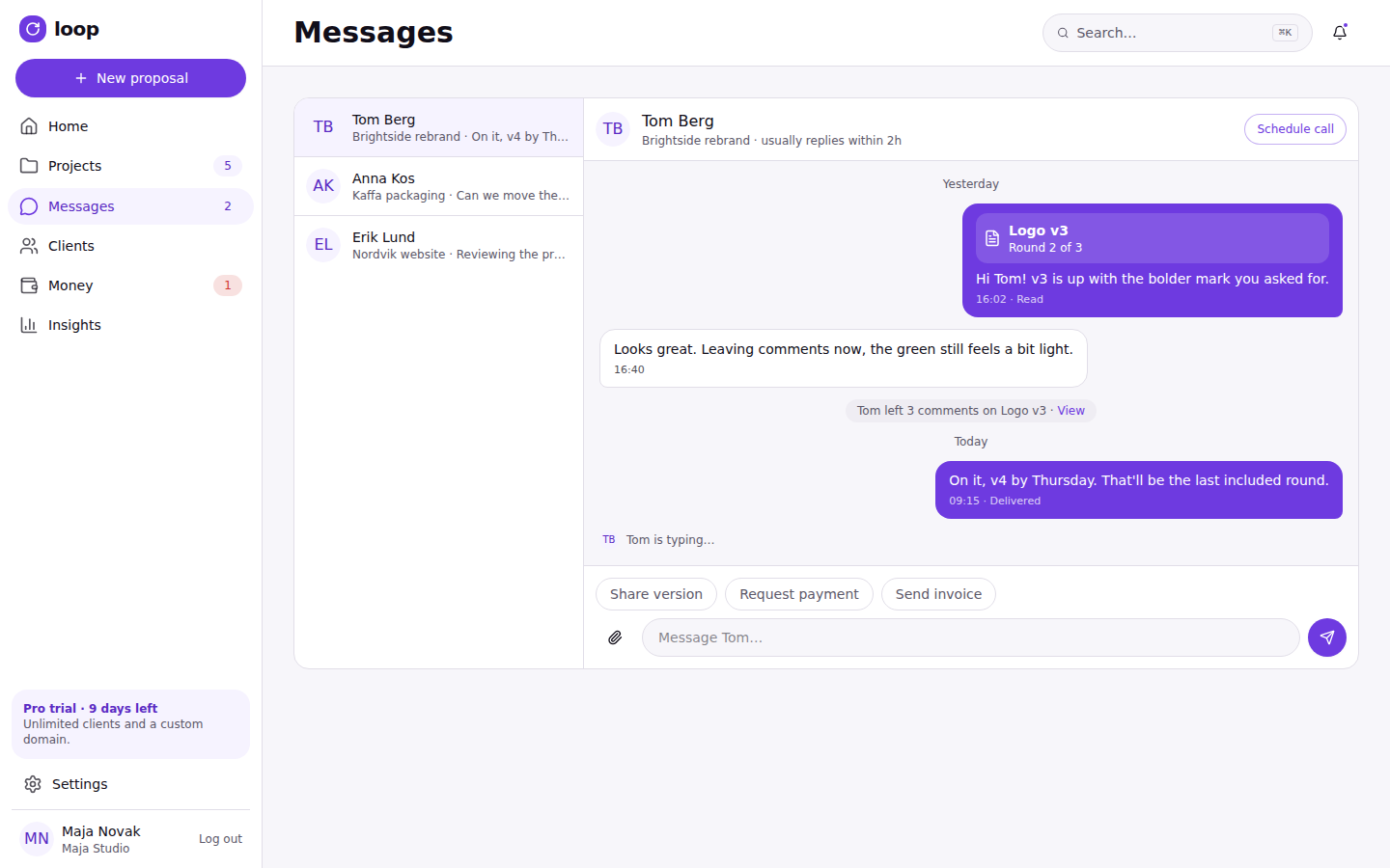
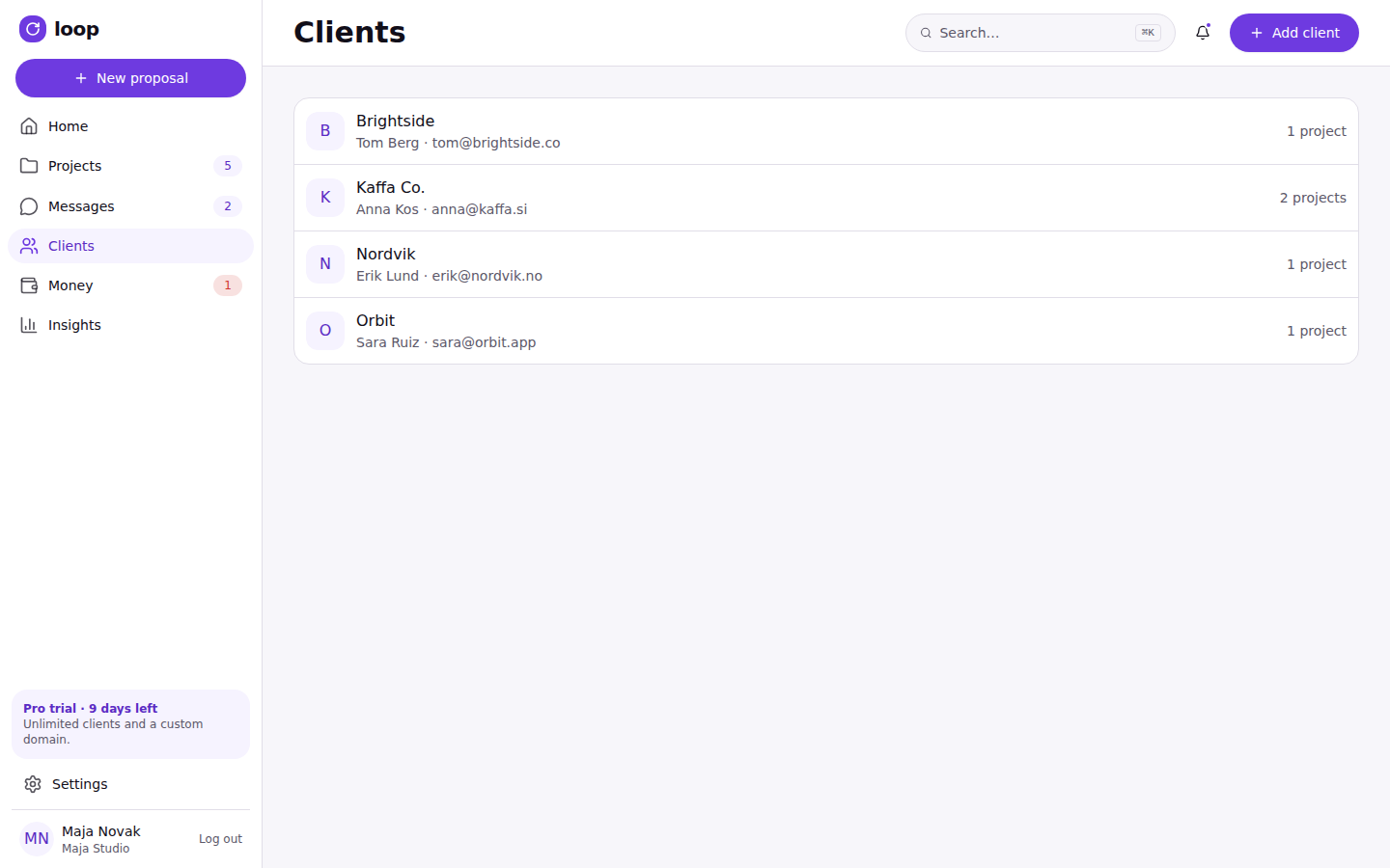
The prototype below is the running build — click it to interact.
What this proves, and what's next
Loop is, at heart, an argument that the fragmentation freelancers deal with — a proposal tool here, an invoicing tool there, a separate place to chase a signature — is a design problem as much as a product-scope one, and that the fix is an opinionated, narrow tool rather than one more all-in-one platform. Carrying that argument from a problem statement through validated flows, a real design system, and a working coded prototype — rather than stopping at high-fidelity mockups — was the point of building it this way: a decision like “clients get a magic link, not an account” only really proves itself once it's a link that opens, on a phone, in an actual browser.
The full range end to end: competitive research, personas and flows, a validated Figma design system, and a coded rebuild that holds up in a real browser at both breakpoints. What's still ahead: extending the notification system beyond its four highest-traffic email templates, and running the usability test plan already written for it — five freelancers, five clients, a target SUS score above 80 — which is the step that will tell me whether “one next action” and the magic-link client flow actually hold up outside the design process that produced them.