Trust is the conversion barrier
Nobody hands over a dog casually. It’s a living thing going off with someone you met in a list. The platforms already running in Lisbon didn’t make that easier: listings scattered, vetting you had to take on faith, and no idea what was happening once the walk started. So owners browsed, bounced, and asked a neighbour instead.
That left me three problems. (1) Get the trust signals in front of people before they give up. (2) Fit two very different users, owners and walkers, into one app without either of them feeling like an afterthought. (3) Make it read as Lisbon, not as a US app with the currency swapped: EUR pricing, Portuguese names, distance-based discovery, and enough languages for a city with as many expats as this one.
End-to-end ownership
I was the only designer on this, so all of it is mine, from the first teardown to the prototype you can click through:
- Discovery — pulling Rover, Wag and Gudog apart, then writing down the assumptions I was working from and the personas I designed against
- Information architecture — 80+ screens across two roles, plus the logic for moving between them
- Design system — 40+ components on shadcn/ui, with the tokens kept in Figma
- Visual design — high-fidelity screens for both Owner and Walker flows, localised to Lisbon
- Interactive prototype — a working React app (Next.js + Tailwind) with live data, real navigation and an AI support bot
- Design-dev handoff — component docs, token specs and flows with notes on them
The prototype below is the running build — click it to interact.
App Flow Walkthroughs
Both sides of the app, screen by screen. Swipe or scroll.
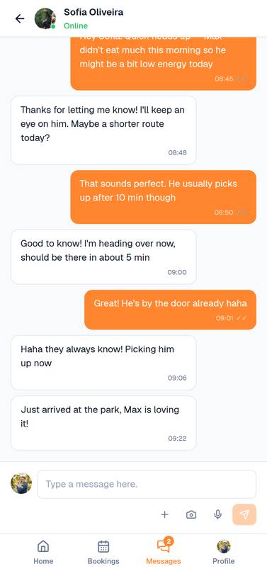
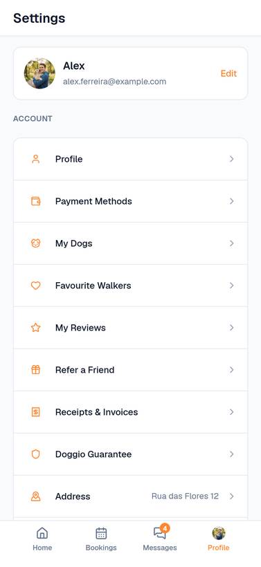
Dog owner flow
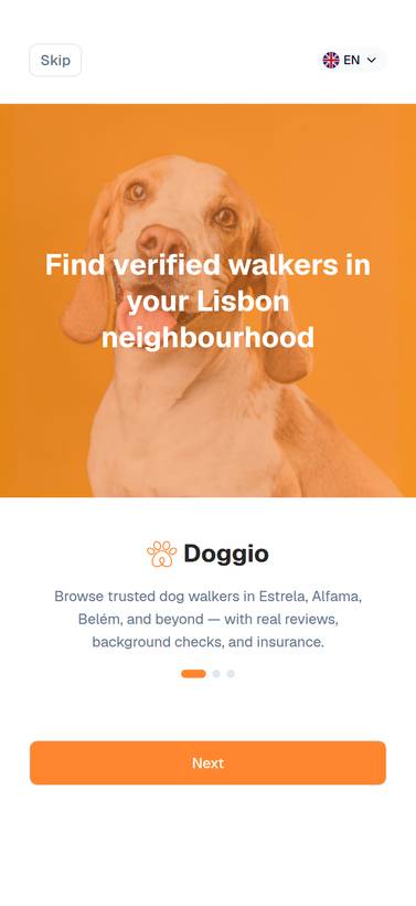
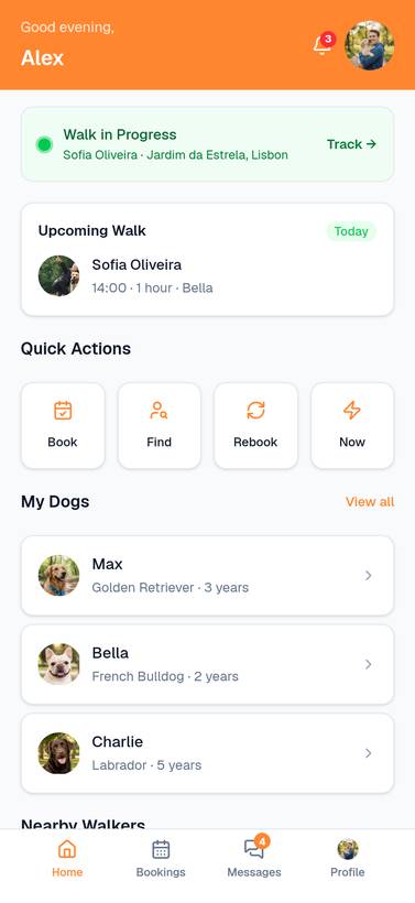
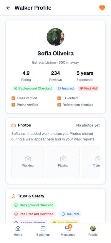
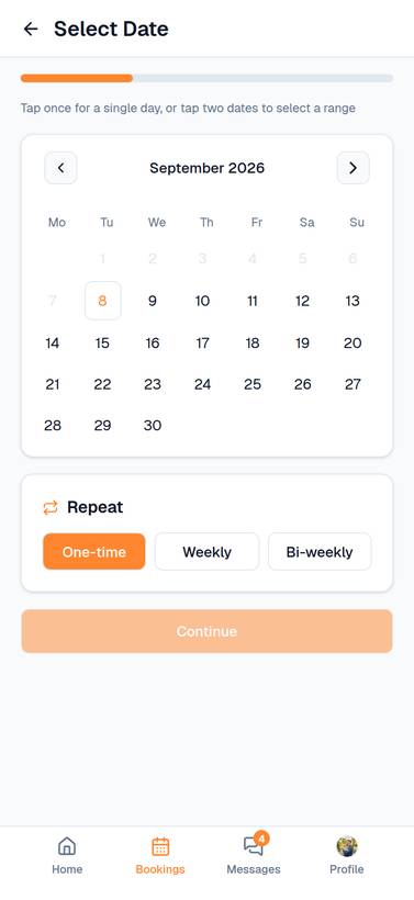
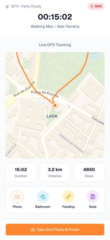
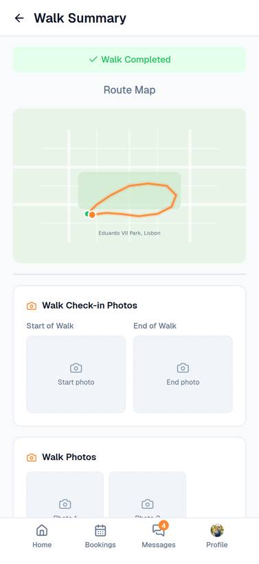
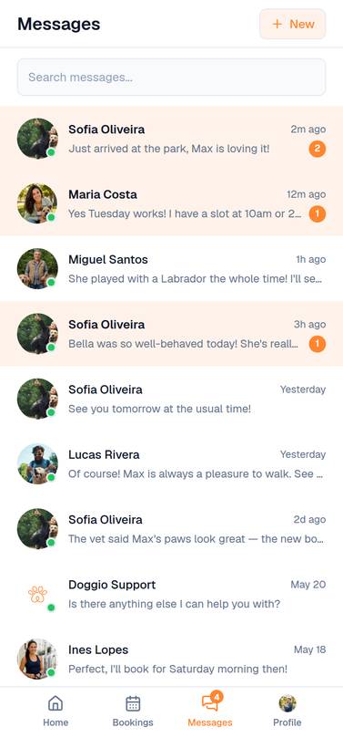
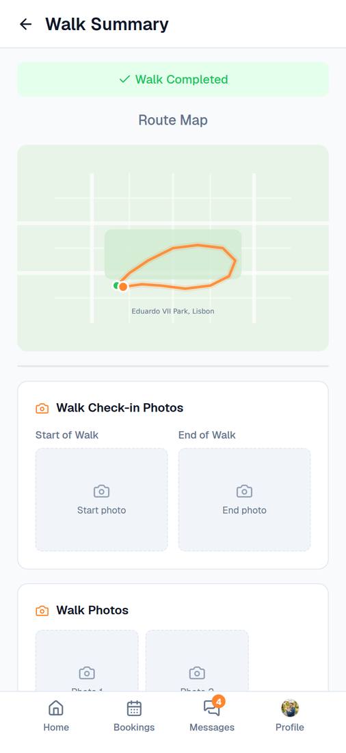
Onboarding, then discovery, booking, live tracking and the walk summary. This is the run the trust signals have to survive.
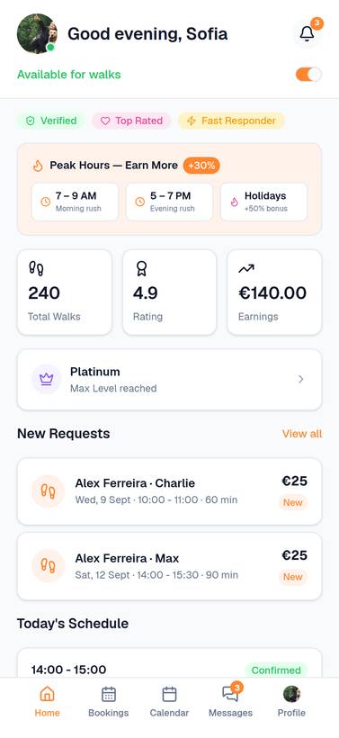
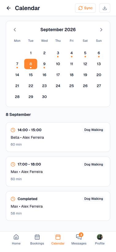
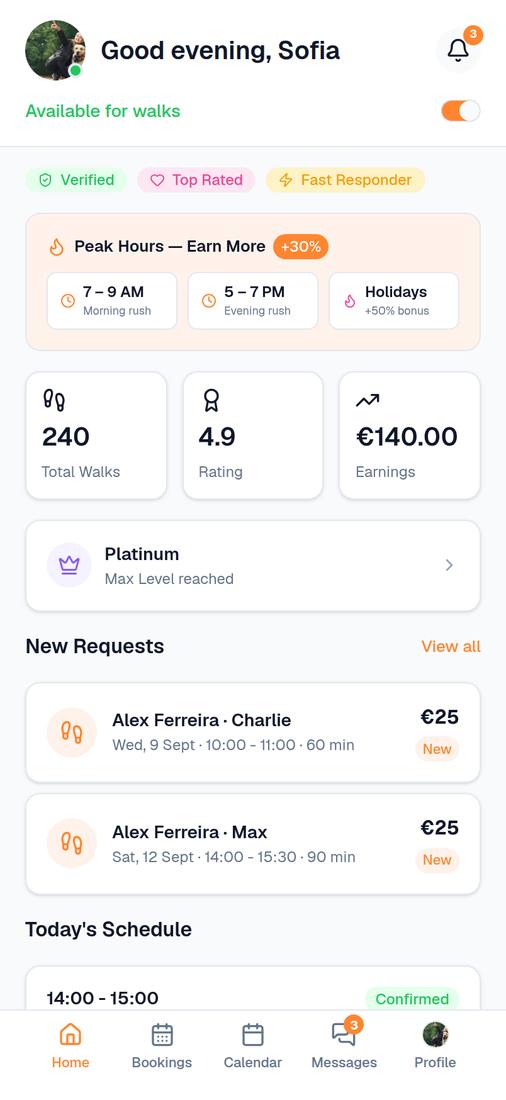
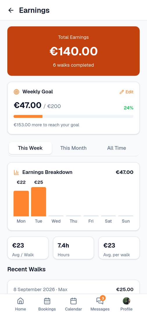
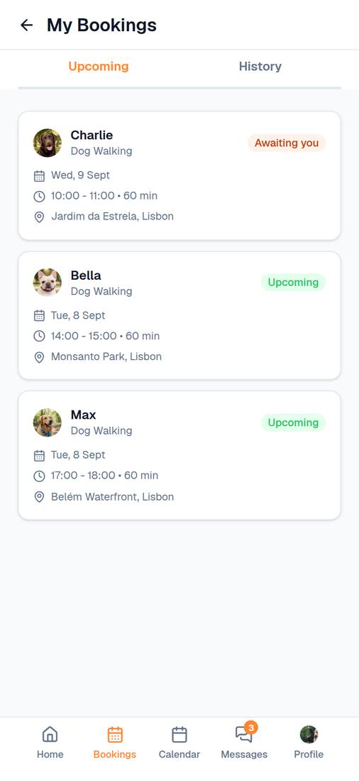
Dog walker flow
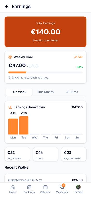
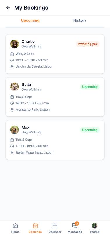
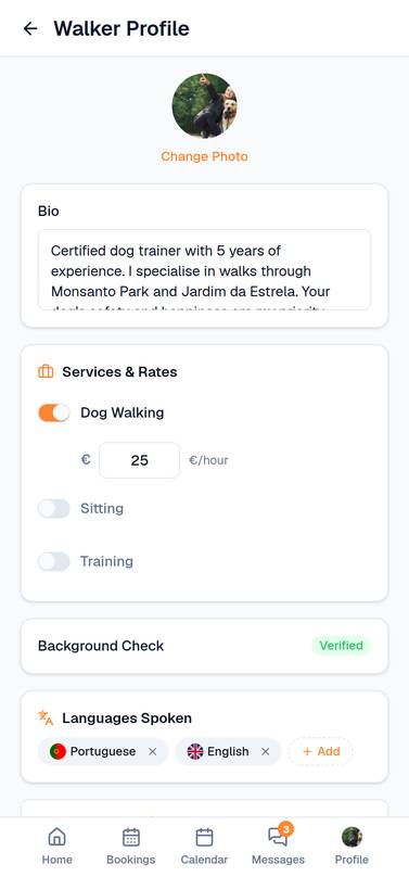
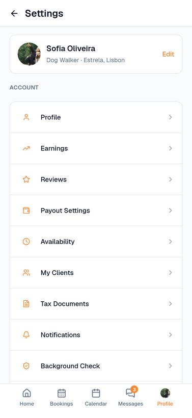
The other side of it: the schedule, the calendar, earnings against a weekly goal, and the bookings themselves.
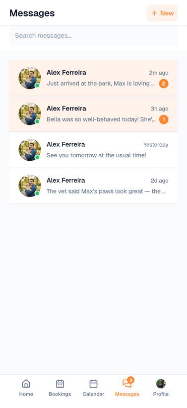
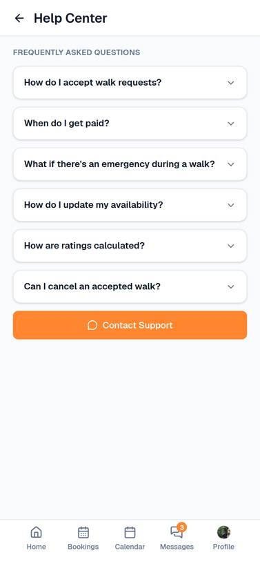
Who I'm designing for
- Find a trustworthy walker within walking distance in Lisbon
- Book recurring walks without friction — in their preferred language
- Track their dogs' walks in real time via GPS
- Manage multiple dogs (Max, Bella, Charlie) with distinct profiles and care instructions
- Language barriers — expat walkers may not speak Portuguese
- Can't assess trustworthiness without meeting in person
- No visibility into what happens during the walk
- Existing platforms don't show distance or availability clearly
- Get discovered by nearby owners through distance-based search
- Display language skills (PT/EN) to attract expat and local clients
- Manage walk requests, active walks, and earnings in one place
- Build credibility through verified badges and reviews
- Competing with unverified, cheaper alternatives on social media
- No way to show qualifications or language skills upfront
- Managing bookings across WhatsApp, Instagram, and phone is fragmented
- No professional tool for walk logging, photo sharing, or reporting
The assumptions this rests on
This is a self-directed concept. I didn’t interview anyone, so none of what follows is a finding. These are the assumptions I designed from, taken off teardowns of Rover, Wag and Gudog and off how marketplaces in neighbouring categories solve the same problems. I’ve written each one so a real study could knock it down, next to what I built on the strength of it:
| Assumption | Design Response |
|---|---|
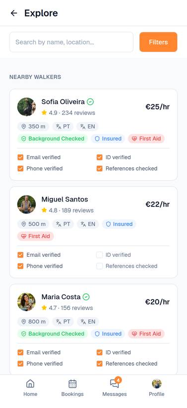
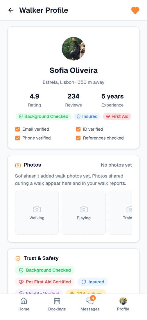
| Trust is the primary conversion barrier for first-time bookings | Verification badges (Email / ID / Phone) sit on the browse card, before anyone opens a profile |
| Users shortlist 2–3 walkers before deciding — comparison is the core browse behaviour | A filter bar that stays put, and price, distance, rating and language all on the card so two cards can be read side by side |
| Language matching is a key comfort factor in Lisbon's multilingual community | Language badges (flag + code) visible on every walker card; dedicated language filter in browse |
| Distance is the deciding factor — owners want walkers within walking distance | Distance is one of the first things on the card, with a radius slider behind it. Every walker sits in a real Lisbon neighbourhood |
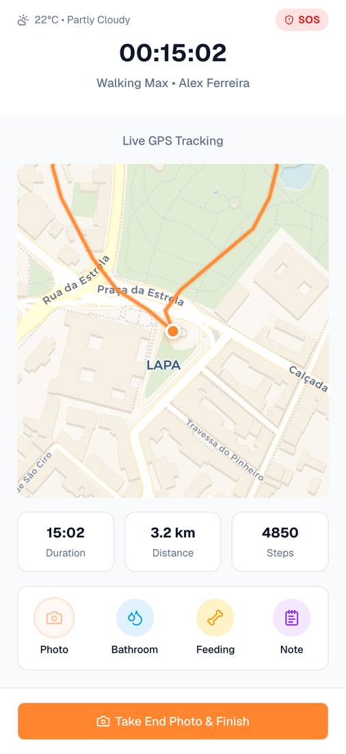
| Owners need real-time visibility into active walks to feel safe | Live GPS tracking: the route on a map, duration, distance, and photos sent while the walk is on |
12 weeks, 5 phases
- Competitive teardown (Rover, Wag, Gudog) surfaced trust gaps
- Assumed language matching matters in a city as multilingual as Lisbon
- Defined dual-role persona model
- Scoped localisation requirements (EUR, distance, 5 languages)
- Mapped 80+ screens across Owner + Walker roles
- Designed 9-step linear booking flow to reduce drop-off
- Defined role-switching logic between flows
- Validated core journey against persona goals
- Built 40+ reusable components on shadcn/ui
- Established design tokens (colour, type, spacing)
- Created language badge & flag switcher patterns
- Ensured Figma library mirrors React implementation
- Designed high-fidelity screens for both roles
- Applied localisation (EUR pricing, Lisbon names, distance)
- Ran consistency audit across 80+ screens
- Surfaced trust signals at browse-card level
- Built fully interactive React prototype (Next.js + Tailwind)
- Implemented AI support bot with guided flows
- Produced design-dev handoff documentation
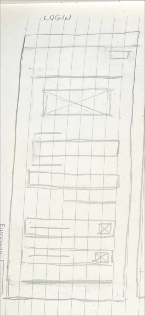
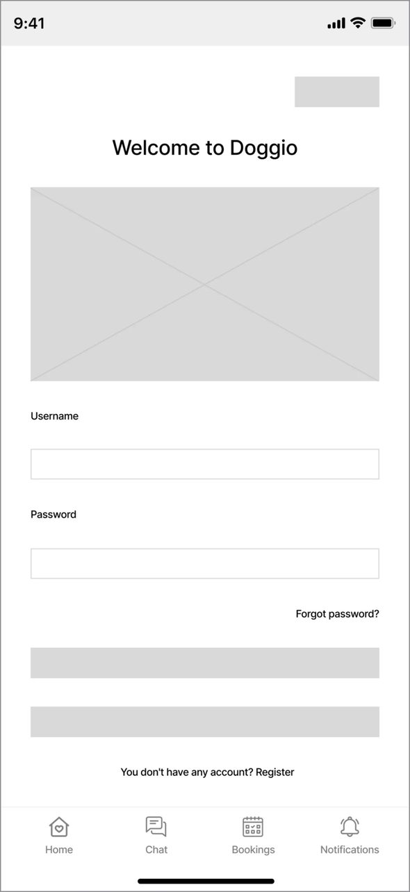
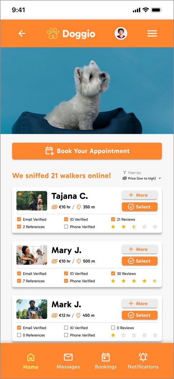
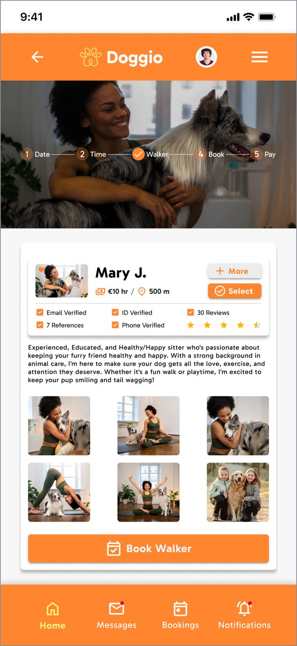
These are working files, not a reconstruction. The high-fidelity walker list specifies distance in metres — “350 m”, “500 m” — which is how I found that the built app was printing the same stored values as kilometres: a regression away from a spec that had been right all along. That fix started as a difference between these files and the running code.
The booking flow
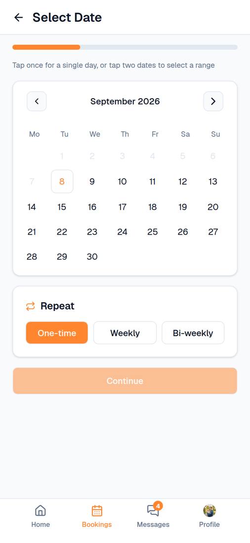
Discovery to confirmed booking is nine steps in a straight line, no branches. Each one asks a single question and nothing else. Nine sounds like a lot until you try putting the dog, the date, the time and the payment on one screen.
Strategic trade-offs
Each of these traces back to one of those assumptions. The five that changed the product most:
| Decision | Rationale | Alternative Rejected |
|---|---|---|
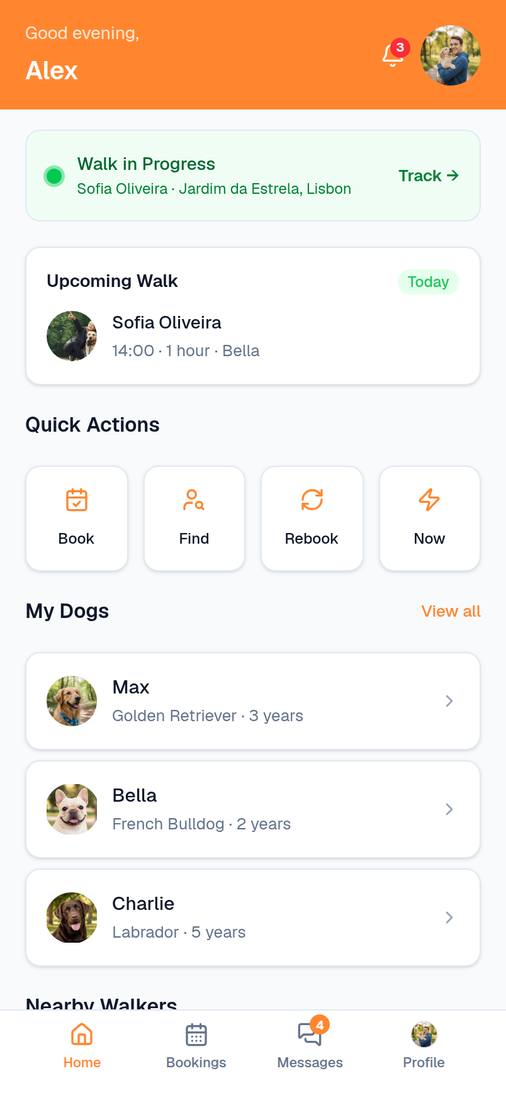
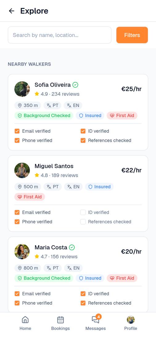
| Trust signals surfaced on browse cards | Shortlisting happens on the cards. In the teardowns, the trust information sat behind a profile tap, which is friction right where the first decision gets made. Putting the badges (Email/ID/Phone) on the card is a bet that losing that tap lowers browse-to-profile drop-off. | Trust info in profile only — most users never reach a profile if the card doesn't earn initial trust |
| Live GPS tracking during walks | My bet for the biggest trust win after the money changes hands. Owners watch their dog's route, get photos, and can message the walker while the walk is still going on. | Post-walk report only — doesn't address real-time anxiety |
| Dual-role app with role switching | I assumed plenty of walkers own dogs themselves. One app with a “Switch to Owner/Walker” control means one install, one login, and half the maintenance of running two products. | Separate apps — doubles maintenance, confuses users who are both |
| Distance-based hyper-local discovery | A walker 8km away is no use to you at eight in the morning, every morning. Distance in metres on every card makes proximity the first filter, which is how people already think about it: “who's in my neighbourhood.” | City-wide list without distance — useless for a service that requires physical proximity |
| Language badges (flag + code) on walker cards | Lisbon has a large expat population, and being able to talk to the person holding your dog's lead matters. Flag badges on the card show who you can actually talk to, without opening anything. | Language info in profile only — requires drilling into every profile to check compatibility |
High-fidelity screens
Visual foundations
Two roles and eighty-odd screens only hold together as a system. Orange carries every primary action, blue is kept for links and system messages, and the neutrals do the rest — so the one orange thing on a screen is always the thing to press. Gabarito runs the whole type scale across five weights, and the icons are Google Material rather than a set drawn from scratch.
Colour
Foundations
What I delivered
Twelve weeks, on my own, from an empty Figma file to something you can actually use on a phone. Here’s what came out of it.
What I learned
Two roles in one app turns out to be mostly a components problem. I couldn’t have held 80+ screens together by hand, and the design system stopped feeling like overhead somewhere around the third screen I hadn’t planned for. The thing I’d carry to the next project is smaller than it sounds: put the trust signals where the first decision happens, on the card, not two taps in. And the gap here is obvious enough that I may as well say it. I never put any of this in front of a real dog owner, so every row in that assumptions table is still an assumption. Next time I’d get something testable out in week three, before the booking flow hardened into nine steps I was already fond of.
Marketplace work where trust is the design problem, not a feature bolted on late. Pricing you can see before you commit, a booking flow that asks one thing at a time, and profile signals placed where they can still change someone’s mind. All of it built out as a React prototype rather than a deck of screens.