Warm precision as design principle
There are three things in MindPeace, all drawn in Figma against one design system. A daily check-in capped at 4 questions, because a longer one gets abandoned. A library of assessments the clinician assigns, rather than a quiz the patient picks off a shelf. And a message thread for the gap between appointments.
The palette had to hold up for both audiences at once, and it's the part I redid most. Deep forest teal carries the clinical half: calm, credible, a bit serious. Burnt orange carries the human half. Sage, cream and mustard sit underneath so the whole thing stays approachable instead of sterile.
- Patient home
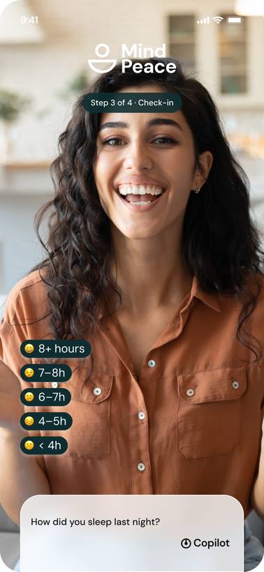
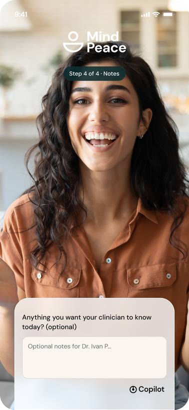
- Daily check-in (mood, energy, sleep, notes)
- Progress
- Assigned assessments (GAD-7 flow)
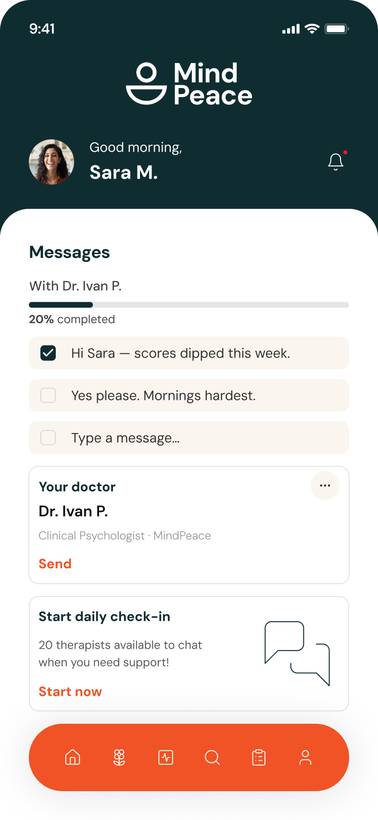
- Messages
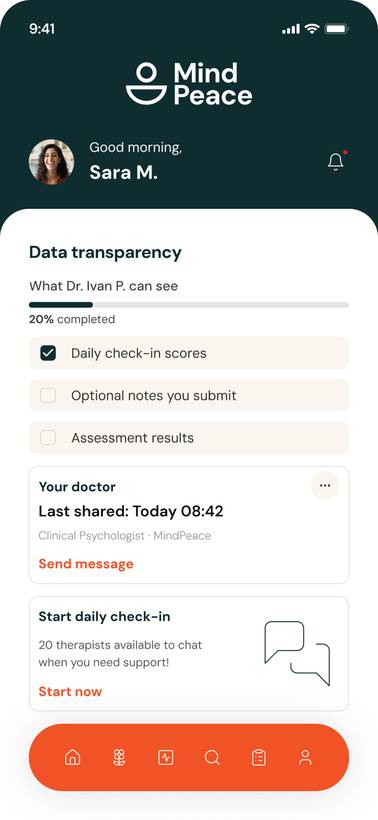
- Data transparency
- Clinician dashboard
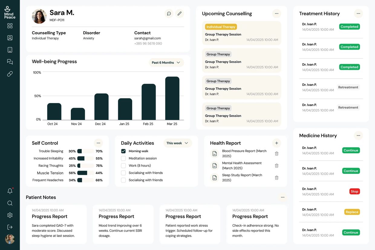
- Patient detail
- Assign assessment
- Results review
- Messaging
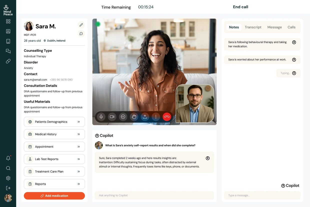
- Video consultation
Designed for two users
- Track mood without it feeling clinical
- Contact therapist between sessions when needed
- Understand her own patterns over time
- Daily check-ins feel like homework if they take too long
- Clinical language makes her feel like a case, not a person
- Worried about who can see her data
- Review patient progress efficiently before sessions
- Identify patients who need urgent attention without reviewing every record
- Export session data for clinical records
- Switching between tools to find patient data
- Patients who don't complete check-ins between sessions
- Consumer apps that clinicians don't trust clinically
The assumptions this rests on
A self-directed concept, so these are not findings from patients or clinicians I spoke to. They come from published work on check-in abandonment and from the validated instruments the product uses — PHQ-9 and GAD-7 — read alongside teardowns of existing mental-health platforms. Each is stated as a claim a real study could overturn, next to what I built on it:
| Assumption | Design Response |
|---|---|
| Daily check-in abandonment is highest when it takes more than 30 seconds | Maximum 4 questions per daily check-in. Full validated scales (PHQ-9, GAD-7) used for periodic formal assessments only. |
| Clinicians distrust platforms showing 'wellness scores' without transparent methodology | Raw data views provided alongside interpreted scores. Clinicians see underlying responses, not just summaries. |
| The between-session gap is when patients most need contact but clinicians are unavailable | Async messaging channel connects patient and clinician outside appointment scheduling — no booking required. |
| Onboarding drop-off is highest when apps ask too much upfront | Progressive disclosure: collect only what is needed for each step. History collected over time, not at registration. |
| Mental health data privacy is a primary concern for patient adoption | Explicit data transparency screen — patients see exactly what their clinician can see, and when it was shared. |
From assumptions to prototype
- Desk research (check-in abandonment, PHQ-9 / GAD-7)
- Competitive teardown
- Persona development
- Dual information architecture
- Core user flows & user stories
- Assessment flow logic
- Colour rationale
- Typography system
- Figma design system & component library
- Patient home + check-in
- Clinician dashboard
- Interaction design (assessment flow)
- Messaging
- Self-walkthrough against the task list
- Copy review
- WCAG accessibility audit
Every screen mapped
Patient-side IA
| Screen / State | Purpose | Key Elements & Decisions |
|---|---|---|
| Onboarding | Setup and progressive consent | Name · Assigned clinician · Condition (optional) · Notification preferences — minimal at registration |
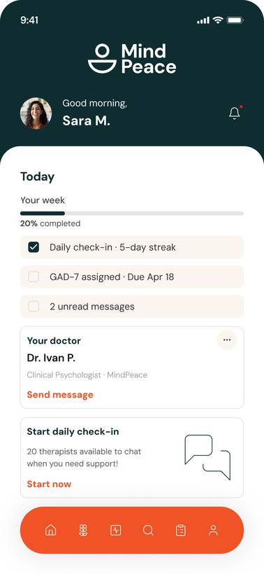
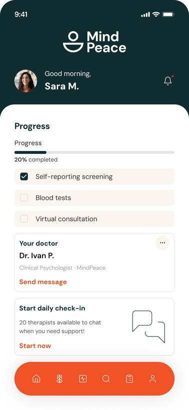
| Home (Patient) | Daily entry point | Today's check-in prompt · Mood trend sparkline · Upcoming appointment · Quick message CTA |
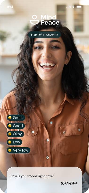
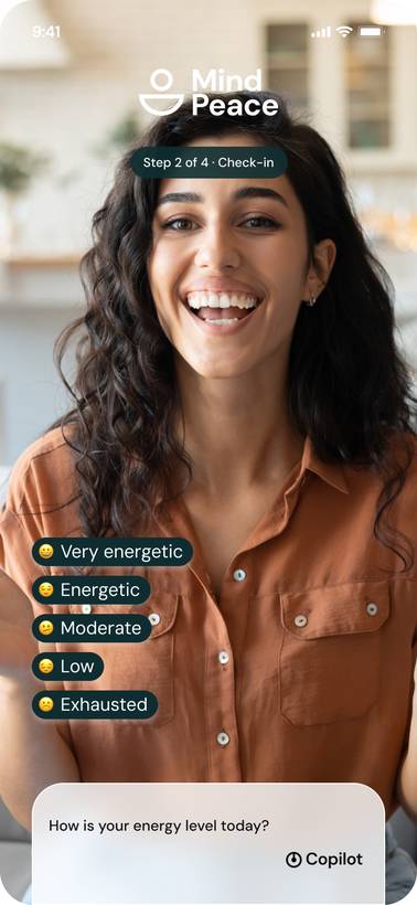
| Daily Check-in | 4-question mood capture | Validated mood scale · Energy · Sleep · Optional notes · target: < 30 seconds to complete |
| My Progress | Personal trend view | Mood over time chart · Symptom frequency · Assessment history · Streak indicator |
| Assessments | Clinician-assigned formal tests | Assigned test list · Completion status · Start / Continue / Review states |
| Assessment Flow | Test completion | Question-by-question · Progress indicator · Save-and-continue · No skipping |
| Messages | Async clinician communication | Thread view · Message input · Read receipts · File attachment option |
| Data Transparency | What clinician can see | Explicit list of shared data types · Last-shared timestamps · Privacy controls |
Clinician-side IA
| Screen / State | Purpose | Key Elements & Decisions |
|---|---|---|
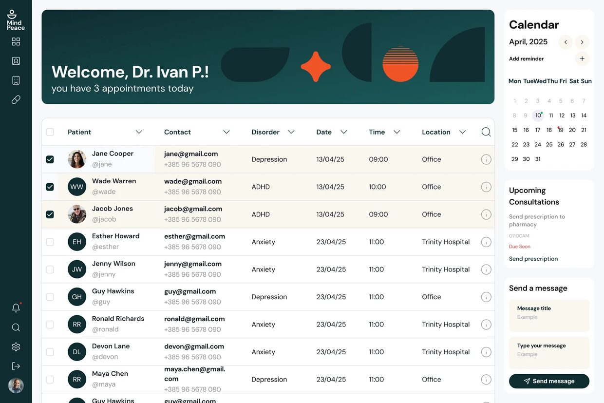
| Dashboard | Patient roster with triage view | Patient list · Last check-in date · Red flags (missed check-ins, high scores) · Search |
| Patient Detail | Individual patient overview | Mood trend · Assessment history · Recent messages · Upcoming appointment |
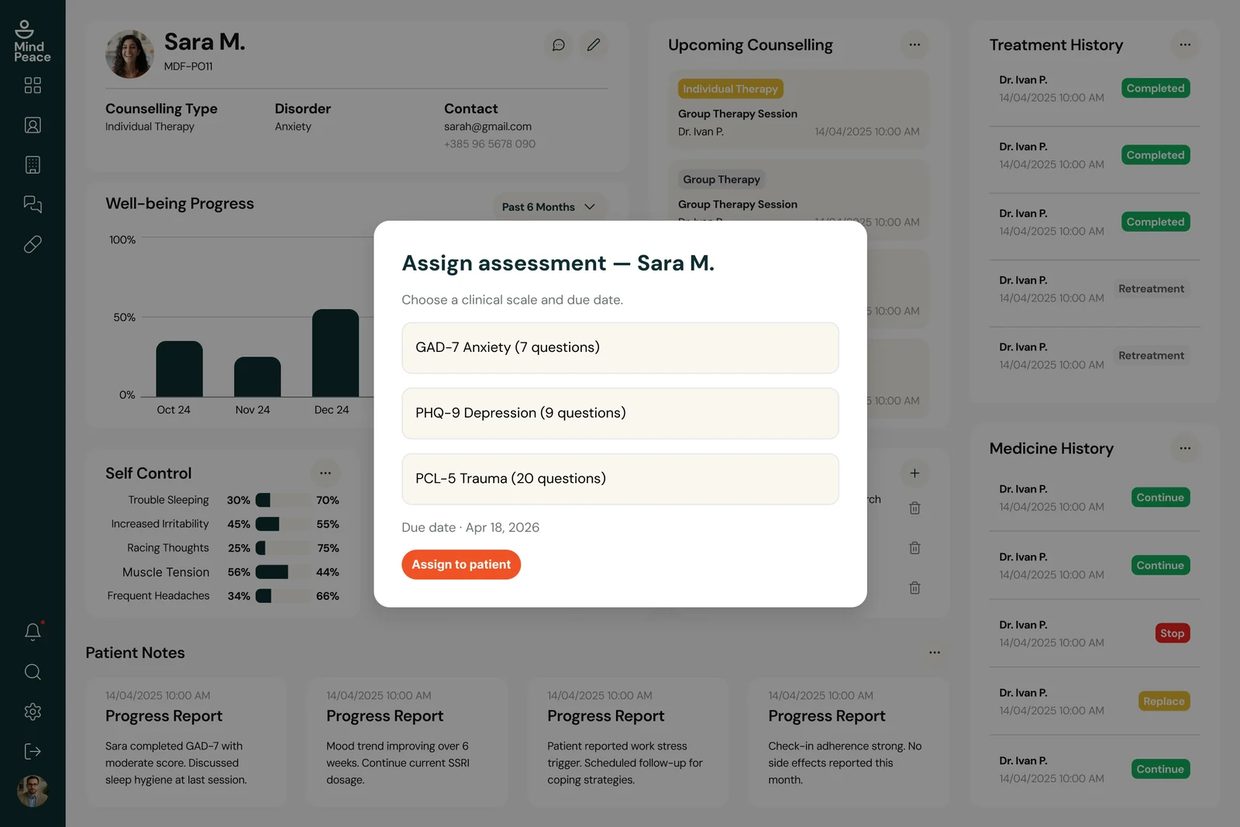
| Assign Assessment | Test allocation to patient | Modal overlay on patient detail · GAD-7 / PHQ-9 / PCL-5 library · Due date · Assign to patient CTA |
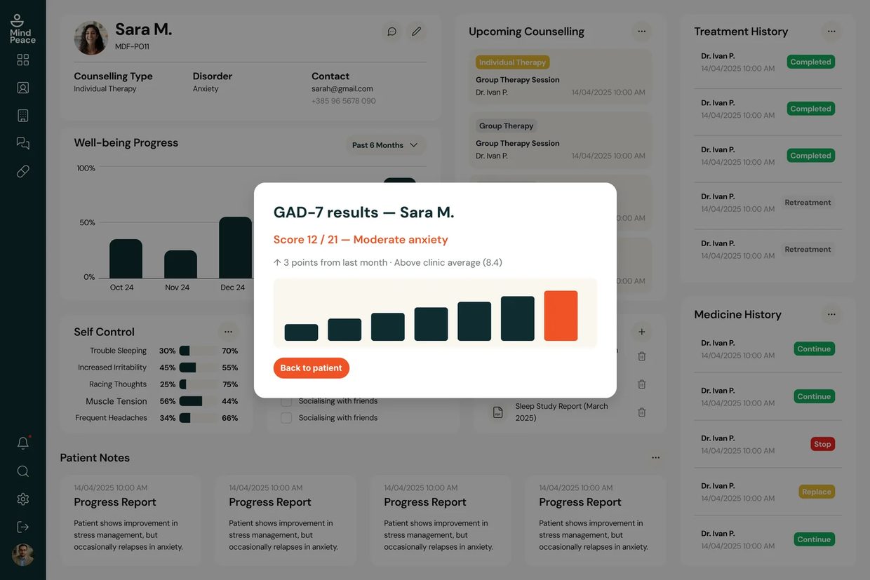
| Assessment Results | Review completed test results | Score with severity band · 90-day trend chart · Normative comparison · Modal overlay on patient record |
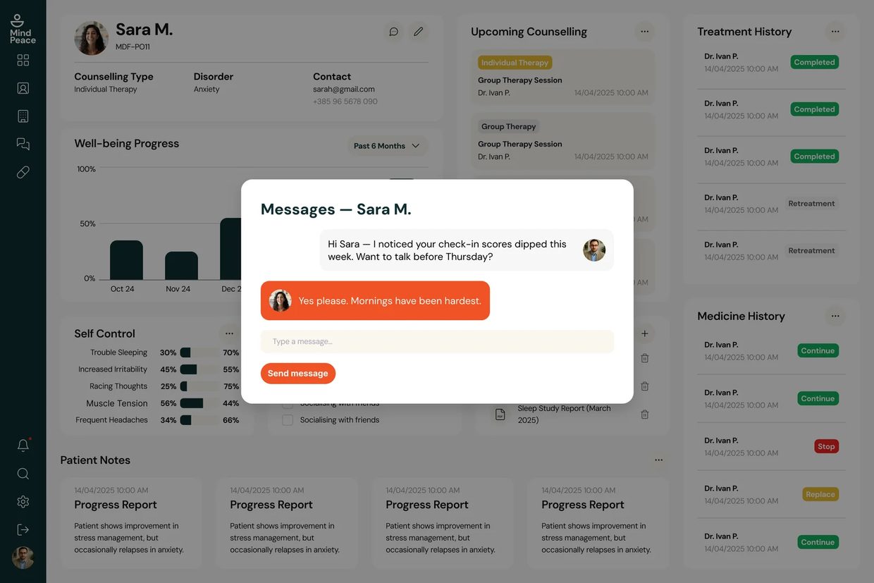
| Messages | Communication with patients | Thread view organised by patient — same model as patient side |
Step-by-step journeys
Interactive flows
The clickable prototype runs in Figma — click it to interact.
The prototype runs both sides end to end. Patient side: home, the mood / energy / sleep check-in, a GAD-7 from intro through submission, messages, data transparency. Clinician side: dashboard, assign assessment, results review, messages, video call. The exported screens further down come out of the same file, so the branding and the demo data match whatever you just clicked.
Every screen in sequence
Screens exported from Figma at 2×, in the order you'd meet them. Click a thumbnail to open it full size.
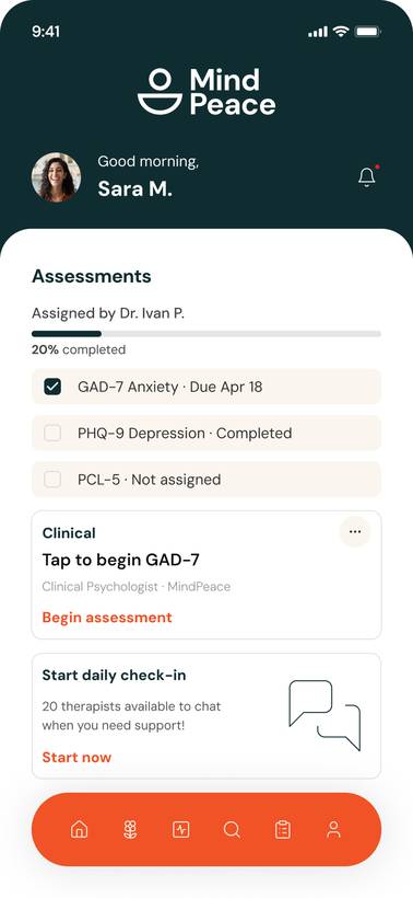
Patient flow — Sara M.
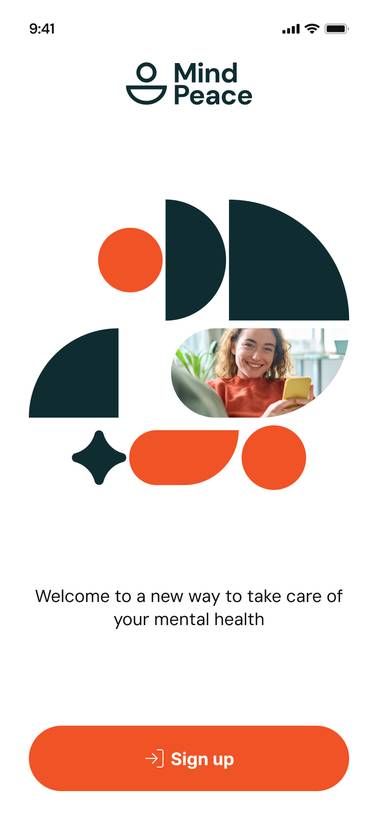
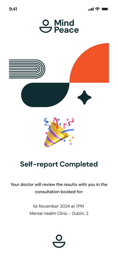
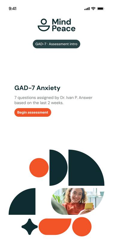
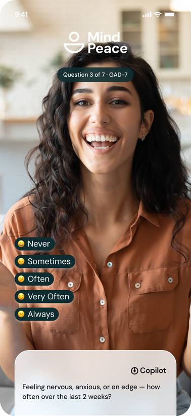
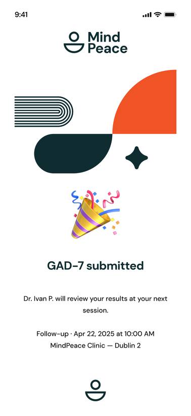
The route Sara takes. Splash and login, home, the four-step daily check-in, progress, the GAD-7 her clinician assigned, messaging with Dr. Ivan P., and the data transparency screen.

Clinician flow — Dr. Ivan P.
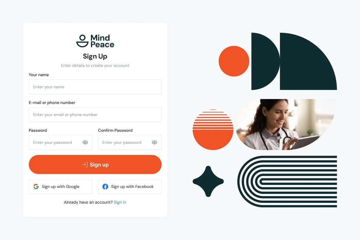
The same data seen from the other side. Roster dashboard, Sara M. patient detail, the assign assessment modal, GAD-7 results with trend, messaging, and an in-session video call.
Every choice justified
| Decision Made | Why — Rationale | Alternative Rejected |
|---|---|---|
| MindPeace palette (forest teal + burnt orange) | Blue/green is the default mental health palette. Deep teal and forest green signal clinical credibility; burnt orange and mustard put the warmth back. I picked it to sit apart from the rest of the category, not because I liked looking at it. | Blue/green — rejected; blends into the saturated wellness app space; purple-forward schemes feel dated in clinical SaaS |
| 4-question daily maximum | Completion rate drops sharply above 4 questions for daily tracking. Full validated scales kept for fortnightly assessments. | Full PHQ-9/GAD-7 daily — rejected; 7–9 questions daily is clinically impractical |
| Flagging system for clinicians | Clinicians triage by need, not alphabetically. The system surfaces patients requiring attention without daily review of every profile. | Chronological list only — rejected; doesn't match how clinicians prioritise their caseload |
| Shared thread model for messaging | One conversation, not two parallel systems. Reduces the clinical distance that patients find alienating. | Separate clinician notes and patient messages — rejected; increases complexity |
| Data transparency screen for patients | Worry about who can see this data is documented and it is reasonable. So the app shows the list on a screen you can open, rather than pointing at a policy. | Privacy policy link only — rejected; no user reads privacy policies |
| Modal overlays on patient detail (assign, results, messages) | Clinicians stay in context of the full patient record while taking action. Reduces navigation depth and keeps trend data visible behind the task. | Separate full-page forms — rejected; breaks continuity and forces clinicians to leave the record they are reviewing |
Brand system
The palette is the part I redid most. Deep forest teal carries the clinical half of the product, burnt orange carries the human half, and sage and cream sit underneath so neither side looks like it borrowed the other's screens. Type is DM Sans across five weights; icons are Lucide.
Colour
Foundations
The targets I designed against
Two audiences, one set of records. Sara wants her week to look like a week. Dr. Ivan P. wants to know which patient to open first on a Monday morning. Most of the work went into making the same data answer both of those without either side getting the watered-down version of the app.
These are targets I designed against, not measured results. I interviewed no patients and no clinicians for this one; the assumptions come from published work and competitive teardowns. It ran from those assumptions through user stories and information architecture to wireframes, a Figma prototype, and responsive layouts for mobile and desktop. It was never built.
What I learned
The colour work is the bit that stuck with me. I started in blue and green, because that is what mental health apps look like, and then I put a screenful of them next to each other and couldn't tell one from the next. Forest teal for clinical credibility, burnt orange for warmth, sage to sit between them. I can defend all three to a clinician and to Sara, and I could only choose them after I'd seen what everyone else had chosen. So now the competitive colour audit happens first, not last.
One healthcare product designed for two people who want opposite things from it. Sara needs it warm and finished in under thirty seconds. Dr. Ivan P. needs it legible across a whole caseload. What's on this page is the working: the assumptions I started from, the IA for both sides, the wireframes, the hi-fi screens, and the design system holding mobile and desktop together.