The whole chain, one person
A regulated medtech company needed one website for two audiences who want different things. Clinicians are evaluating whether a diagnostic tool is credible enough to use on patients. Investors and research partners are assessing whether the company behind it is worth backing. Both need the evidence, but they weigh it differently, and neither should have to wade through the other's material to find theirs.
I did the whole thing: sketches, lo-fi and hi-fi wireframes, prototypes, the Figma design system, the responsive front-end build, a staging environment for review, and deployment.
The brand identity is mine too. The logo I designed is the mark the company now uses — on the site, in its product interfaces and on its conference stand.
Working as the only designer meant every decision had to survive contact with the next stage myself. A wireframe I was vague about became a component I had to build. That closed the usual gap between design intent and what actually ships, and it is the part of this project I would point at first.
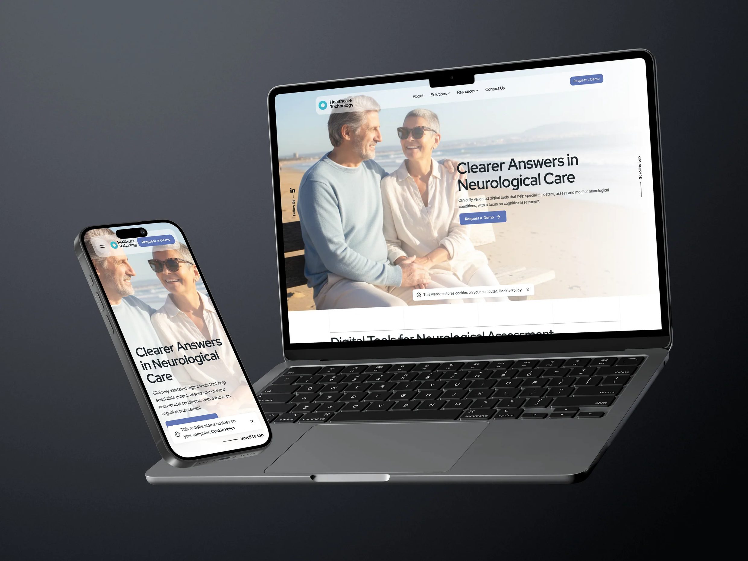
Sketches to deployment
One person, the whole chain. Each stage had to be finished enough that the next one could be built on it without going back.
- Page-level layout options on paper
- Section order and what each one has to prove
- Cheap enough to throw away
- Block layout, heading hierarchy, content order
- Information architecture across the full site
- Mobile-first breakpoint planning
- Figma design system and component library
- Type scale, colour and spacing tokens
- Every template drawn to production fidelity
- Clickable prototypes for desktop and mobile
- Navigation, dropdowns and form states wired up
- Used to walk stakeholders through the site before build
- Rounds of review against the prototype
- Content hierarchy and call-to-action placement reworked
- Changes made in the system, not screen by screen
- Reviews with the founding and commercial teams
- Scientific and regulatory copy verified with the people who own it
- Decisions recorded so they stayed decided
- Staging environment set up for review before release
- Changes checked in place rather than described in a meeting
- A release path that did not touch the live site
- Responsive front-end build of every template
- Interaction and state work: menus, filters, forms
- Accessibility, cross-browser checks and launch
What the site had to hold
A medtech company site is not a brochure. It carries regulated product information, a research evidence base, press coverage and a publications archive, and all of it keeps growing after launch. The structure had to make room for that, and it had to let a clinician and an investor each reach their own evidence without reading the other's.
| Section | What it carries | Design consideration |
|---|---|---|
| Home | Positioning, the product portfolio, clinical validation, awards, conference schedule and contact | Long page, many audiences. Ordered so each block resolves on its own and the page can be entered from any anchor |
| About | Mission, values, research and development, management team, partner institutions | Credibility page. Named people and named institutions do the work, so the layout stays out of the way |
| Solutions | One page per product — features, clinical evaluation, reimbursement, technical and infrastructure requirements, FAQs | The densest templates on the site. Tabbed and accordion patterns so a clinician can reach one table without scrolling past four others |
| Publications | A searchable database of peer-reviewed papers with abstracts, links and BibTeX | Four filter dimensions — year, type, tag, author — plus free text and pagination. The hardest interface problem on the site |
| News articles | Press coverage and announcements, with detail pages | Archive, category and tag filtering, pagination, and a sidebar of recent items that stays useful as the archive grows |
| Contact | General and product-specific enquiry routes, postal address, assistance hours | Separate addresses per enquiry type so messages reach the right team, with one form rather than a choice to make first |
| Global | Navigation, demo request, compliance and certification marks, legal | The certification row is load-bearing in this sector — designed as content, not as a footer afterthought |
The parts that keep growing
Three areas of the site are not fixed pages but systems the company adds to without a designer involved. Those needed to be designed as patterns — a record type, a list state, an empty state, a filter set — rather than as a layout that happens to fit today's content.
The publications database holds peer-reviewed research with abstracts, external links and citation exports, filterable by year, type, tag and author at the same time. The news system carries press coverage with archives, categories and tags. The partner grid and the awards and conference blocks on the home page work the same way. Each one had to look considered at three entries and still work at fifty.
Structure first
Every page began as a lo-fi wireframe: block-level layout, heading hierarchy and the order of the argument, with no colour, imagery or type decisions to hide behind. That is where the dual-path structure was settled — which audience each section speaks to, what it has to prove, and where the two tracks separate. Visual design only started once the skeleton held up on its own.
Six templates, end to end
Home, about, articles, article detail, publications and contact. Click through them below — each page is the full length of the real thing, archived here so this walkthrough keeps working whatever happens to the live site. The two product names are redacted — that work is under NDA — and everything else is the design as shipped.

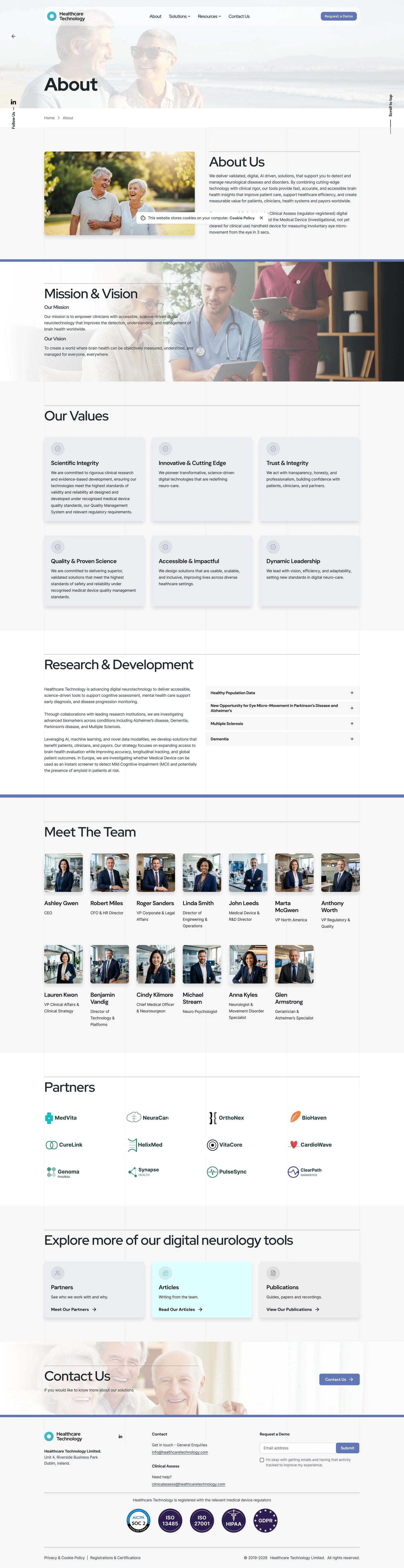

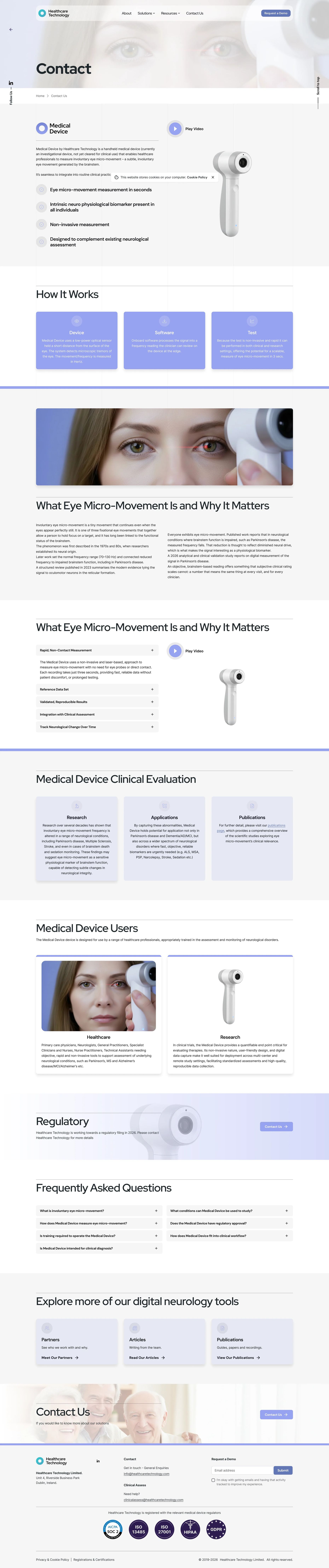
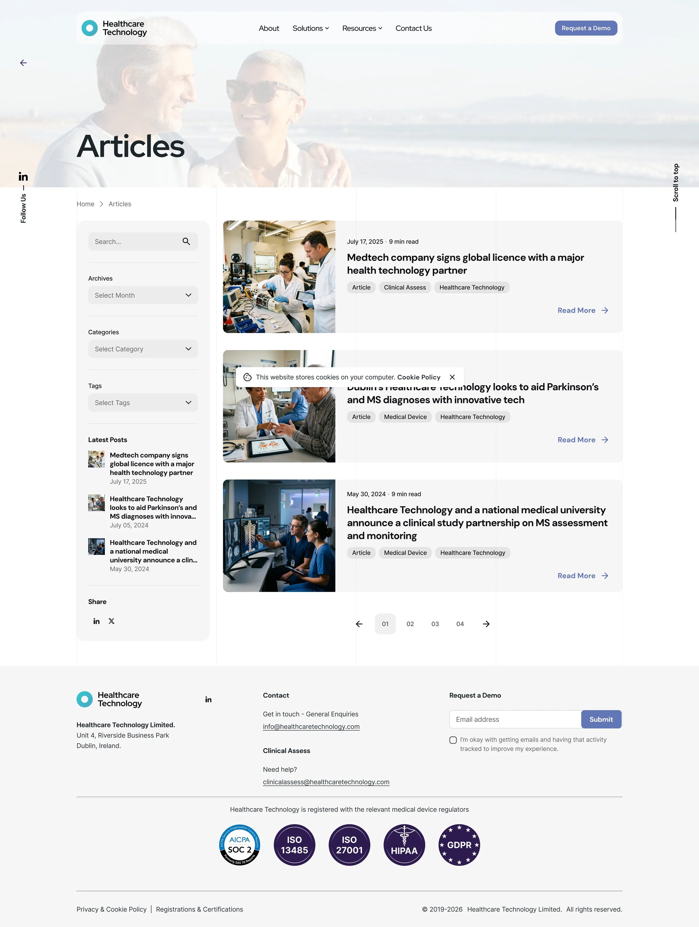
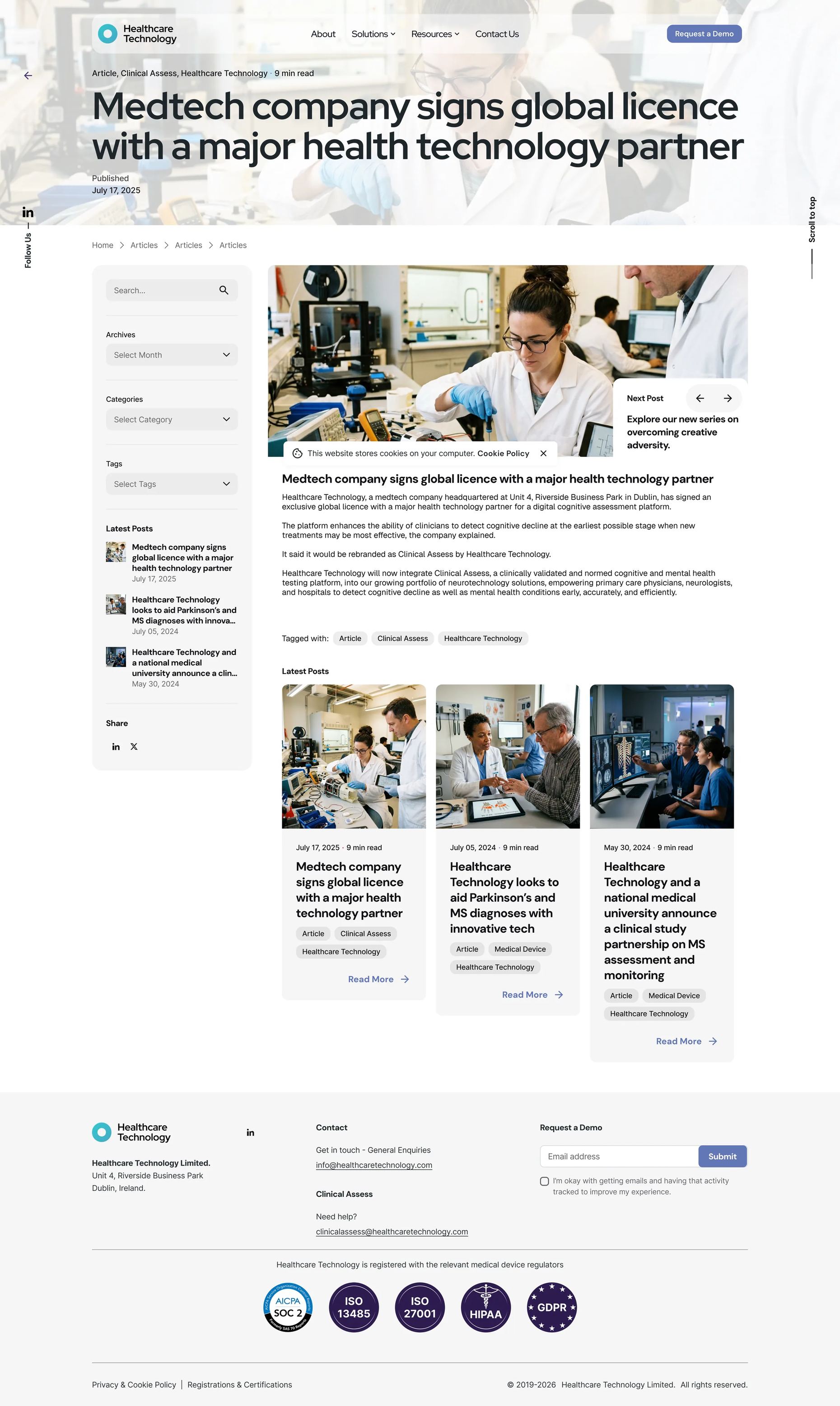
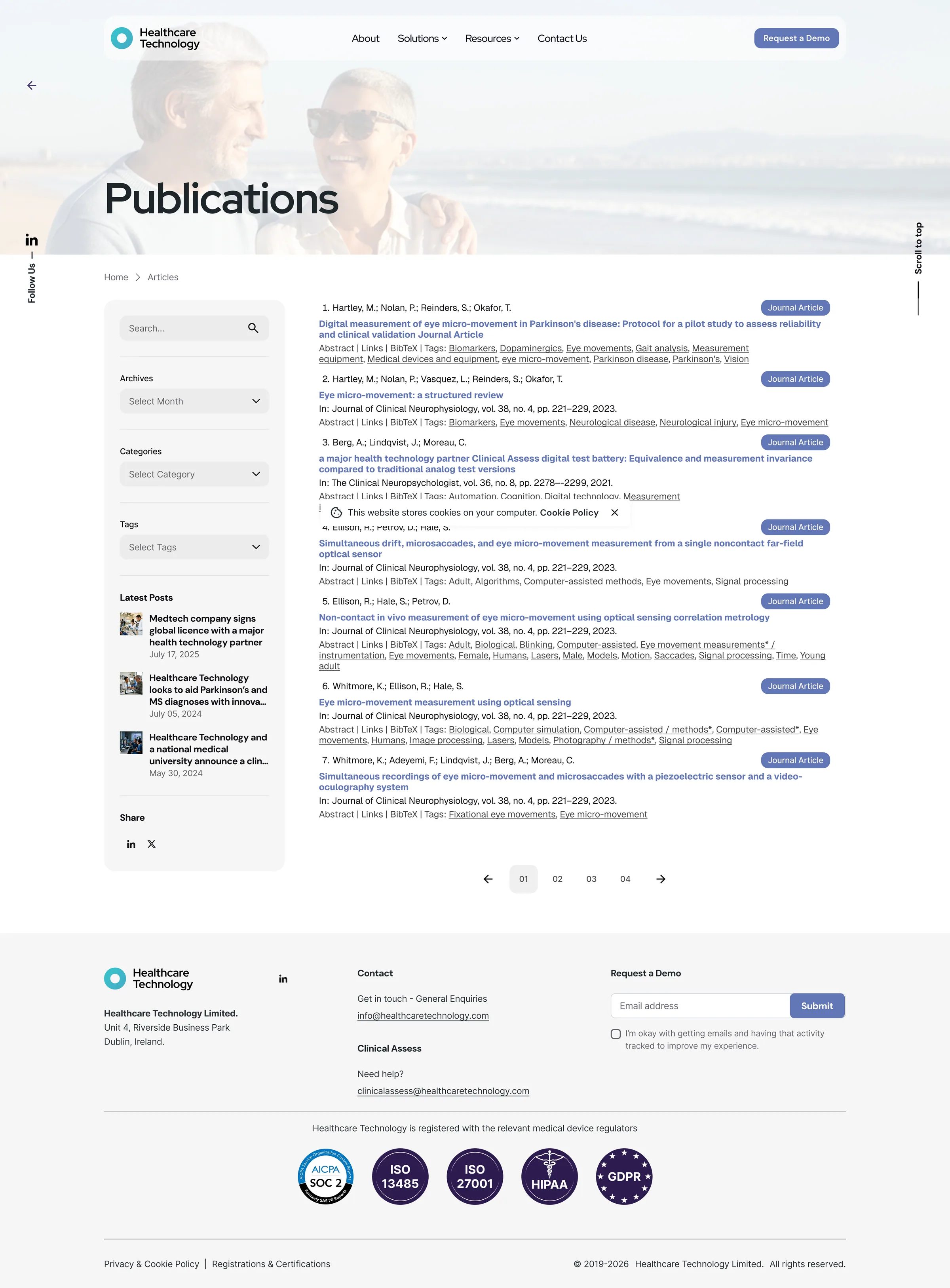
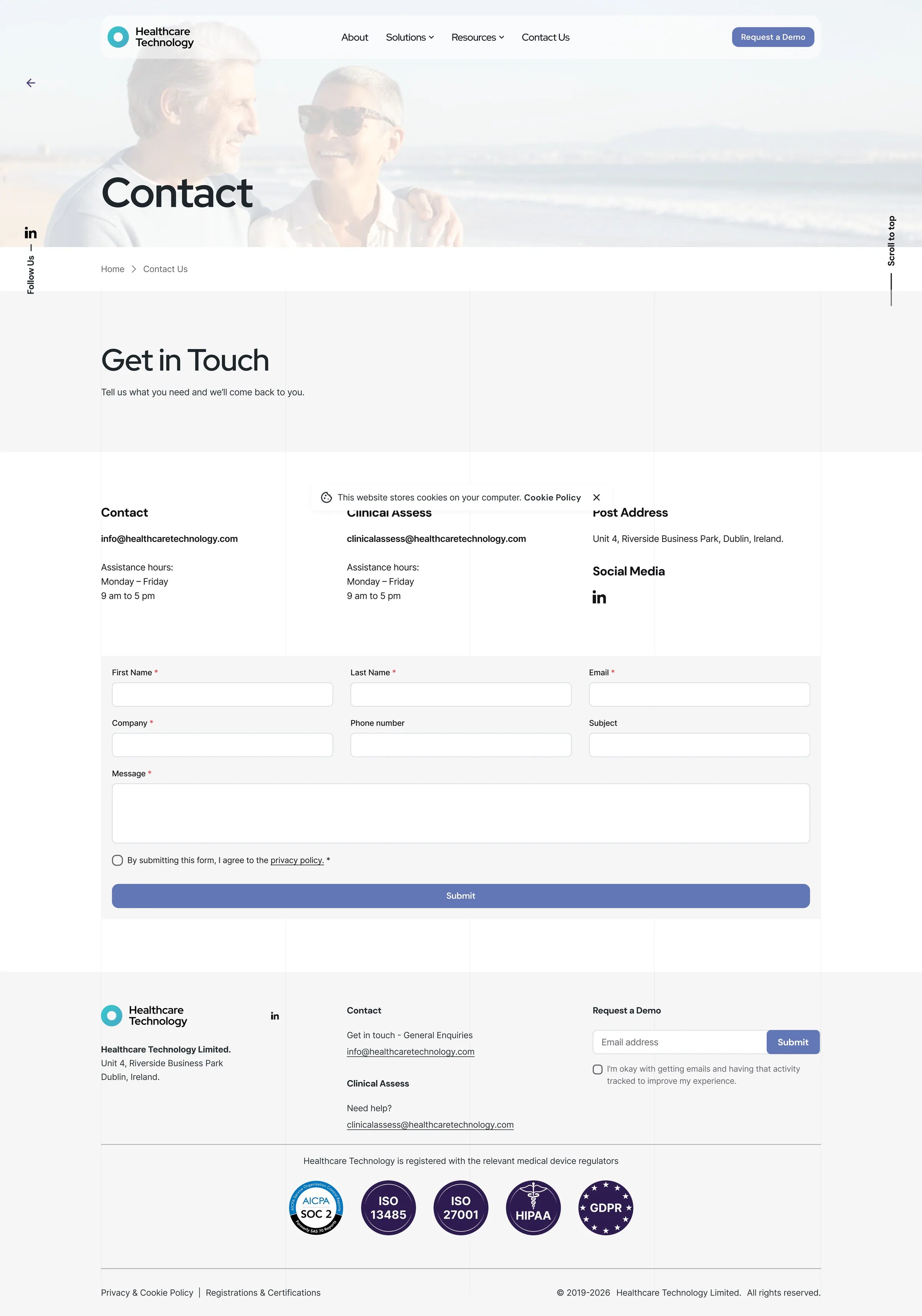
Scroll inside the frame · switch pages above
Click through the pages as they shipped. Client and product names are replaced throughout.
What I shipped
Six page templates — home, about, articles, article detail, publications and contact — and the systems behind them: a publications database filterable on four dimensions at once, a news archive, and the partner and award blocks on the home page. The mark on the site is the logo I designed, and it is still the company's. I built and deployed the front end myself.
What happened next
The site went live and became the company's main digital presence. The parts built as systems rather than pages — the publications database, the news archive, the partner and award blocks — have been added to since without a designer being involved, which was the point of building them that way. The Figma design system and component library remain the reference for the company's digital work.
What I learned
Designing something I then had to build changed how I design. Details I would once have left to the developer — an empty state, a filter with four dimensions active, a card at fifty entries instead of three — became my problem at the next stage, so I started resolving them at the wireframe. I carry that into work I hand off now: the specification is finished when there is nothing left for someone to guess.
The other lesson was about review. Once there was a staging environment, stakeholder conversations stopped being about interpretations of a mockup and started being about the thing itself. Decisions got made faster and stayed made.
Brand identity design, information architecture for content that keeps growing, interface design from sketches through lo-fi and hi-fi to prototypes, a Figma design system, stakeholder management, a staging and release workflow, and the responsive front-end build and deployment behind it — a project taken end to end by one person.