Banking, redesigned
NovaPay is a fintech banking app I built from nothing, in the order I think it should be built: tokens, components, screens, code. No one was going to hand me a style guide for it, so I made one, and then I made the app to find out whether the style guide was any good.
The tension I kept hitting is that a bank has to look like it can be trusted with your money and also let you check a balance in three seconds. Trust tends to mean density. Speed tends to mean taking things away. Most of what follows is me picking a side, screen by screen.
Token-based foundations
Everything sits on Figma variables: colour, type, spacing, radius. I did this first because I've done it the other way round and spent the back half of a project hunting hard-coded hex values. It is about an hour of tedious setup. It pays for itself the first time someone asks for a dark mode.
| Foundation | Details | Purpose |
|---|---|---|
| Colour Tokens | Primary, secondary, success, warning, danger palettes with light/dark mode values | Named by job, not by hue, so the theme can switch and contrast stays checkable in one place |
| Typography | Inter font family · Display, heading, body, caption scales | In a banking app the numbers have to outrank their labels. The scale makes that automatic |
| Spacing | 4px base unit · 8-point grid · Consistent padding and margins | Every gap lands on the same grid, so nothing drifts when a layout changes width |
| Border Radius | 4px (inputs) · 8px (cards) · 12px (panels) · Full (avatars, badges) | Rounded enough to feel current, not so rounded that a bank starts looking like a toy |
20+ reusable components
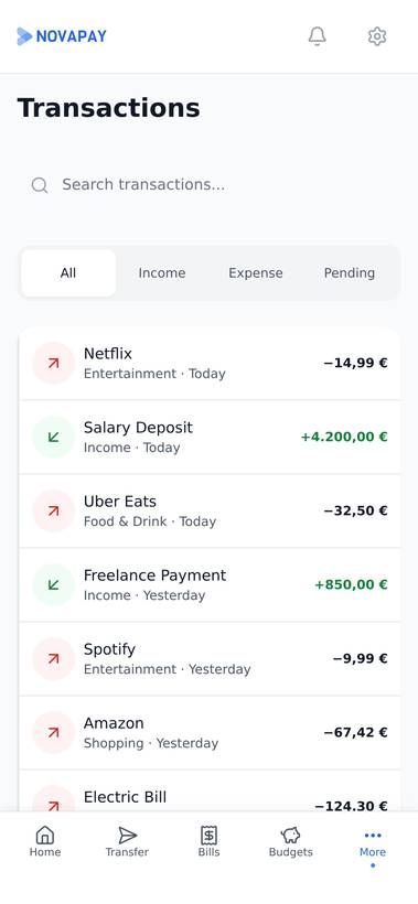
There are 20+ components in the Figma library, all built with variants. The one I redrew most was the transaction row. It has to carry a merchant name, a category, a date and an amount, and at 375px something has to give. I let the merchant name truncate, because that is the part you can usually guess. The amount never does. Every component has default, hover, active and disabled states and works at both breakpoints.
Every screen mapped
| Screen | Purpose | Key Elements |
|---|---|---|
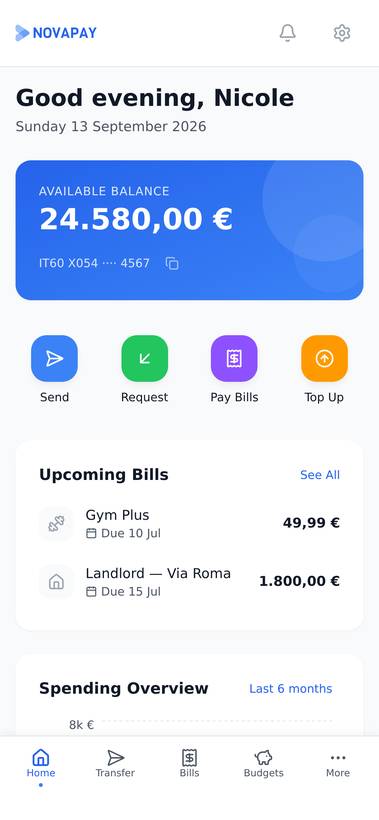
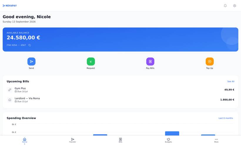
| Dashboard | Financial overview at a glance | Available balance · Account cards · Upcoming bills · Spending overview chart · Recent transactions |
| Transactions | Complete transaction history | Filterable list · Category badges · Date grouping · Search · Amount display |
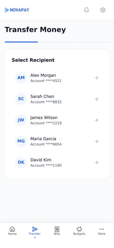
| Transfer | Send money between accounts | Recipient selection · Amount input · Account picker · Confirmation flow |
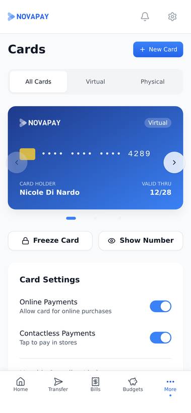
| Cards | Card management | Virtual/physical card display · Card details · Freeze/unfreeze · Spending limits |
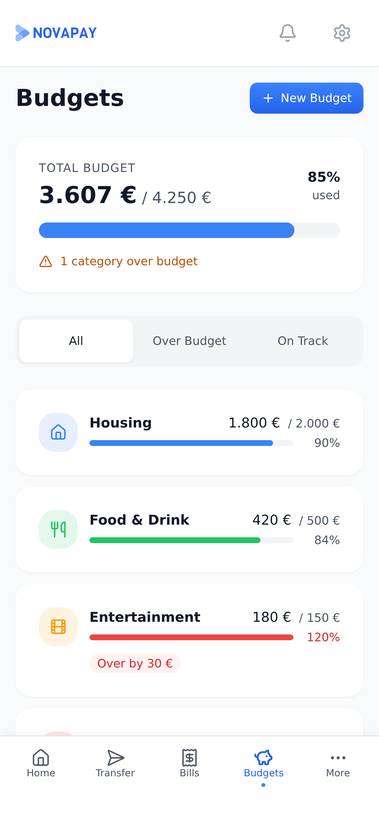
| Budgets | Spending category tracking | Category budgets · Progress bars · Monthly comparison · Overspend alerts |
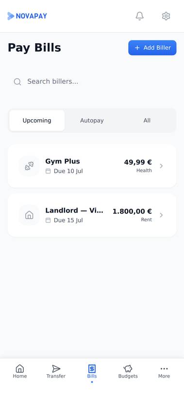
| Pay Bills | Bill payment management | Upcoming bills · Payment history · Auto-pay setup · Reminders |
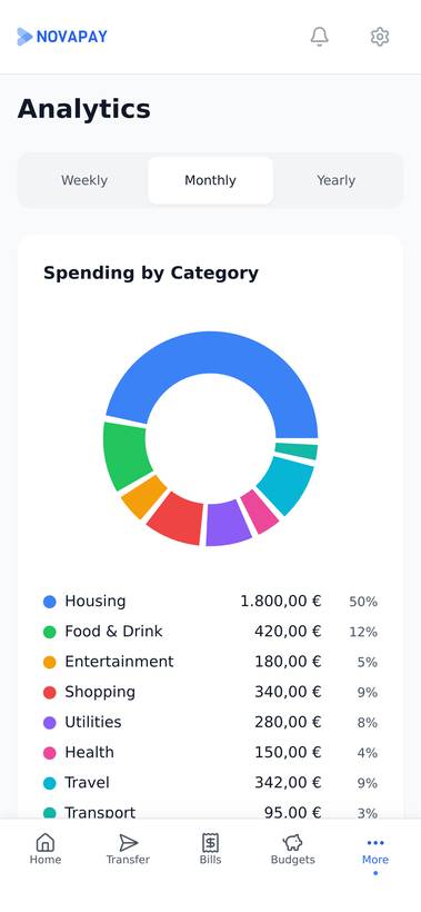
| Analytics | Financial insights & trends | Income vs spending · Category breakdown · Monthly trends · Savings rate |
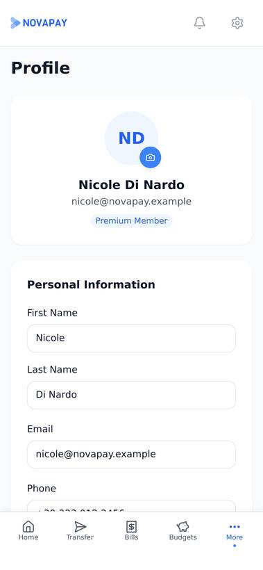
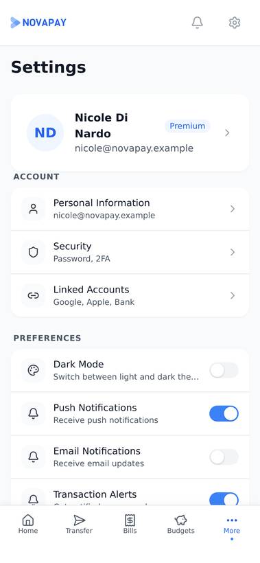
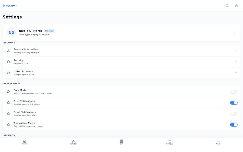
| Profile & Settings | Account configuration | Personal info · Security settings · Notification preferences · Theme toggle |
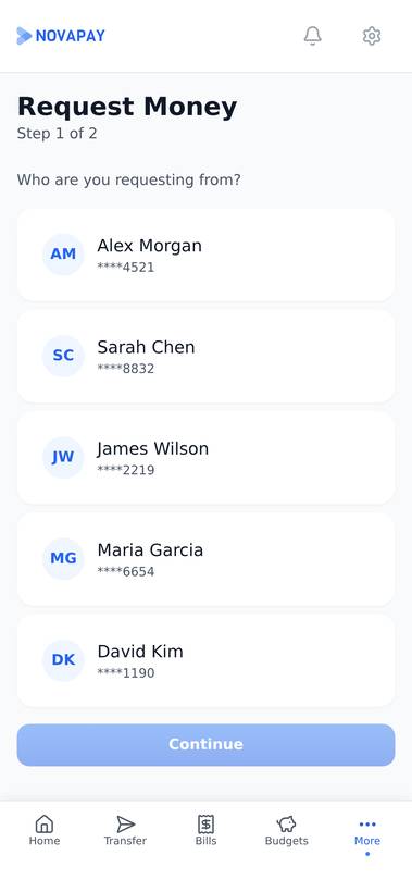
| Request Money | Ask a contact to pay you | Contact picker · Amount & note · Sent vs. invited state |
| Recipients | Saved payees for transfers | Recipient list · Verified/unverified badge · Add new recipient |
| Disputes & Support | Flag and track a disputed transaction | Reason picker · Evidence upload · Status timeline |
| Receipts | Proof of a completed transaction | Itemized breakdown · Share or export · Merchant details |
Eight destinations, mapped as a tree
- NovaPayApp root
- OnboardingLog inSign upForgot passwordOTP verify
- DashboardBottom tab
- TransactionsBottom tabDisputes & SupportReceipts
- TransferBottom tabRequest MoneyRecipients
- CardsBottom tab
- BudgetsSidebar · More
- Pay BillsSidebar · More
- AnalyticsBottom tab
- Profile & SettingsSidebar · More
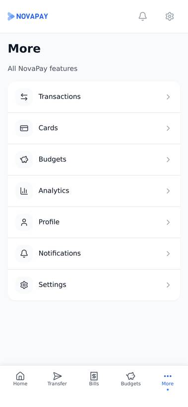
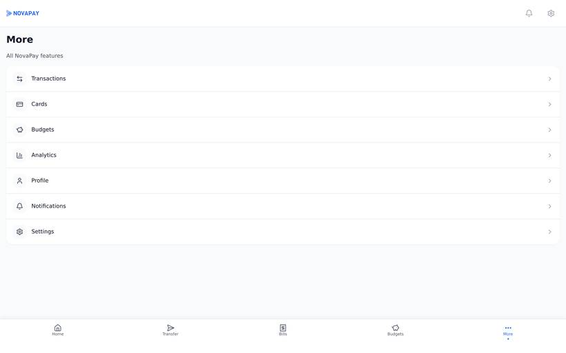
Bottom tab is one of the five icons in the mobile tab bar — Dashboard, Transactions, Transfer, Cards, Analytics. Sidebar · More is the other three: the desktop sidebar has room to list them directly, the 375px build tucks the same three behind a More screen instead. Same eight destinations, two different amounts of space to put them in.
Three flows, followed to the edge
The three flows below cover everything that moves money or asks for it to move: sending, requesting, and disputing. Each is drawn as it actually ships, branch points included — how it can end isn't an afterthought bolted on after the happy path.
Send money
Confirm is its own screen, restating the recipient and amount, rather than a checkbox on Review — the one step in the app that moves money doesn't share a screen with anything else.
Request money
No money moves at any point in this flow — only a request does. The note field exists because “Alex requested $40” with no context reads like a mistake to whoever gets it.
Dispute a transaction
Disputed sits between Submit and either ending — the transaction shows it honestly, as under review, rather than holding the previous status until someone decides.
Designed for what goes wrong
A banking app earns trust in the moments that aren't clean: a transfer still pending, a recipient nobody has verified yet, a card someone froze on purpose. The seven states below are what actually ships; the four cases after them are what the design had to hold up under.
Seven states, one honest signal
Pending and Cancelled share a tone; Reversed and Refunded share another. The label and the icon are what actually tell them apart — colour is the last signal here, never the only one.
The edge cases that decide trust
From concept to prototype
I worked in the order below. It matters more than it looks: tokens before components, components before screens, screens before code. Skip back a step and you end up reconciling two versions of the same card.
- Fintech competitive audit
- User needs analysis
- Feature prioritisation
- Information architecture
- Color token system
- Typography scale
- Spacing & radius variables
- Figma variable setup
- 20+ Figma components
- Variant architecture
- Responsive behaviour
- Interaction states
- 22 mobile screens (375px)
- 19 desktop screens (1440px)
- Dark mode variants
- User flow diagrams
- Next.js implementation
- Tailwind CSS styling
- Framer Motion animations
- Responsive & dark mode
Every choice justified
Here are the calls I made and the ones I turned down. This was a self-directed project with no users to test against, so these are reasoned decisions rather than validated ones. I've kept the rejected column because that half is usually more revealing.
| Decision | Rationale | Alternative Rejected |
|---|---|---|
| Dashboard as financial hub | Most visits to a banking app last ten seconds: how much is in there, what went out, what's due. Putting those three on one screen means the routine visit needs no navigation at all. | A balance-only dashboard. It looks calmer in a portfolio shot and sends you digging for the two things you opened the app for. |
| Token-based design system | One edit to a variable updates all 41 screens, and the light and dark values live next to each other instead of in two separate files. A developer reads the numbers off the variables rather than off my redlines. | Hard-coded colour values. Fine for five screens. At 41 it turns dark mode into a manual rewrite. |
| Mobile-first with desktop adaptation | People bank on their phones. Starting at 375px forced every core flow to survive the tightest space first, and the 1440px versions then spend the extra room on density instead of the phone inheriting a squashed desktop layout. | Desktop-first. The mobile version becomes a compression job, with tap targets sized for a cursor. |
| Dark mode as first-class feature | People check their balance at 6am and at midnight. Dark mode went into the token system on day one, which is the only cheap time to do it, and it saves battery on OLED screens besides. | Light only. Every dark value then has to be invented afterwards, one screen at a time. |
| Lucide icon system | The same stroke weight everywhere, and the same set exists as Figma components and as React components. The icon in the mockup is the icon in the build, with nothing redrawn in between. | Icons pulled from wherever. Stroke weights stop agreeing, and the tab bar is where you notice it. |
Interactive walkthrough
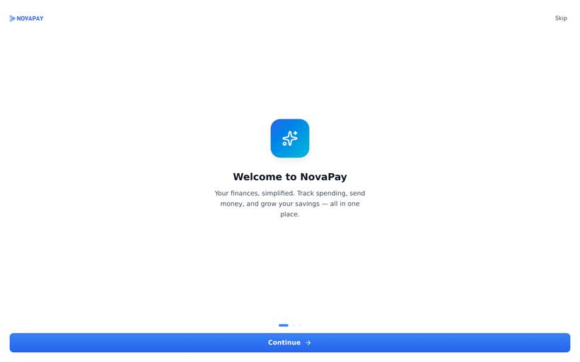
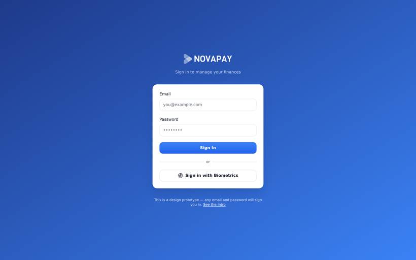
This one you can actually use. Move money between accounts, freeze a card, switch the theme. It's built in Next.js with Tailwind and Framer Motion, and building it is the step that catches what a static mockup hides.
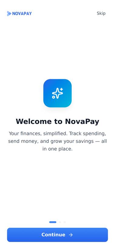
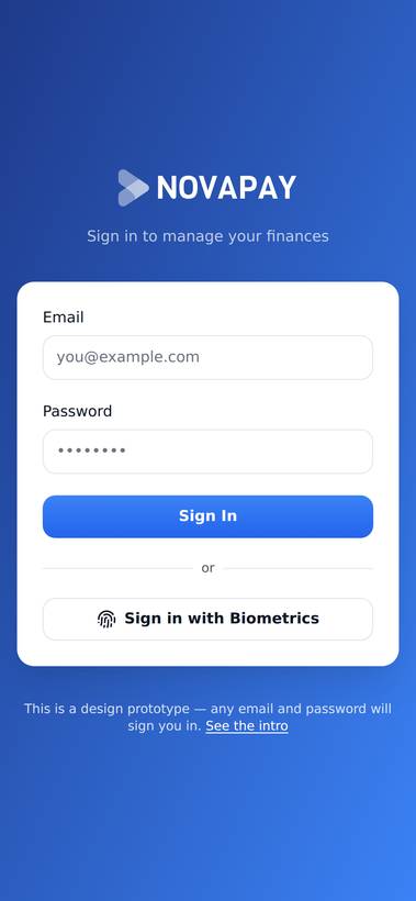
Mobile — 14 core screens
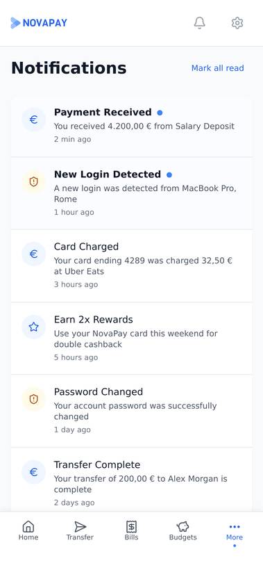
Captured from the running build at 390px. Onboarding through settings, every flow proven end to end.
Desktop — the same system at 1440px
One component library, two densities. Nothing is re-drawn for the wider layout; the grid and the nav adapt.
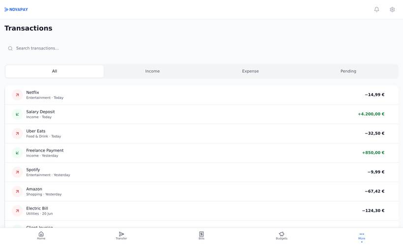
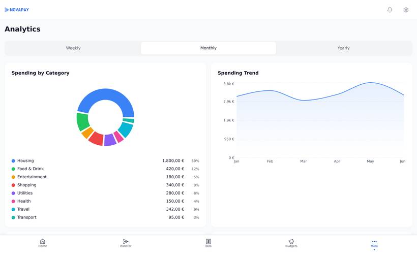
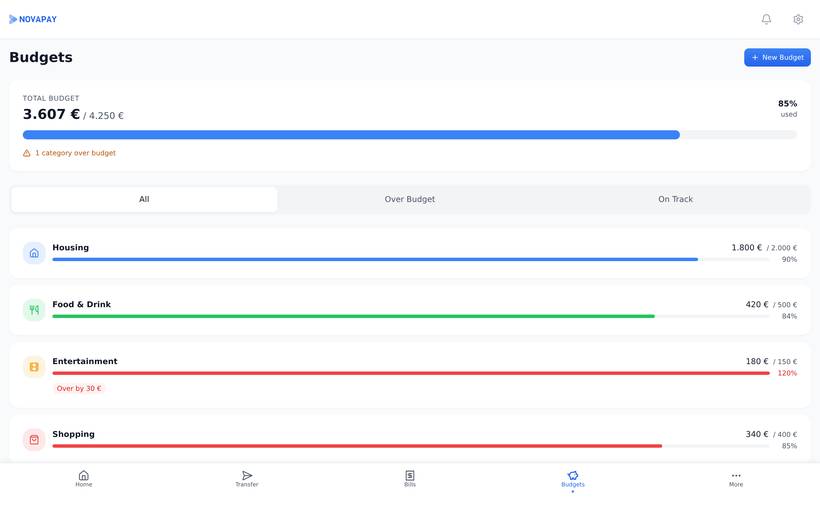
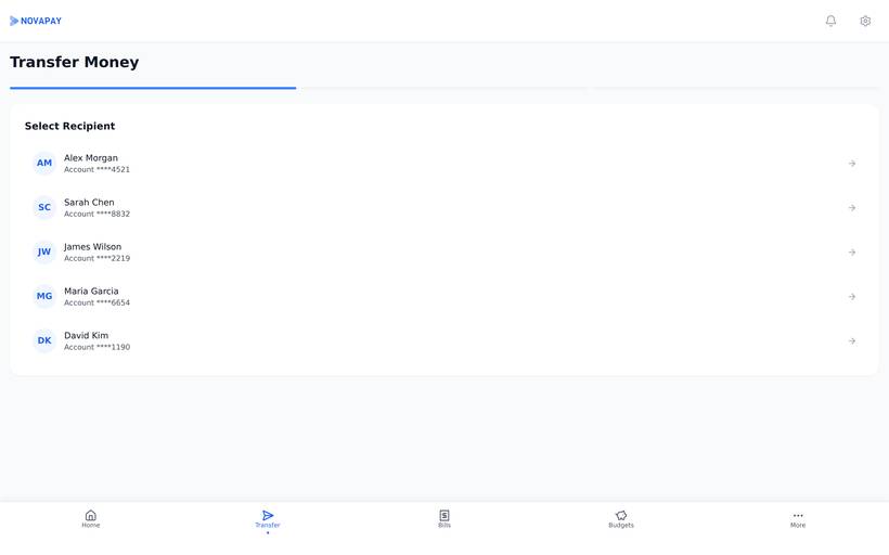
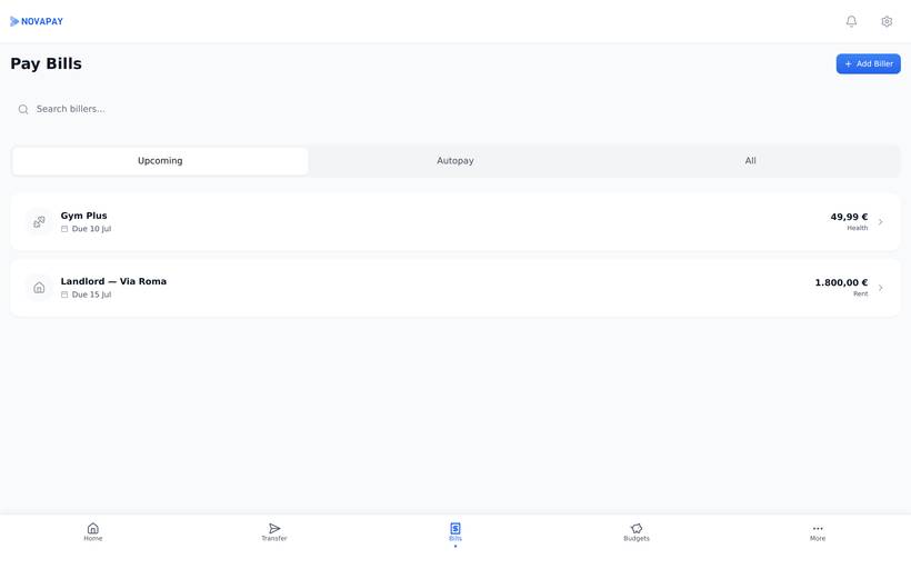
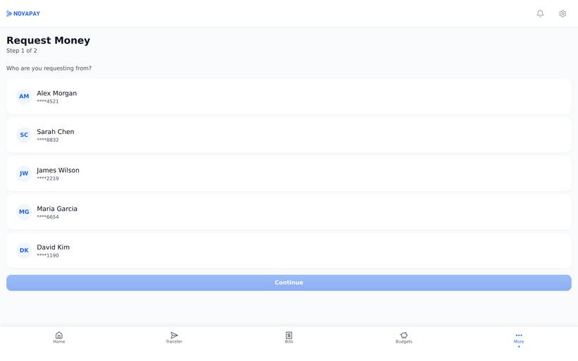
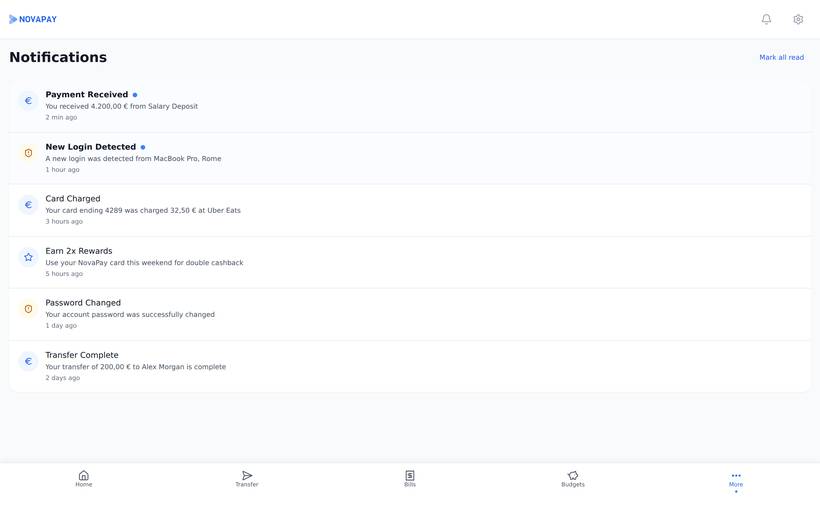
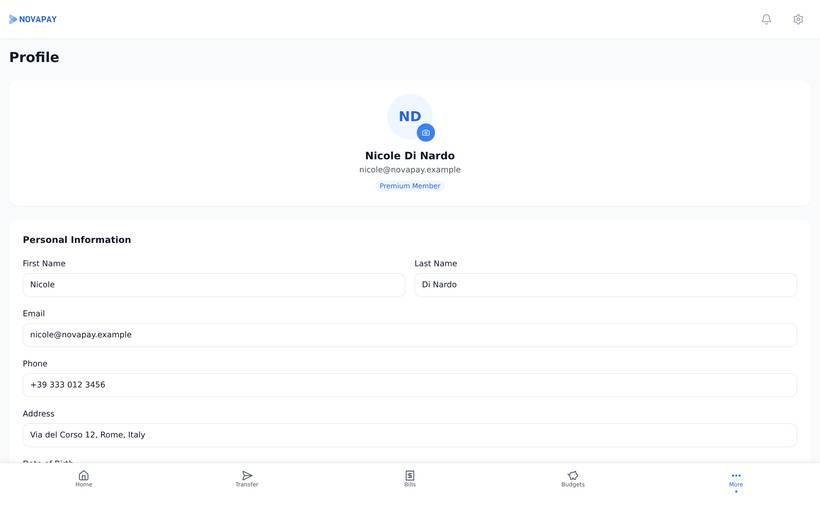
The prototype below is the running build — click it to interact.
From design to code
| Layer | Technology | Why Chosen |
|---|---|---|
| Design | Figma (Variables, Components, Auto Layout) | Variables are the reason. Nothing else I use handles a token-based design system as directly |
| Frontend | Next.js · TypeScript | One route per screen, which matched how the Figma file was already organised. TypeScript for the props |
| Styling | Tailwind CSS | The spacing and colour utilities map almost one to one onto my tokens, so the code reads like the design file |
| Animation | Framer Motion | Page transitions and chart reveals without hand-writing keyframes for each one |
| Icons | Lucide React | The same set as the Figma file, so no icon had to be traced or swapped for a near match |
Visual foundations
What the system covers
I did all of it: the tokens, the components, 41 screens, and the code underneath them. The last part is the one I'd point at. Plenty of design systems look consistent in Figma and come apart the moment someone builds them, and the only way I know to find out is to build it yourself. What I can't tell you is how real customers used it. Nobody did. This was self-directed, so it shows the craft, not the outcome.