People launch fast, then fall off a cliff
For a first-time small-business owner, the moment right after “Publish” is the moment it stops being fun. There are fifty things they could do and nothing tells them which one matters. So they do a burst of work at launch, then nothing for weeks.
For a subscription business, that silence has a price. No visible results means no perceived value, and no perceived value turns up months later as a non-renewal . The steepest drop in the lifecycle sits between publishing and making a first improvement, so that’s the gap I went after.
How I’d earn conviction
This is a self-directed concept, so there’s no research behind it yet. What follows is the study I’d run before asking a team to build it. It starts with 12 interviews with owners 2–16 weeks post-launch, to hear what they actually did after publishing. Then funnel and cohort analysis mapping publish → improve → renew, session replays of the post-launch dashboard, and tagged cancellation reasons, because what owners tell me in a room and what they do on a Tuesday night are rarely the same thing.
The concept rests on four assumptions. Each one is a claim that study would confirm or kill:
Two moments the product exists to change. I wrote them as scenarios, not findings. Nobody said these to me:
“I spent the whole weekend building the site, hit publish — and then just sat there. Nobody tells you what comes next.”Illustrative scenario · owner, three weeks after launch
“I paid for a full year. Two months in with no visitors, I assumed it wasn’t working and let it lapse.”Illustrative scenario · the churn this concept targets
One next move. Every week. Proof it worked.
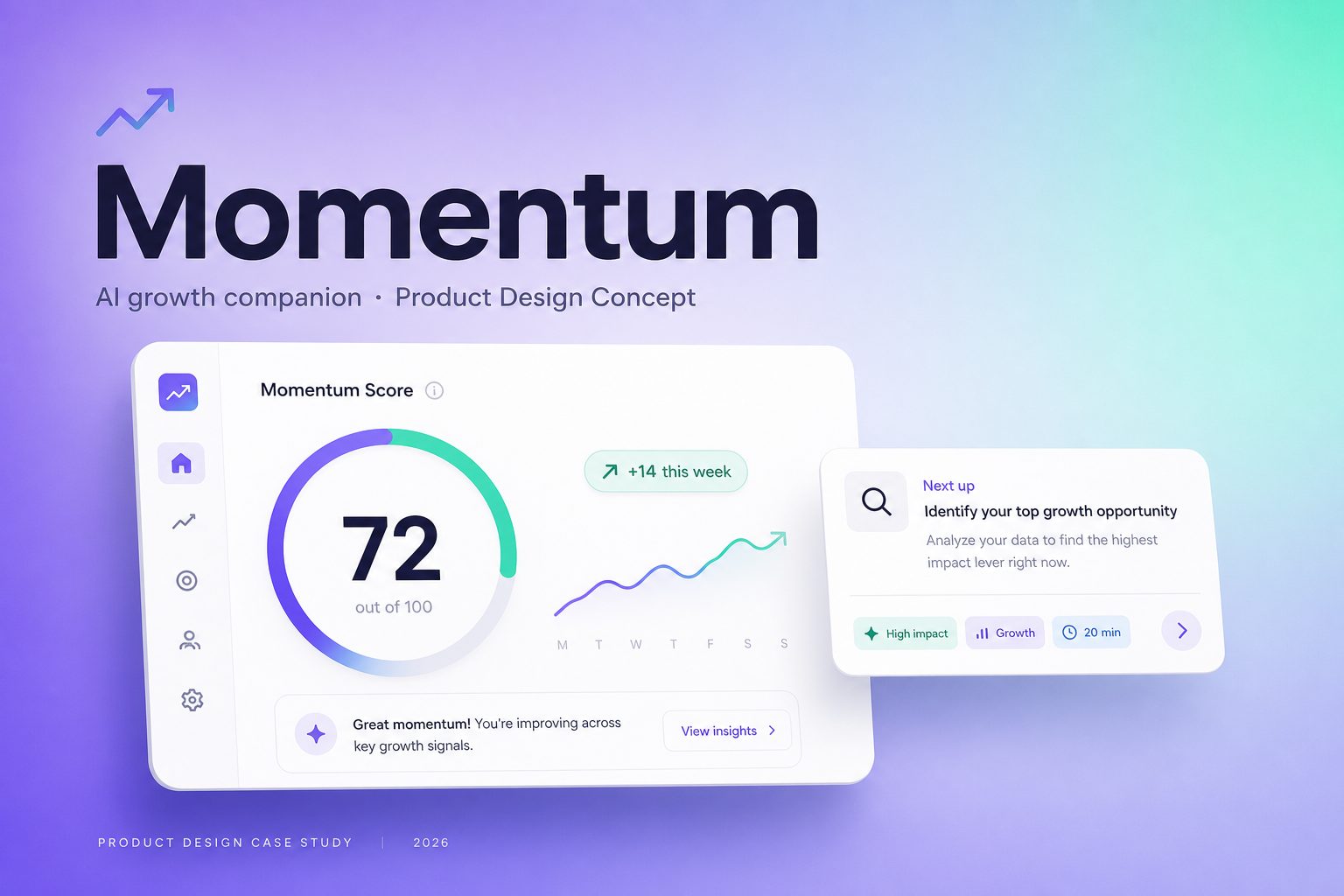
Momentum sits inside the dashboard the owner already logs into. Instead of a toolbox of growth features, it hands them one thing to do this week. Four principles carry the assumptions into the product:
Interactive walkthrough
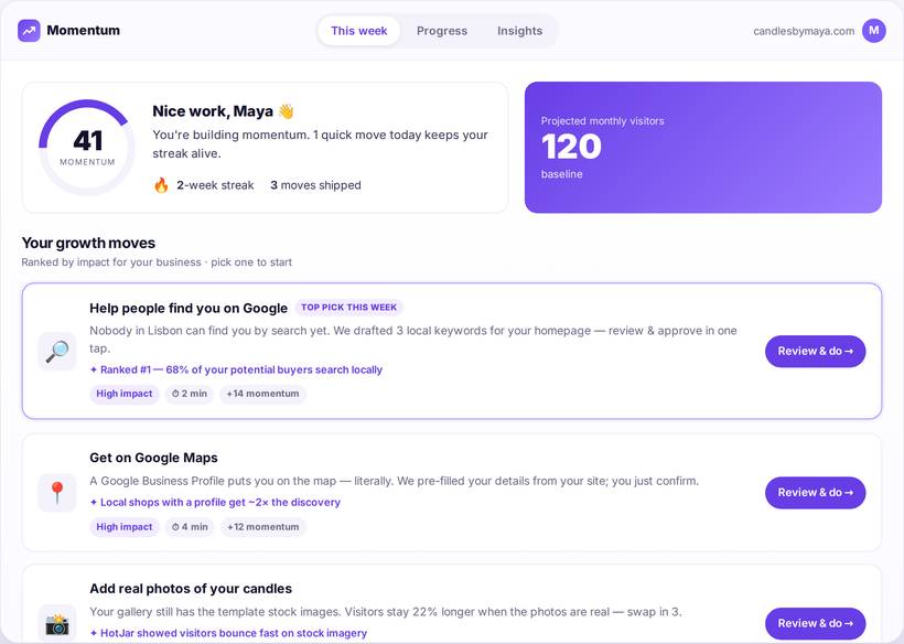
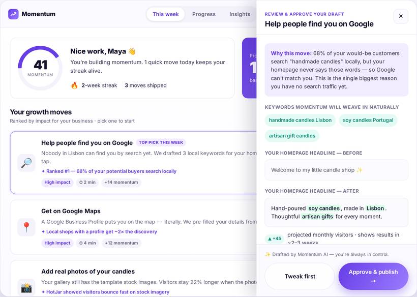
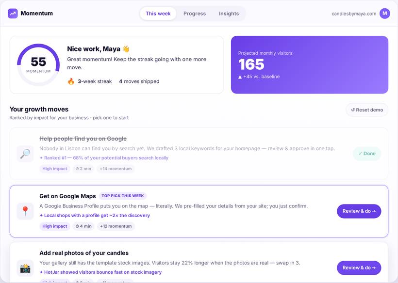
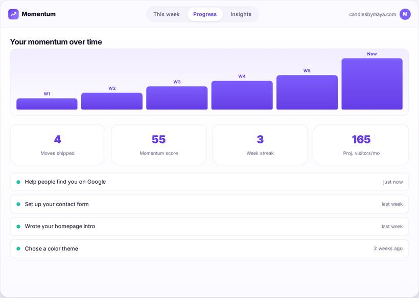
The prototype below is live, not a screenshot. Click a growth move to open the review-and-approve drawer, approve the AI-drafted change, and watch the Momentum Score and streak respond. That’s the whole loop: suggest → do → see it land → measure.
The prototype, screen by screen
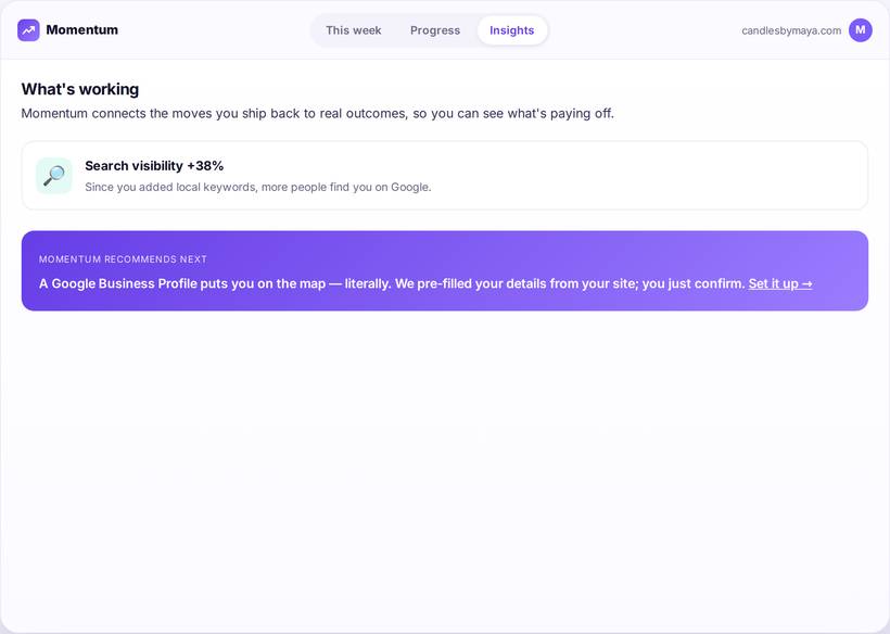
Captured from the live build. Approving one move moves the Momentum Score from 41 to 55 and the projection from 120 to 165 monthly visitors — the state change is the whole argument.
The prototype below is the running build — click it to interact.
Best experienced on desktop — the drawer and the progress panes need the width. The prototype also has its own full case-study page: open it in a new tab.
Built on reusable, token-driven components
Momentum extends an established SaaS design language rather than reinventing it. The new patterns it needed — growth-move cards, the Momentum ring, streaks — are documented as tokens and components so another team can adopt them without asking me what I meant.
Colour tokens
Foundations
Radii, elevation and motion are tokenised, which is what keeps the components consistent once someone else is building with them. The running system is on the prototype page.
What would have to be true
Before I’d project any business impact, the concept would have to survive 9 moderated usability sessions on the clickable prototype below. I’d write these thresholds down before the first session. Miss any of them and the concept goes back:
- 8 of 9 participants complete a growth move unprompted in the first session. Fewer than that, and ranking one next move hasn’t solved the paralysis.
- Time to first improvement under 3 minutes. Longer, and “two minutes, done-for-you” is a promise the product doesn’t keep.
- 7 of 9 would open a weekly nudge, and none call one-per-week spammy. Any “spammy” and the cadence is wrong, not the copy.
Writing the pass mark down first is what stops a usability session turning into a hunt for encouragement. After that, here’s what I’d instrument:
To be clear about what this is: a self-directed concept. I ran no interviews and no usability sessions, and I queried no analytics. Every number on this page is a target I set in advance, not a result I measured. What it shows is how I frame a problem and how I’d decide whether I was wrong about it. Not affiliated with or endorsed by any company referenced.
The hardest trade-off
Auto-applying every change would push completion numbers up, and I still didn’t do it. If the owner never sees what changed, they never learn their own site, and the first time the AI gets something wrong they have no way to catch it. So: review-and-approve, and I’ll pay the friction that costs. The risk I’d want to kill first is notification fatigue, which is why it’s one move a week and not a feed. After that I’d look at benchmarking (“sites like yours”) and a multi-site view for agencies.
This one is about how I get from a problem to a product bet. Naming the assumptions out loud, picking a north-star metric, and writing the pass mark for a usability study before running it, so the study can still say no.